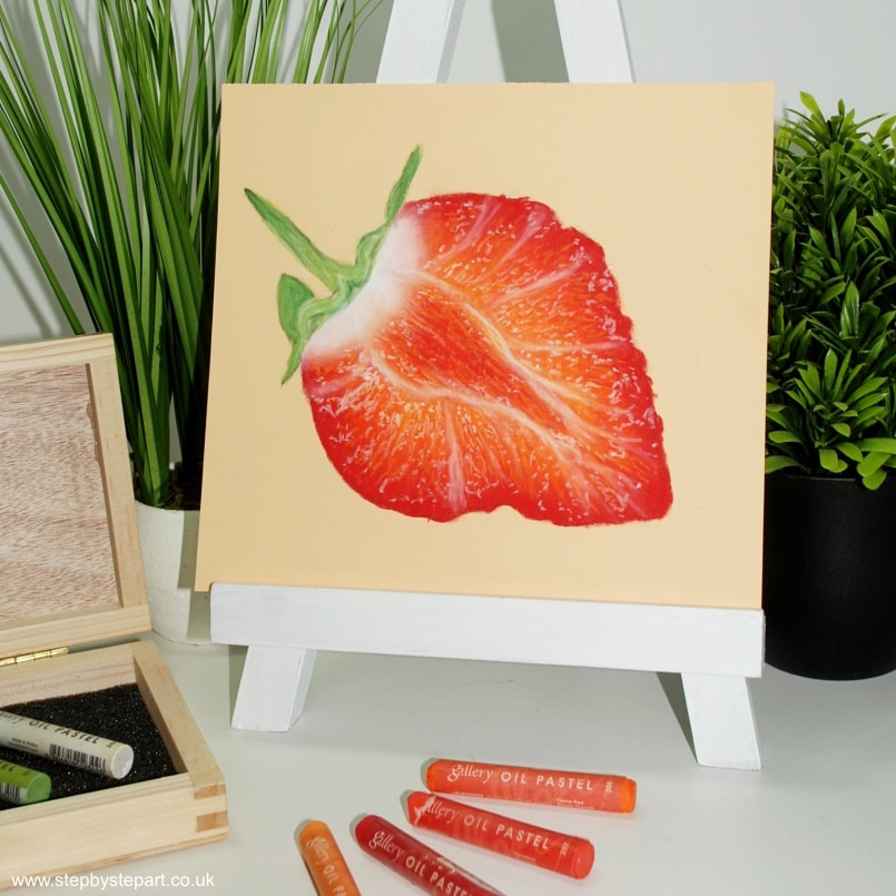
Juicy Strawberry
A 10 minute tutorial for oil pastel artists
Are you new to oil pastels or wish to try the medium, but unsure where to start? Maybe you feel it is too difficult and have never given them a second thought? Oil pastels are so easy to manipulate, which make them an ideal medium for the absolute beginner. We provide a simple step by step guide, allowing you to create a highly effective drawing in just 10 minutes. We show you how to build your layers and how to blend oil pastels for effectiveness. By providing you with images and written descriptions, we break this down into an easy to follow guide for any artist.
We hope you enjoy this tutorial and should you wish to request a subject that you would like to see in a future mini tutorial, please get in touch!
The products you will need
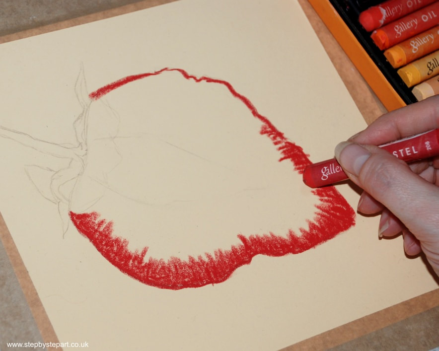
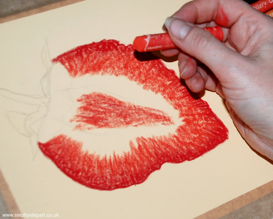
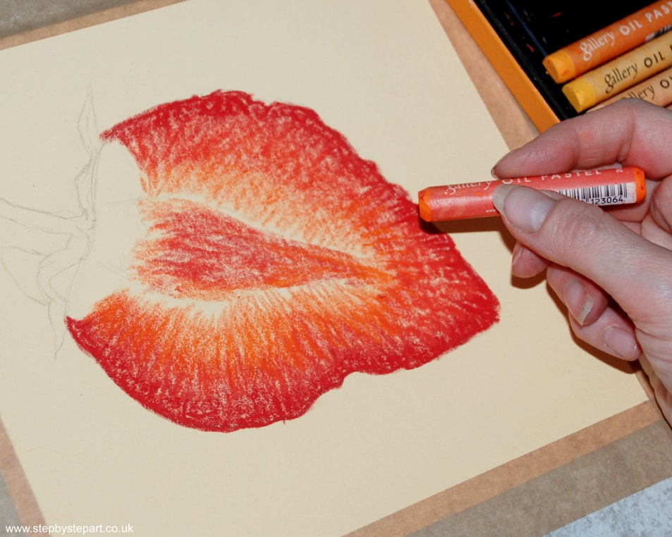
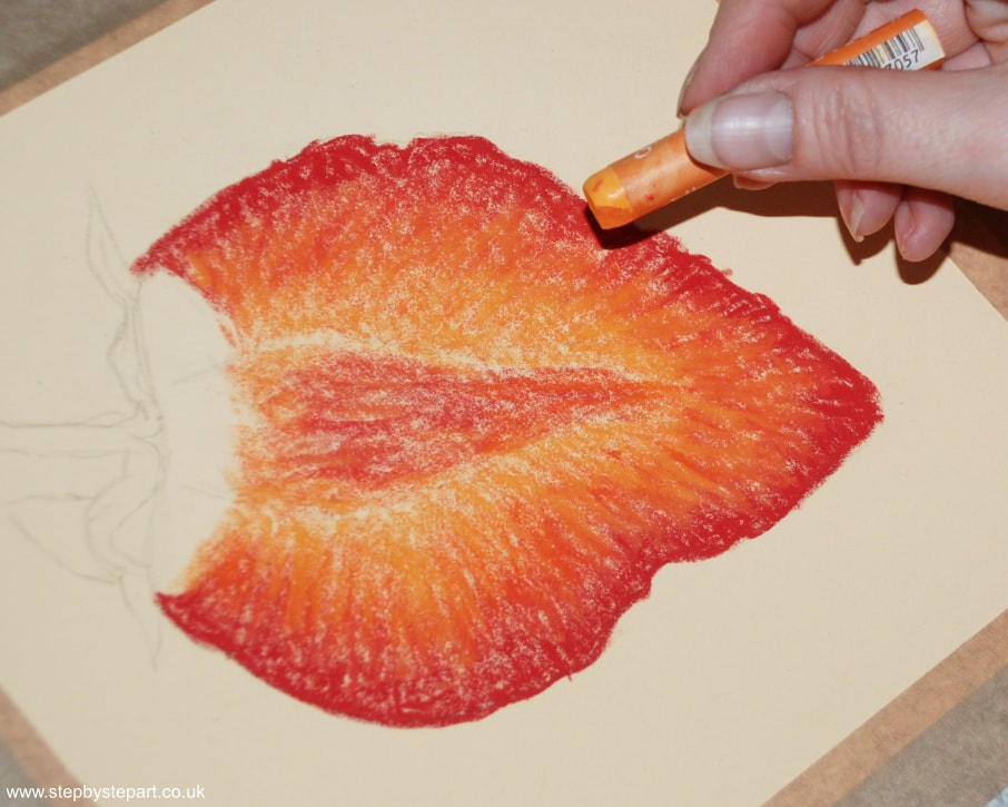
We only used 8 colours for this tutorial, just to keep things simple. We used the student grade 'Gallery' oil pastels on the Clairfontaine Pastelmat in Buttercup for this tutorial. Your products do not need to match ours, simply select colours from your own palette that closely resemble the colours we use and choose a textured surface, as the pastels are easier to manipulate. The tone of your paper is not important, however, the outcome will vary upon the base tone you do select.
|
* Textured paper *Oil pastels
* Blending tool * Protective paper * F pencil Vertical Divider
|
Paper Used: Clairfontaine Pastelmat Buttercup
Oil pastel range used: Gallery |
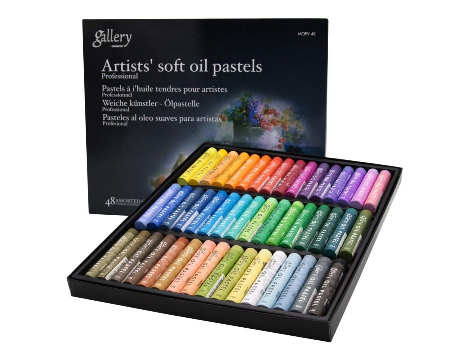
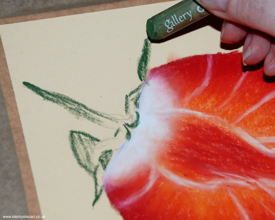
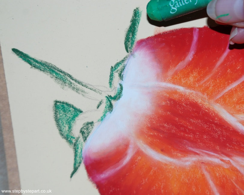
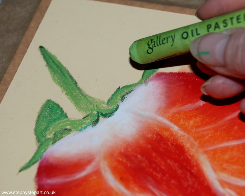
Gallery oil pastels are soft and creamy, and suitable for those new to oil pastels. They are also sold under the names Mungyo and Hashi. The box set used in this tutorial is the 48 set, but we only used 8 colours as we wanted to keep this tutorial as simple as possible.
|
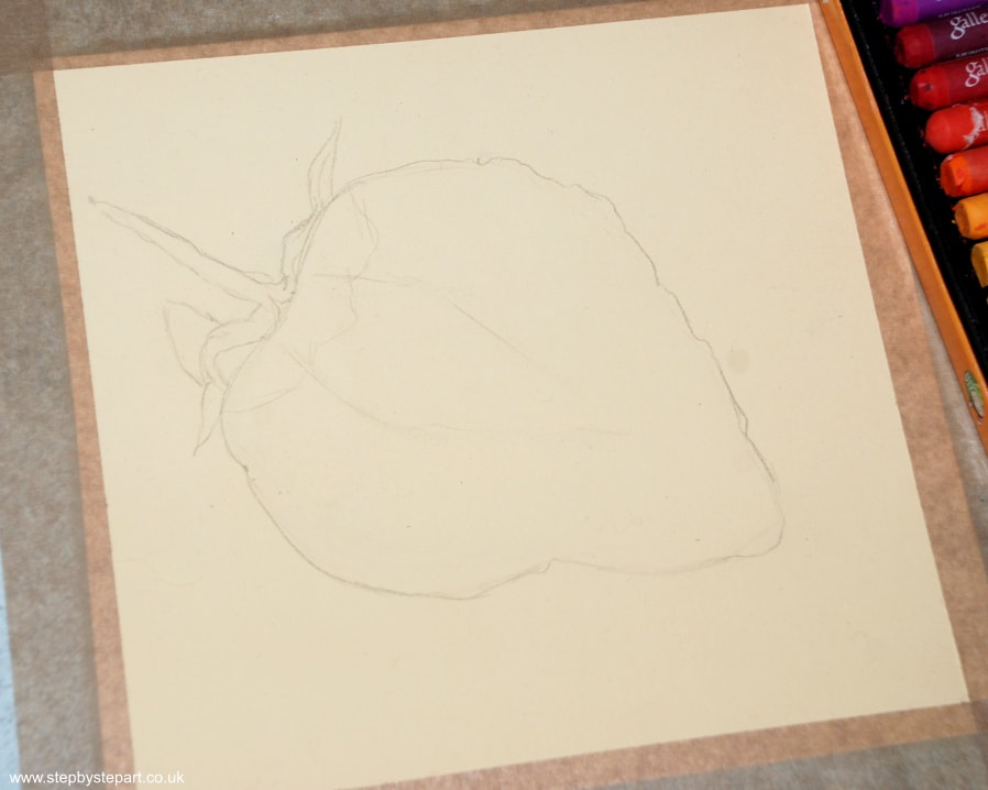
A textured paper is most suited to oil pastels. You can use a standard pastel paper or an abrasive paper. The tooth grabs and holds the pigment, whilst allowing you to blend your colours together. We used the Pastelmat paper from Clairfontaine, in the Buttercup tone.
|
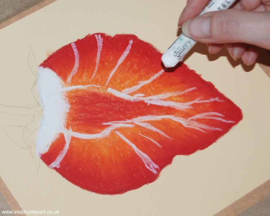
The reference image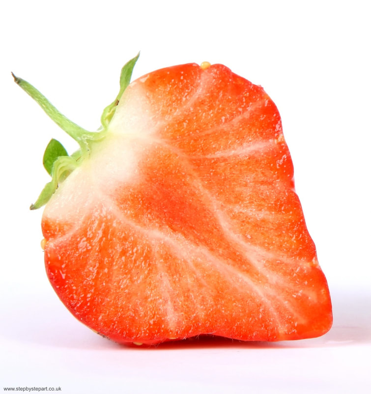
|
Colour chart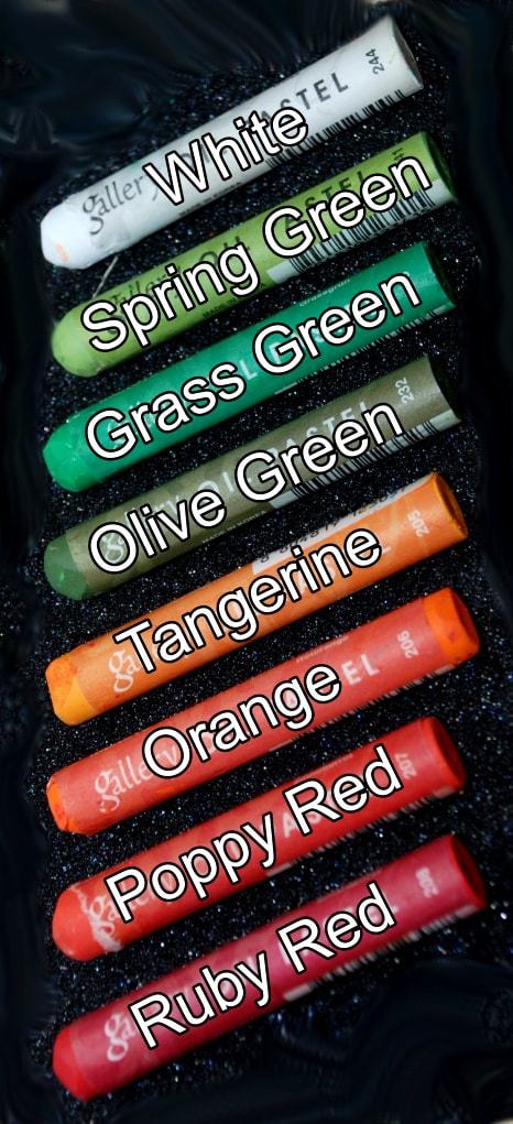
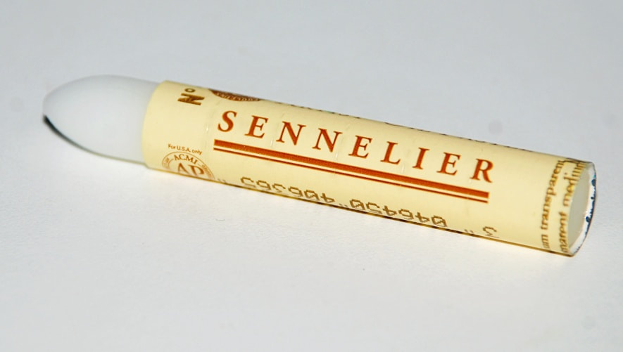
You can use a transparent oil pastel instead of the paper blender.
|
IMPORTANT TIPS:
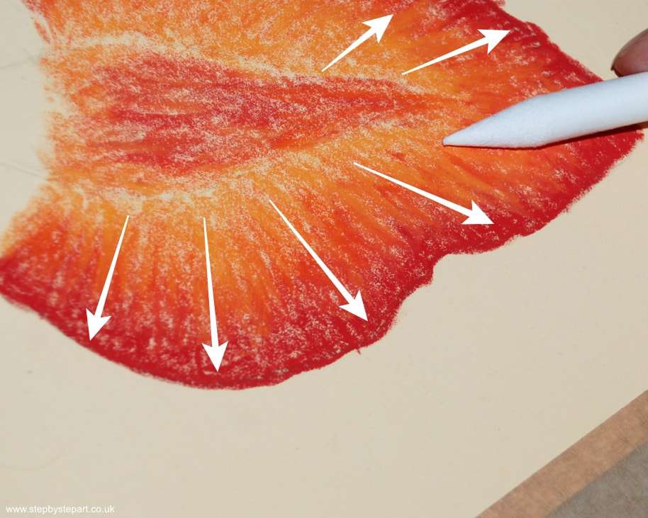
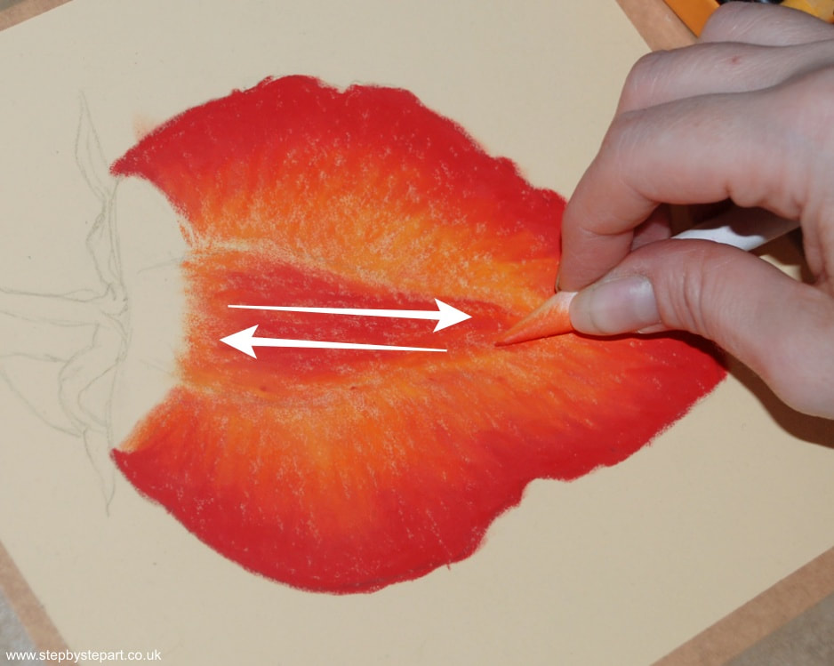
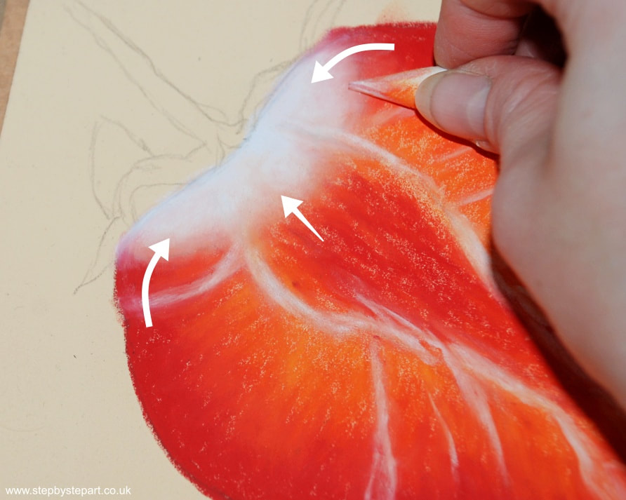
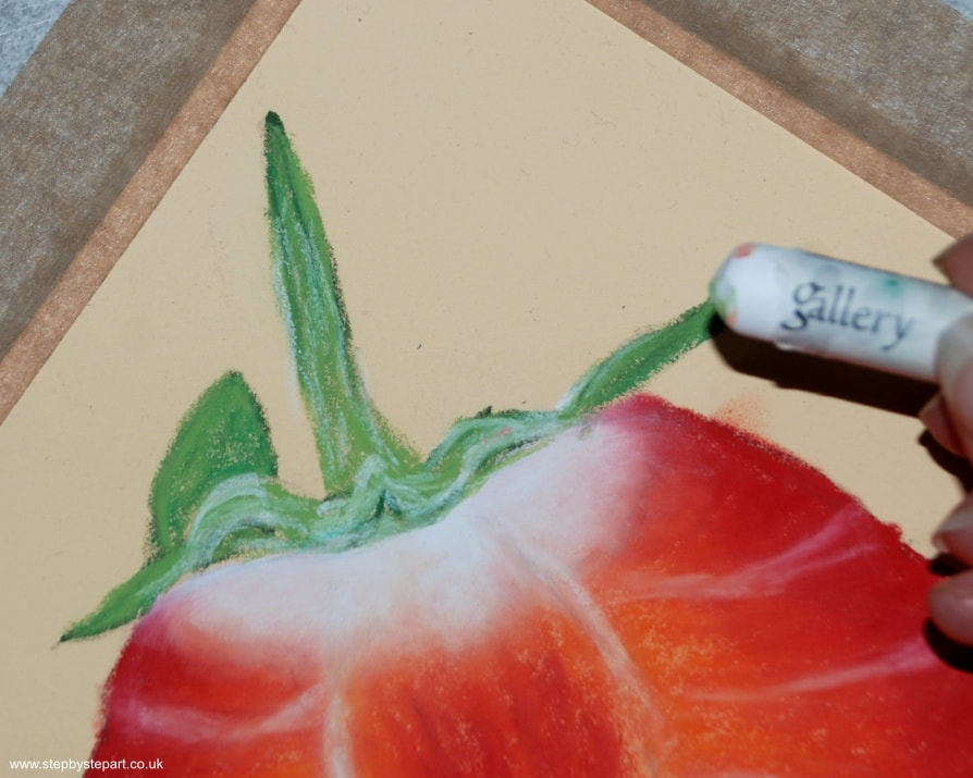
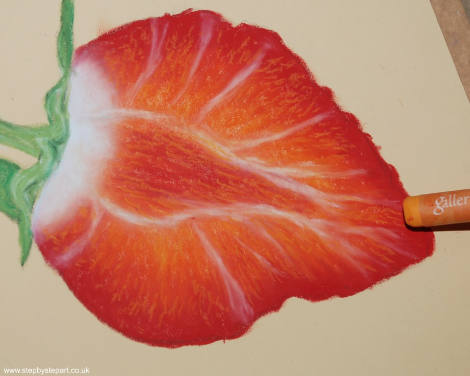
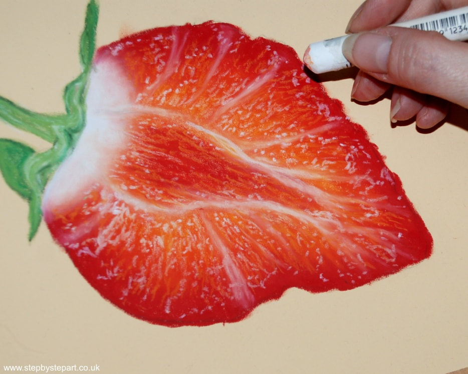
* Dark pigments will overpower light ones when mixing and blending so, apply a small amount of dark pigment to a large ratio of paler ones. Apply loose applications before blending the colours together.
* Avoid saturating your paper. Oil pastels are highly pigmented, so a small amount may provide all the colour you need. You can always add more should you need to.
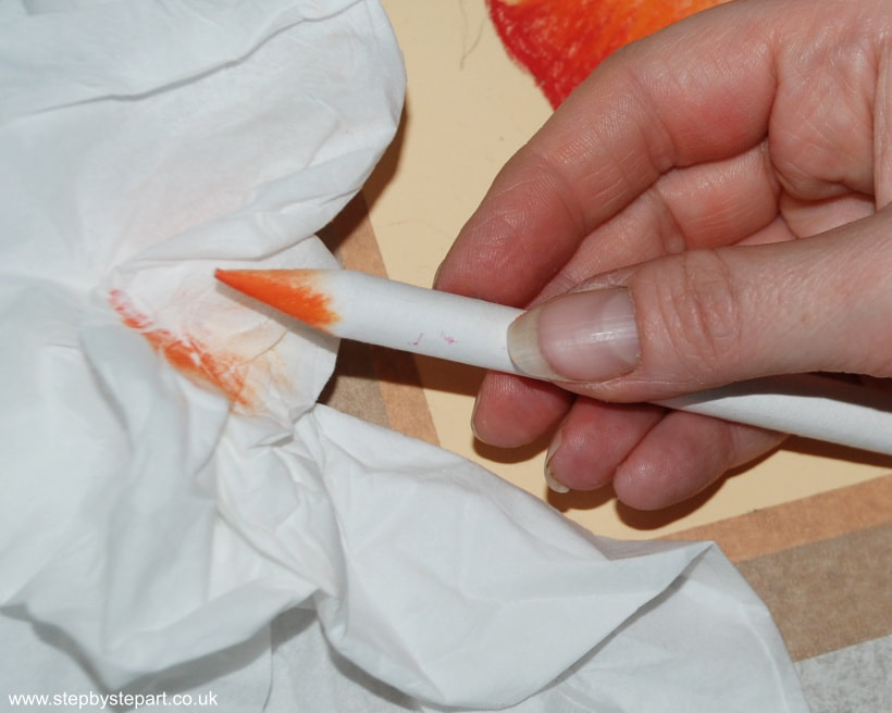
* You can purchase a transparent medium, which will replace the paper blender. This will blend the pigments together without changing the colour.
* To avoid smudging your drawing, always have a clean sheet of paper between your paper and your hand. Rogue smudges can be easily removed with a putty rubber.
* Dark pigments will overpower light ones when mixing and blending so, apply a small amount of dark pigment to a large ratio of paler ones. Apply loose applications before blending the colours together.
* Avoid saturating your paper. Oil pastels are highly pigmented, so a small amount may provide all the colour you need. You can always add more should you need to.
* You can purchase a transparent medium, which will replace the paper blender. This will blend the pigments together without changing the colour.
* To avoid smudging your drawing, always have a clean sheet of paper between your paper and your hand. Rogue smudges can be easily removed with a putty rubber.