Have you ever worked with Textured paper & Coloured pencils?
If not, this article may be of help for getting started.
Back in 2013, I created a couple of large Coloured pencil portraits on textured paper, finding that I had to adapt my technique in numerous ways to achieve the fine detail that I prefer in my own pencil work.
Using the Sumatran Tiger portrait I created, as example for this article, there is advice on choosing the type & tone of paper as well as how to build up your layers and finally a little about mixed media which can help you get the best out of working with Coloured pencils on textured paper.
PRODUCTS: I used my Caran Dache Luminance pencil range for the finer layers and the Derwent Coloursoft pencils for the base layers, I also had a few Caran Dache Supracolor watercolour pencils that I had forgotten about but used for the background.
TextureThe coarse texture of paper varies from company to company, from the fine grit paper such as PASTELMAT to grittier paper such as UArt240. You can use most Pastel papers for Coloured pencil Art but do be aware that the more coarse papers will wear pencils down much quicker.
Check out our UArt Dark article which may be of interest if you prefer to work on dark textured paper. |
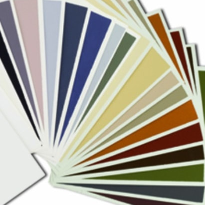
Paper toneTextured papers come in a range of colours, selecting a suitable tonal base for your subject can help cut down on pencil application. Choosing brown, beige & yellow paper tones for warm subjects and Blues, Grey, Greens tones for cool subjects will provide a great starting base. I used a sheet of white COLOURFIX for this subject although a popular choice, white paper is not always ideal particularly if the subject is also light and another colour option may be far more effective.
|
Base layersWhen laying the initial base tones, it is far more cost effective to use cheaper pencils or even watercolour pencils, only using your professional pencil range(s) to build up the finer layers, especially if you are working on a large portrait and particularly if you like to add a lot of detail too. I used some of my old Crayola pencils for some of the base application in this portrait.
|
Secondary layersThe secondary layers are the layers placed over the base tones before the finer details are applied. I begin to build up the detail at this stage but only layer loosely using a soft pencil range in this case I used the DERWENT COLOURSOFT but ranges such as Prismacolor Premier or Royal Talens Van Gogh ranges are also ideal as softer leads can help to build thicker layers allowing for a quicker application in preparation for the finer details next.
|
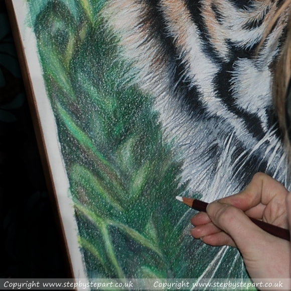
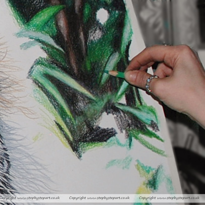
BackgroundsOnce all the secondary layers have been completed, I then begin work on the background. On textured paper, Coloured pencils grab better and the pigments look more vibrant. Being unable to effectively indent textured paper to place fine lines such as the whiskers on this Tiger, it is better to create the background first and then apply the finer details over the completed background. You may have to introduce a little mixed media if you have a very dark background and need to achieve bright lines.
|
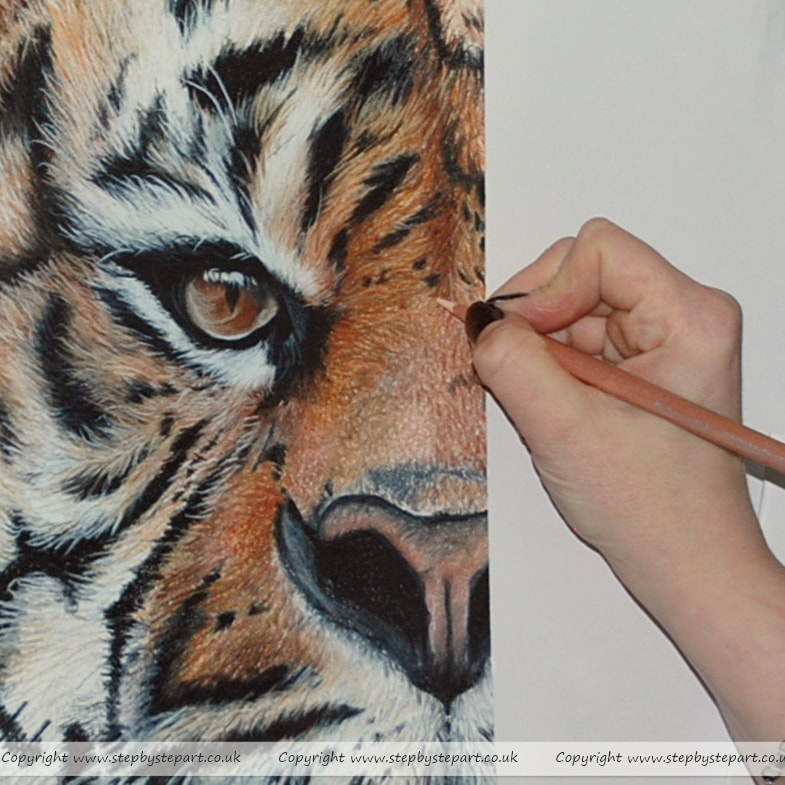
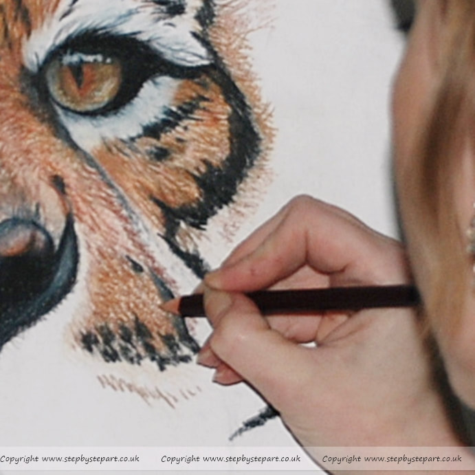
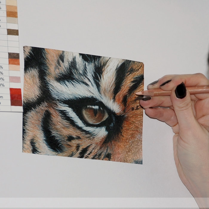
Fine detailsWhen creating the finer details, I use the wax based pencil range CARAN DACHE LUMINANCE being one of the most lightfast pencils available. If you prefer to use an Oil based pencil, the Faber Castell Polychromos (another lightfast range), will create much finer lines as Oil based pencils tend to be harder and will hold their point for longer. I only use the Luminance pencils in the final layers of working on textured paper to minimise wear and tear whilst ensuring my portrait is lightfast.
|
Taking regular breaksI cannot stress how important it is to take regular breaks when working on a piece of Art. Avoid straining your eyes for too long and also, by taking a step away from your Art to have a break means that when you come back into the room, you will see your work with fresh eyes, which can allow you to pick out any areas that may need tweaking or give you a much needed confidence boost when you see how effective your Art has become.
|
Other related articles that may be of interest
Coloured pencils Checklist
|
UArt Dark sanded paper
|
Derwent blender pen
|
Coloured pencil mini tutorial
|
Helpful Hints & Tips for working with Coloured pencils
Concentration issues?If like me, you struggle to concentrate on one area at a time, finding yourself distracted often and forgetting which section you were working on, you may find that isolating a section of the drawing using a plain sheet of paper with a square cut out, can aid concentration. Simply move it around sections of your picture to keep yourself focused. Keep checking perspectives as you move it around the paper.
|
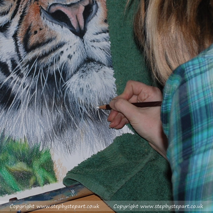
Avoid smudgingWhen working with textured paper, pencils are easier to smudge, especially if you are working flat, with your hand constantly moving around the paper, having a clean piece of paper beneath your working hand is recommended, glassine paper is the better options. Alternatively, if you work upright you can cover the area with a clean towel as I did in the image above.
|
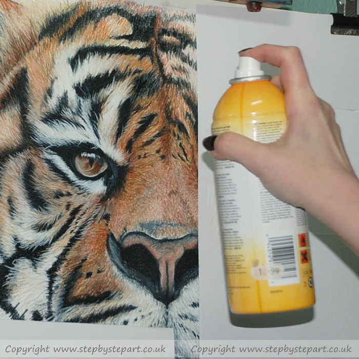
Using fixativeFixative can be a great tool for Coloured pencil Artists, using it in between layers can help to seal the last layer and prepare new ground for the next layer. Colours can look as vibrant as they did on first application. There are workable fixatives that have been created specifically for this purpose such as the 'Krylon Workable Fixatif' which is archival, but I would suggest you ask around for recommendations as fixatives can vary.
|
Mixed Media
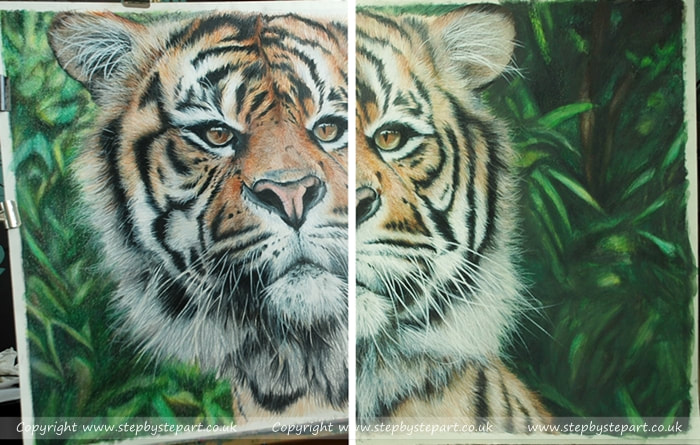
Textured paper is ideal for many Art mediums and there may be times when using mixed media is better. This was a large portrait at 50cm x 70cm and extensive use of wax based pencils on a portrait this size would wear down pencils at a faster rate than normal and a watercolour pencil can come in extremely handy to minimise excess waste. I don't work with watercolour in any capacity but I had some old Caran Dache Supracolor pencils that had been stood in a cupboard for many years unused and so I decided to utilise them. The left side of the image above shows initial pencil application before water was added and the right side was after water was added. Now, the background no longer overwhelms the subject and the focus is entirely on the Tiger, as was intended.
|
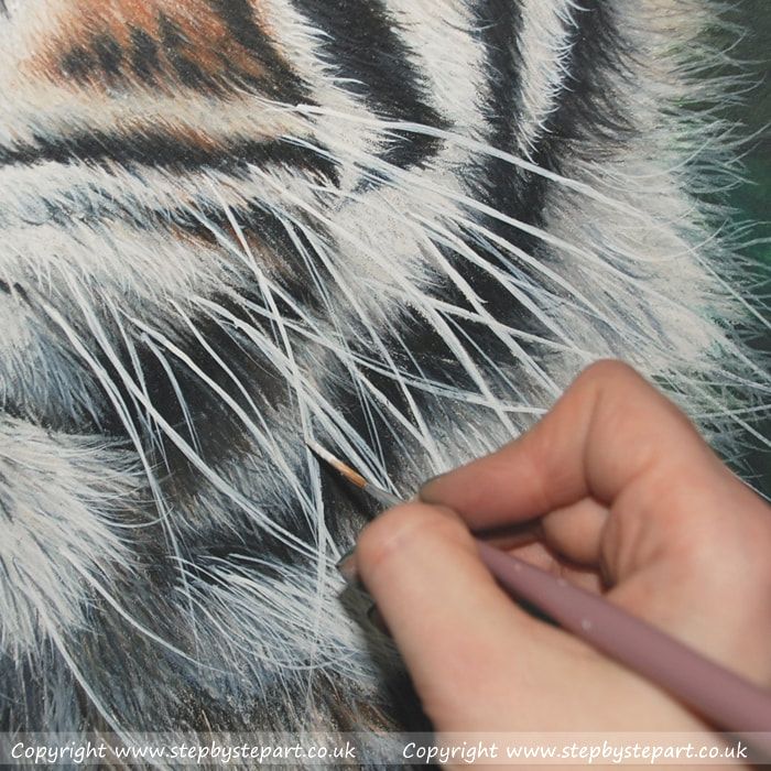
The problem with Coloured pencils is that after so many applications, further layers can look muddy as colours mix together or consecutive layers may slip off the paper (known as saturation), to keep the whites looking bright (especially when it comes to the whiskers), I decided that the use of Acrylics would achieve brighter whites than a pencil and so completed all the important areas where an opaque white was needed and personally feel the final portrait looked more effective because of it.
|
The final portrait
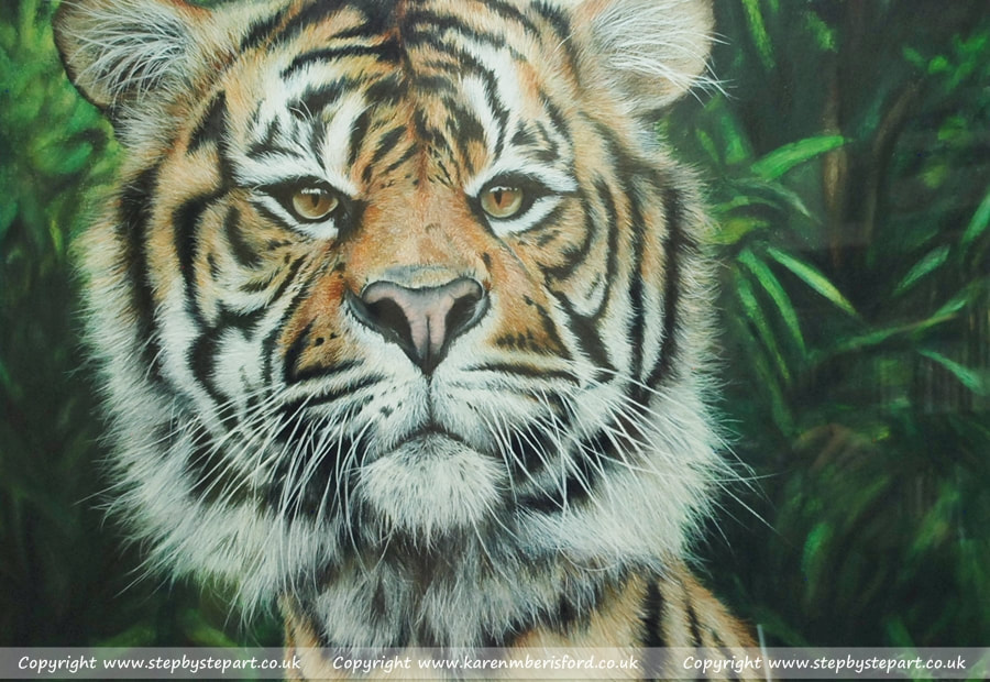
The finished portrait
|
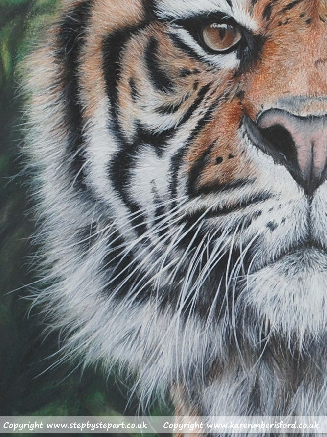
A closer look at the painted white fur
|