Learn how to paint a pink orchid in Acrylics
and how to create acrylic washes
Artist level: All
Written: April 2020
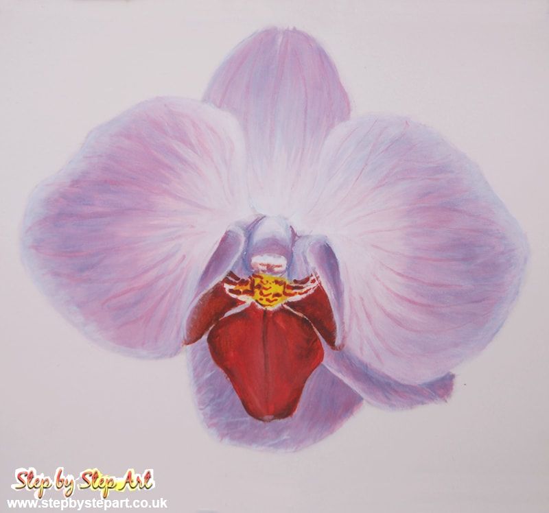
In this tutorial, I show you how to create depth and shape in your acrylic paintings and show the importance of washes. Both images and written explanations have been provided, which offers a better experience for the reader. You can find the reference image below. Screen grab, print out or view on your mobile whilst following the visuals on a second device.
Your painting does not need to look exactly like mine, I encourage freedom of expression. You may favour a different style, but can still use the techniques explained here. If you wish to include a background with your orchid, complete this first before the flower.
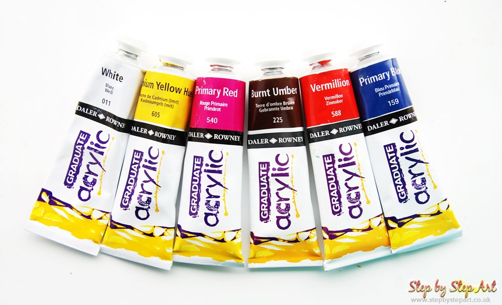
The colours used in this demo are the Graduate range from Daler Rowney. These 6 colours can be found in most acrylic starter kits, or you can use colours from any paint range.
I hope you enjoy this tutorial!
Your painting does not need to look exactly like mine, I encourage freedom of expression. You may favour a different style, but can still use the techniques explained here. If you wish to include a background with your orchid, complete this first before the flower.
The colours used in this demo are the Graduate range from Daler Rowney. These 6 colours can be found in most acrylic starter kits, or you can use colours from any paint range.
I hope you enjoy this tutorial!
The Products you will need
White watercolour paper or canvas - Acrylic paints
Paintbrushes - Palette dish - Water dish - A sheet of kitchen roll
Paper Used: Arches Aquarelle 300gsm Paint range Used: Daler Rowney Graduate acrylics
Paintbrushes - Palette dish - Water dish - A sheet of kitchen roll
Paper Used: Arches Aquarelle 300gsm Paint range Used: Daler Rowney Graduate acrylics
The reference image
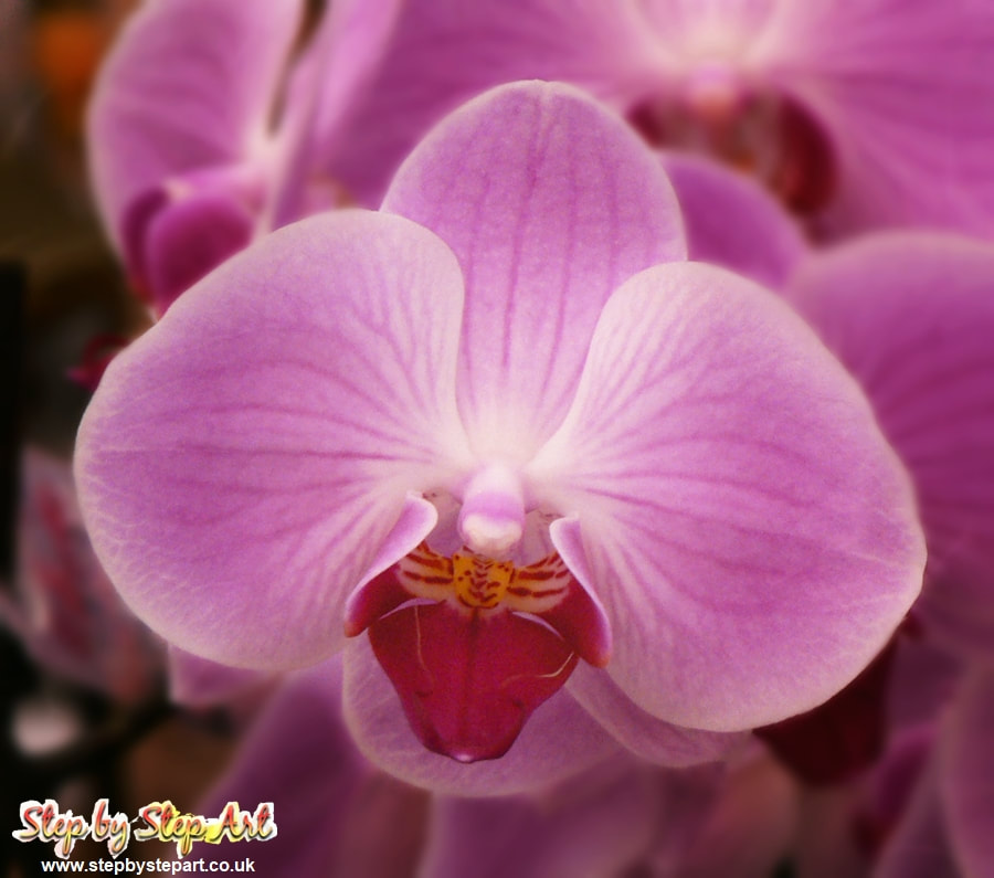
Photograph of a phalaenopsis orchid
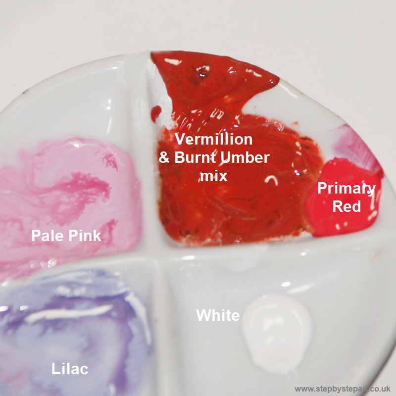
Colours used:
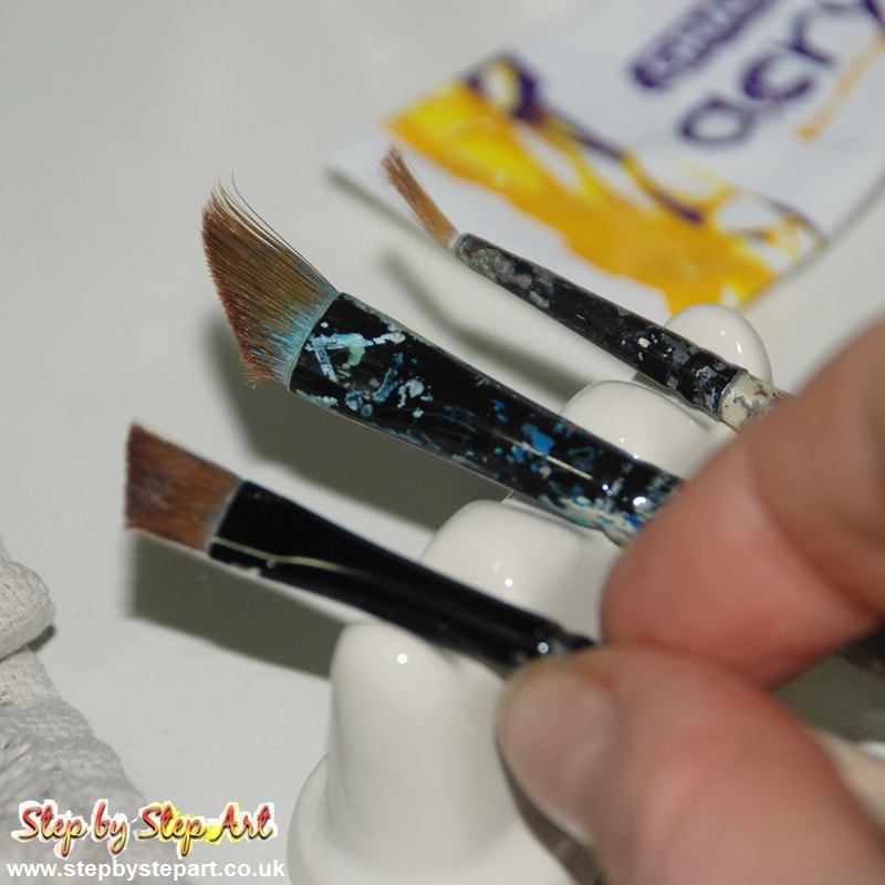
I have chosen three paintbrushes that will aid application. I used the following Daler Rowney Graduate brushes:
Sword 1/4", Liner 10/0 & Angle shader 1/4" The painting in this tutorial measures 7" x 6". If you are creating a smaller painting, you may not need the sword brush. |
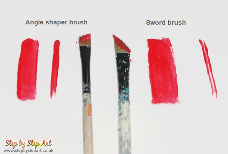
The angled brushes can be used two different ways. Use the brush width for thick applications and the long edge for thinner ones. When applying base tones, the width of the brush allows for quick coverage. If shaping or creating detail, use the edge. The liner brush is best for very fine details.
|
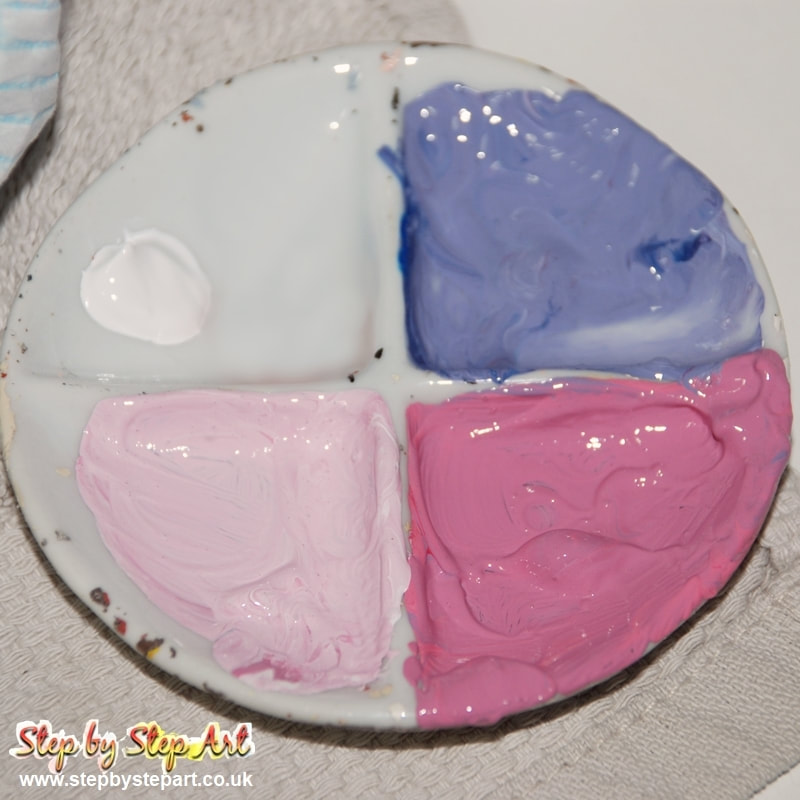
For the base & mid layers, I use the following colours: Primary Red, Primary Blue & White I mixed the colours as follows:
Pale pink - 80/20 white/primary red Mid pink - 40/60 white/prim. red Lilac - 60/30/10 white/prim. red/prim. blue |
IMPORTANT TIPS:
* The amount of paint you need will depend on the size of your painting. When mixing a new colour, it is better to mix too much than not enough. Store extra paint in a seal tight container to stop it drying out
* Applying paint over a wet surface makes it easier to blend
* When taking a break, cover the paint palette with cling film and store in a cool place.
* Adding drops of water onto the paint palette will help to keep the paint supple during use. Do not mix the paint and water together.
You can find out more tips on working with acrylic paint on our tonal background tutorial
Reference images
The importance of layers
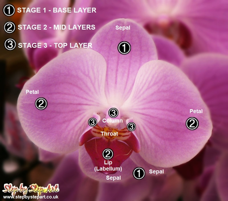
Before you begin, visually split your reference image into three layers will help decrease the amount of time you spend re-working your painting. Study your subject or reference image and pick out those sections which make up the base, the middle and the top layers. I have already split this into three, so you can see how I predetermined each layer. Always start at the base and work 'up' to foreground. If your painting has a background, this is always the base layer.
|
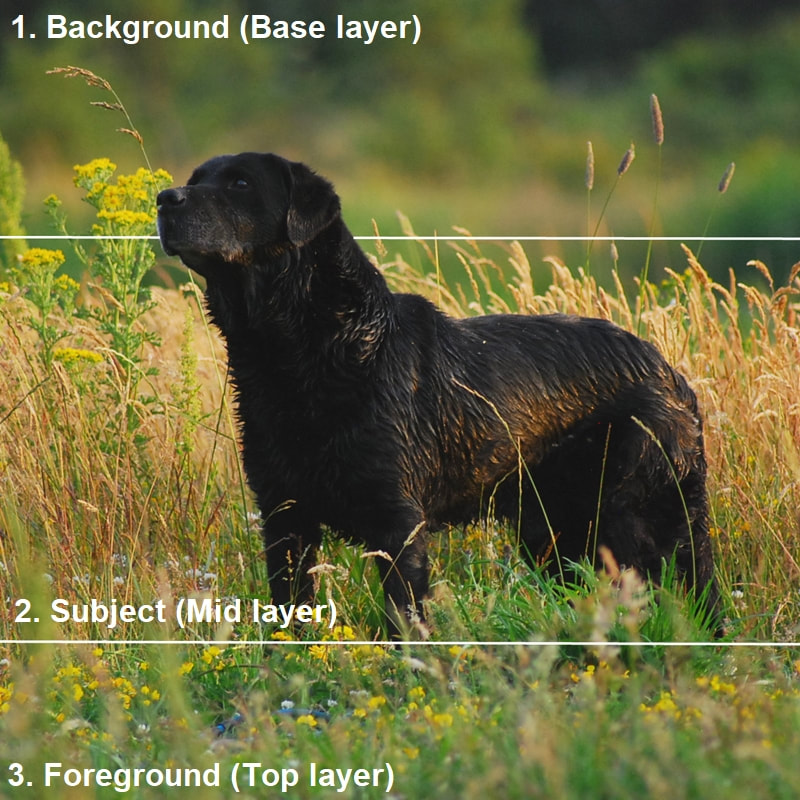
A simpler image to explain this process is the one seen above. Completing the background first makes it easier to overlap mid-layers. This is also the case with the foreground, allowing you to create smoother transitions. Working any other way could mean repetitive applications, an unnecessary and time-consuming job.
|
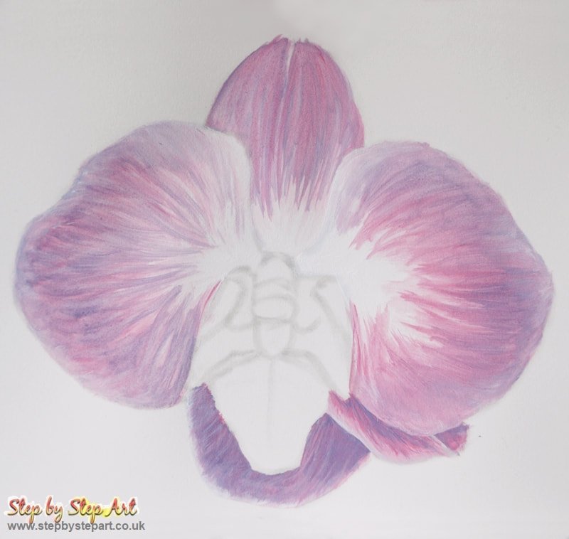
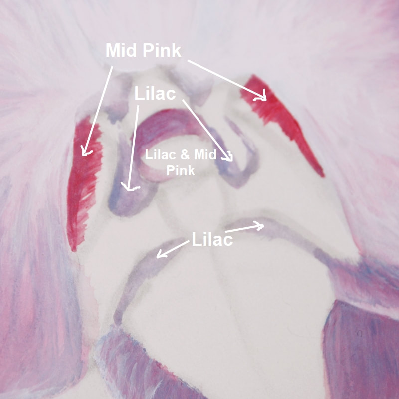
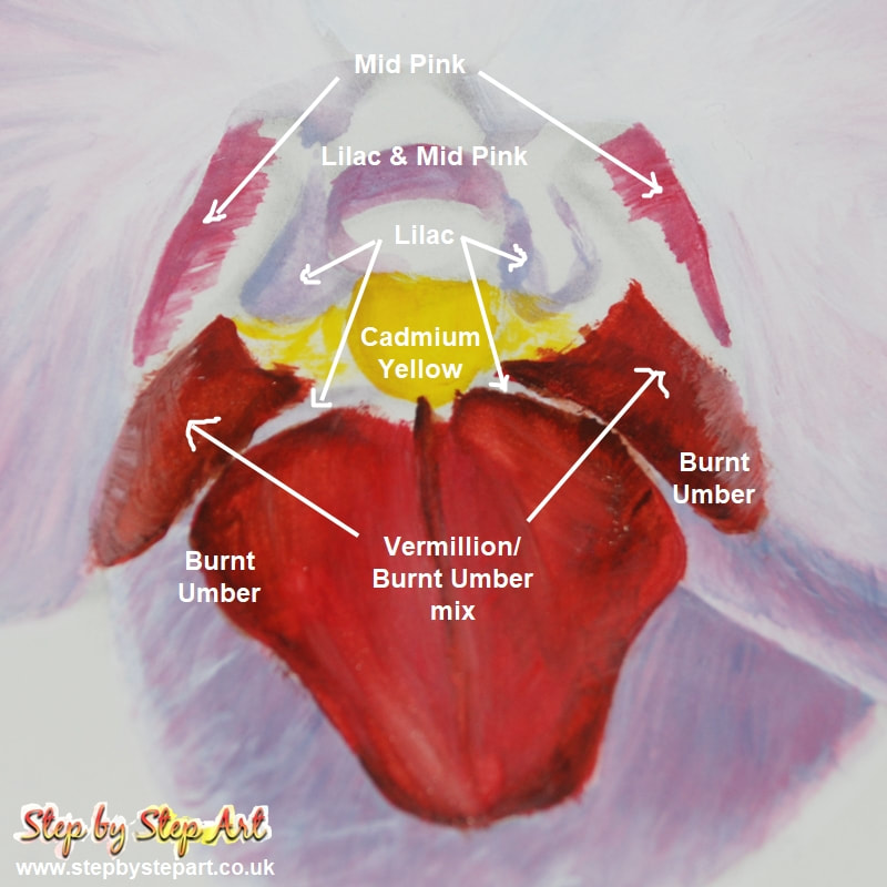
1 - BASE LAYERS - THE SEPALS
Before you begin: If you are using watercolour paper, you may need to soak and dry your paper first. Learn how to size your watercolour paper (Blick Art YouTube video). Always keep your paint supple in the palette by applying a drop or two of water on top, but do not mix. You should apply your paint colours from light to dark. As we are working with acrylic washes, the initial base tones needs to be made darker than those found in the reference image. Keep a piece of kitchen towel close by. It is frequently used to absorb excess water or colour from your paintbrush.
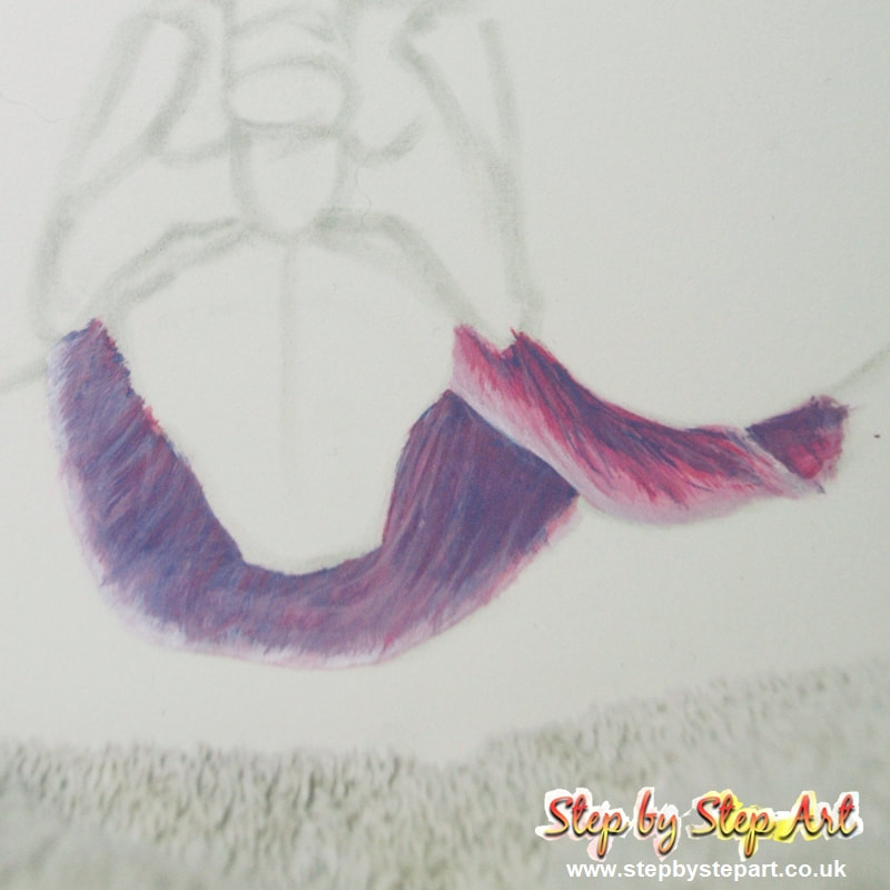
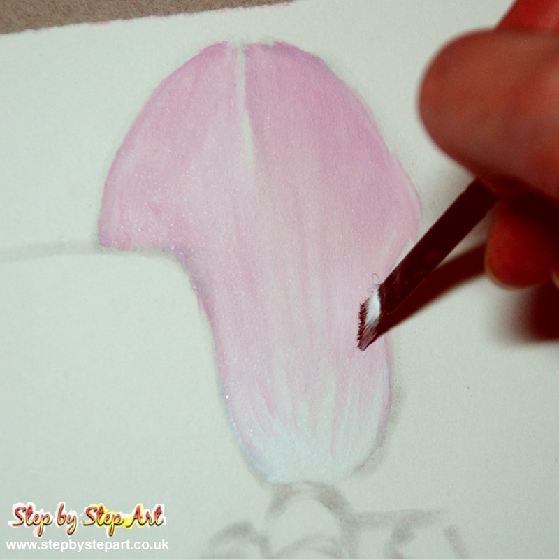
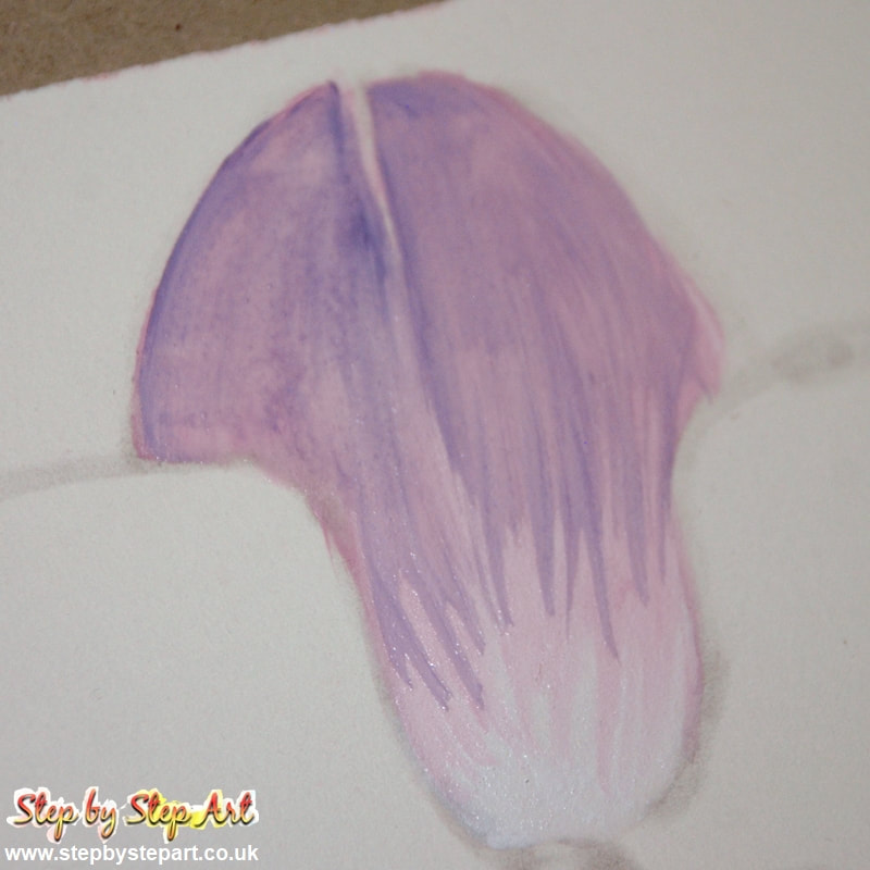
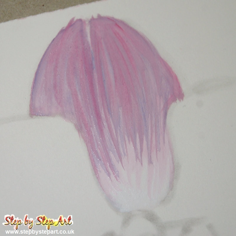
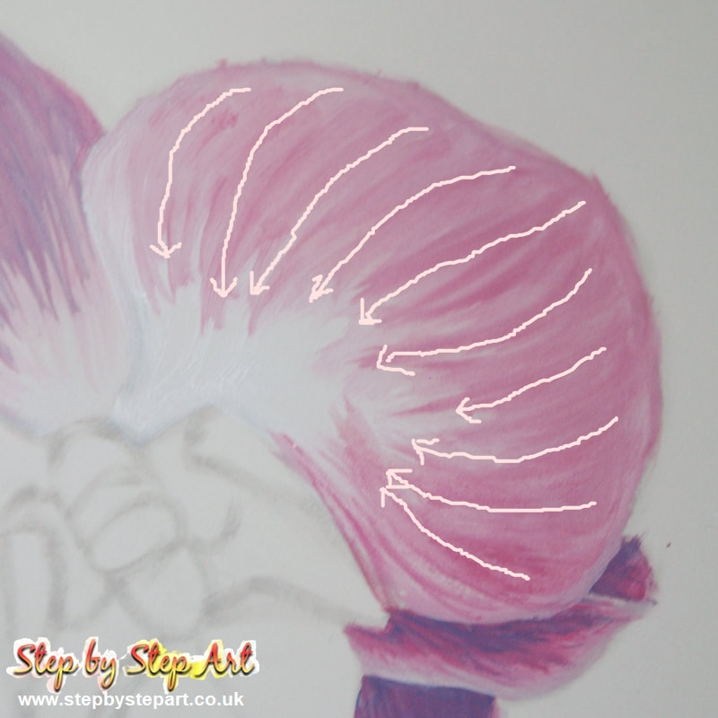
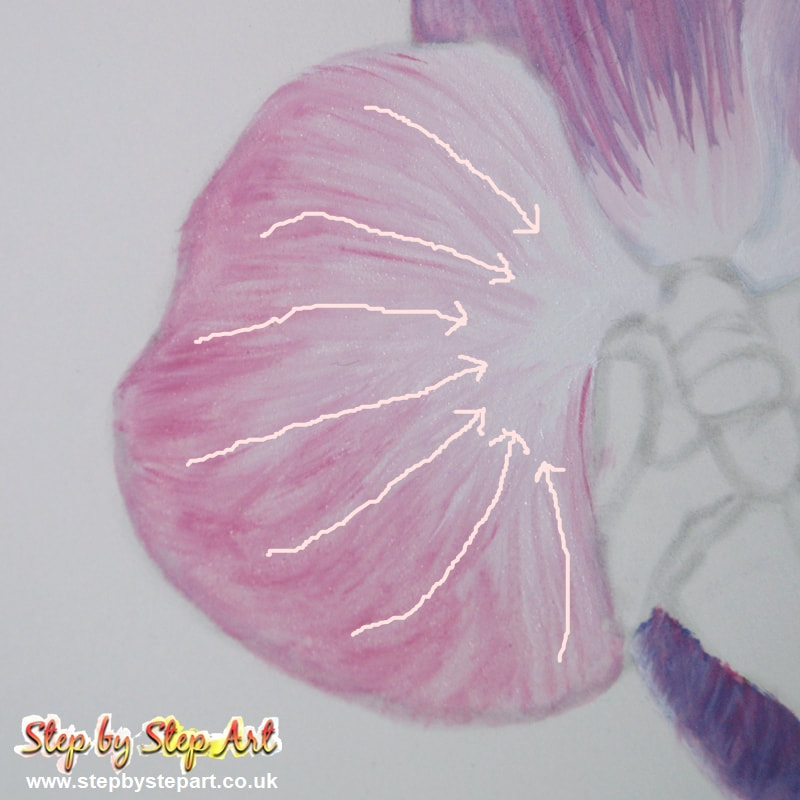
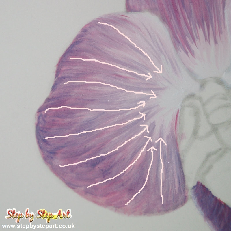
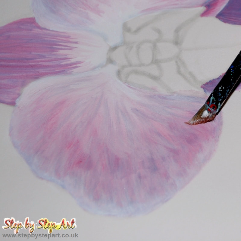
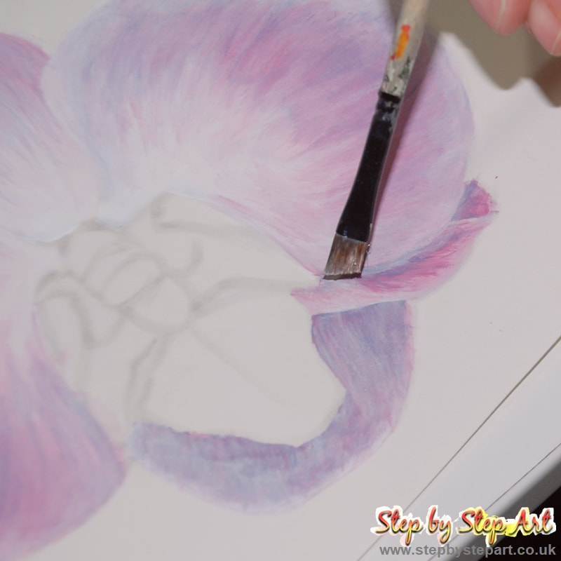
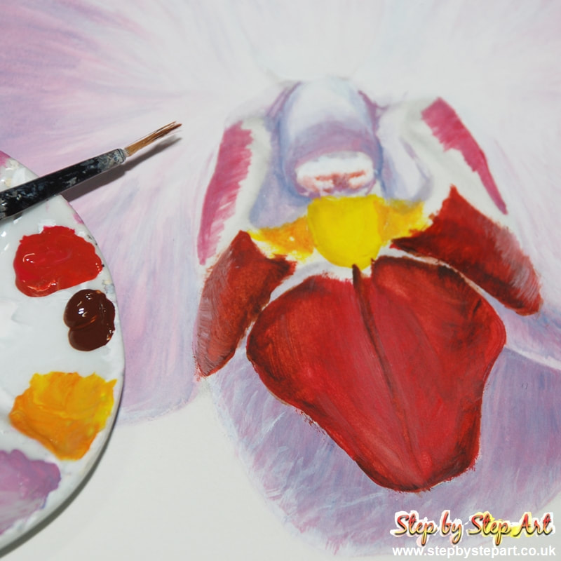
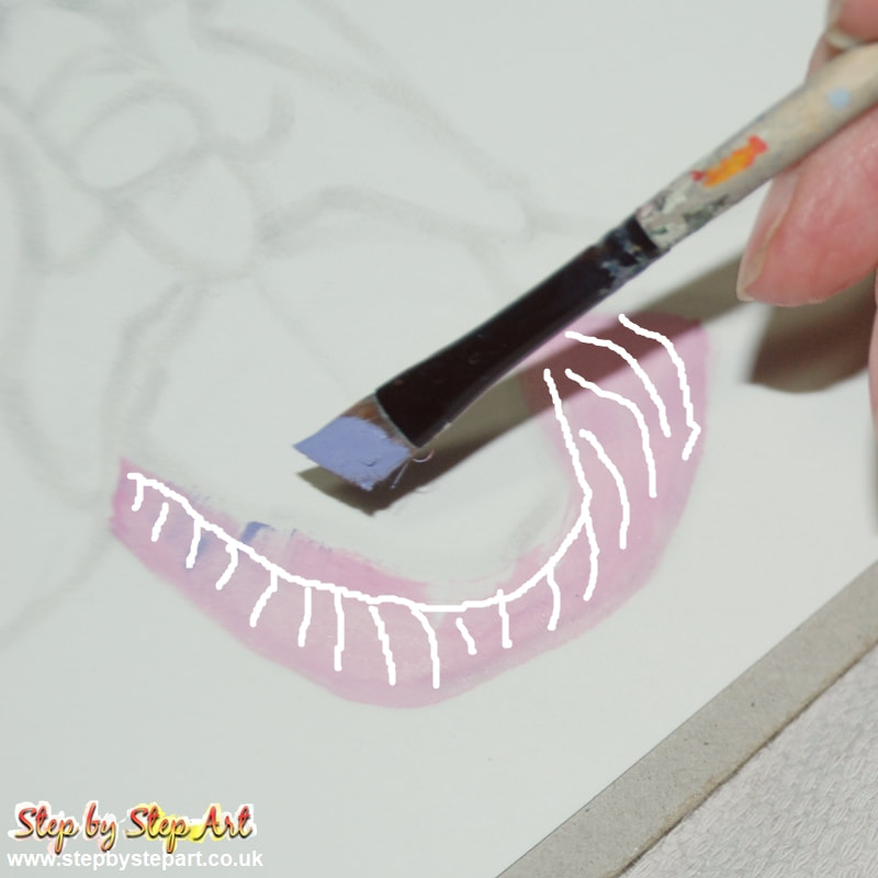
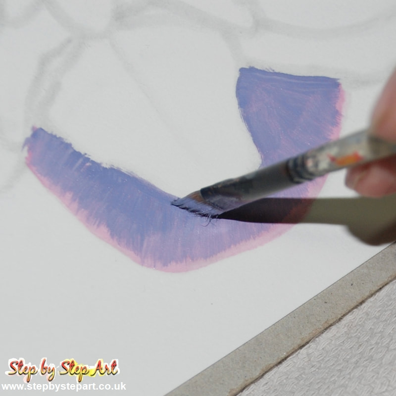
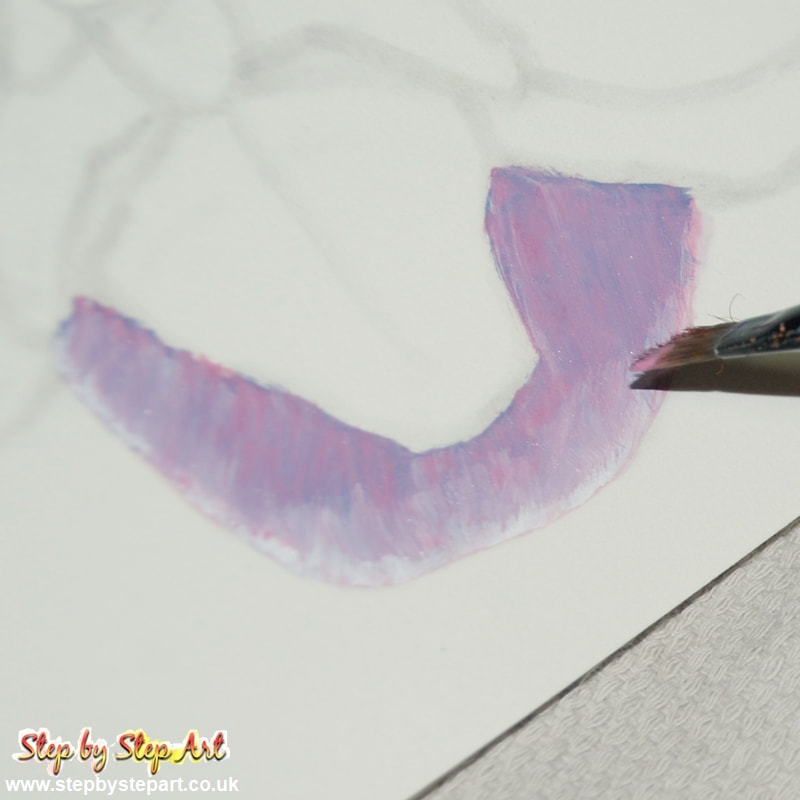
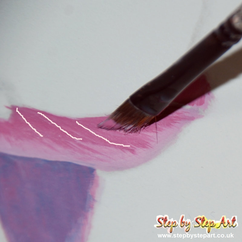
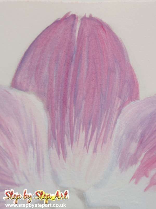
Begin with the smallest sepals found at the bottom of the flower. Use the angled brush for application. As these are shaded by the lip, they should be painted darker. Work on each separately so as not to lose the outline. Wet the paper/canvas before applying paint as this aids blending. Cover the whole area using pale pink. Load the width of the brush with lilac paint, then brush outwards towards the edge (2). You only need to cover three-quarters of the area. Apply following the white guidelines shown on the image. Add a layer of mid pink (3) using the same application as before. Finish by adding a white edge and blend towards the pink for a smooth transition. Repeat (4 and 5), on the smaller sepal, but apply individual lines using the edge of the brush, dragging it outwards (see image 6).
|
|
|
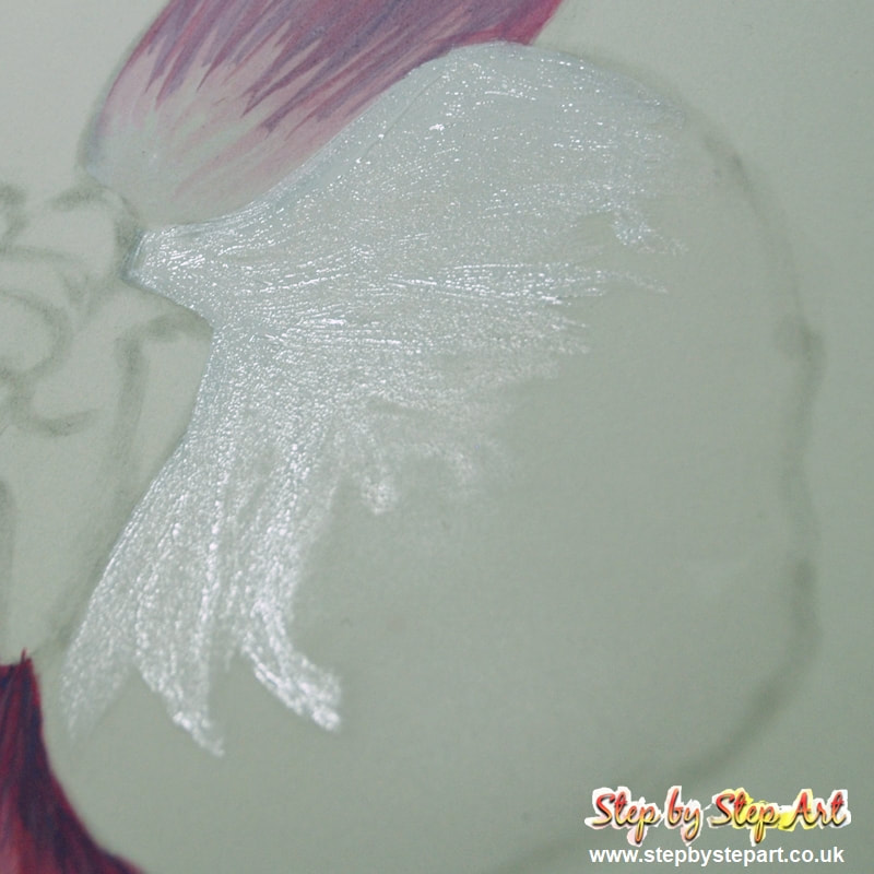
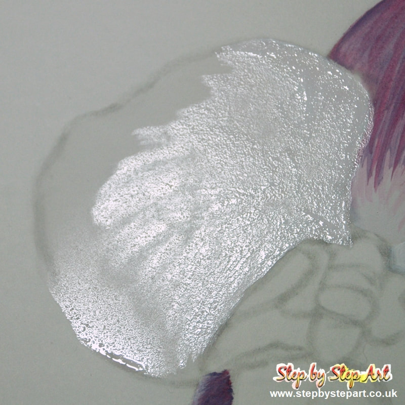
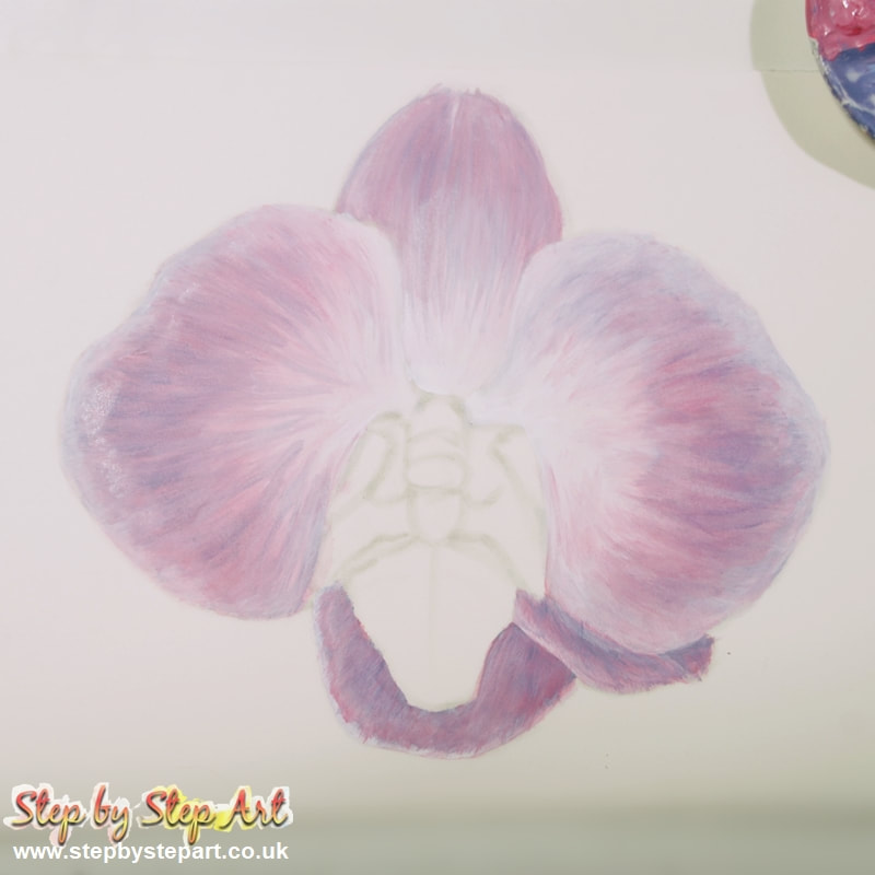
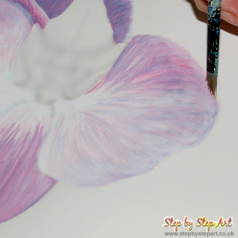
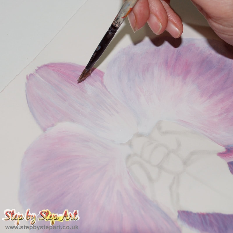
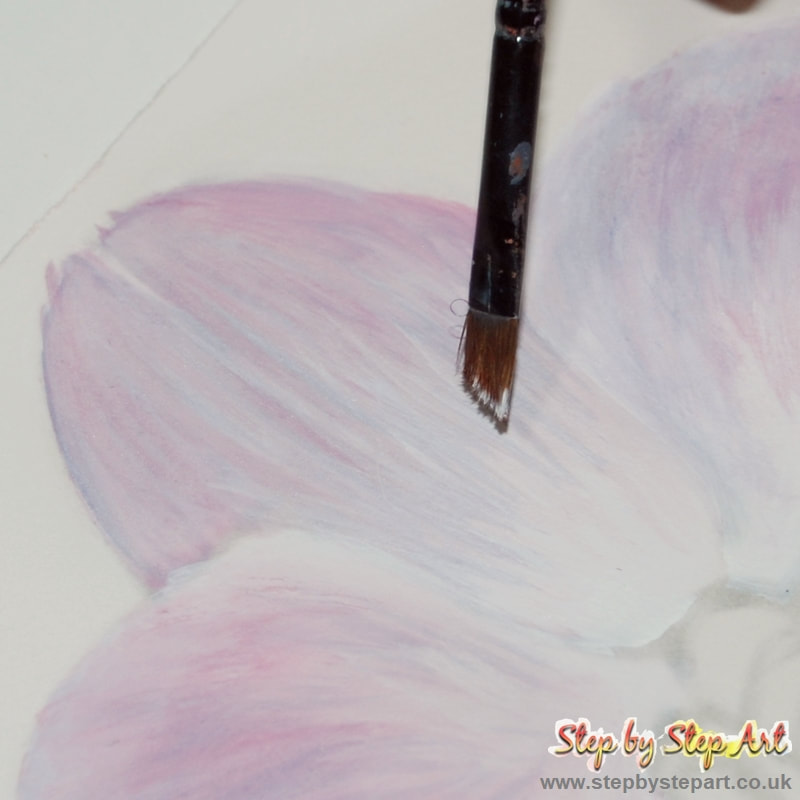
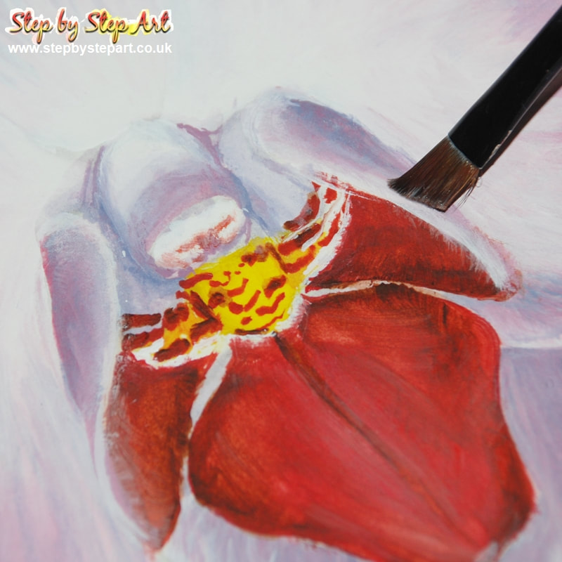
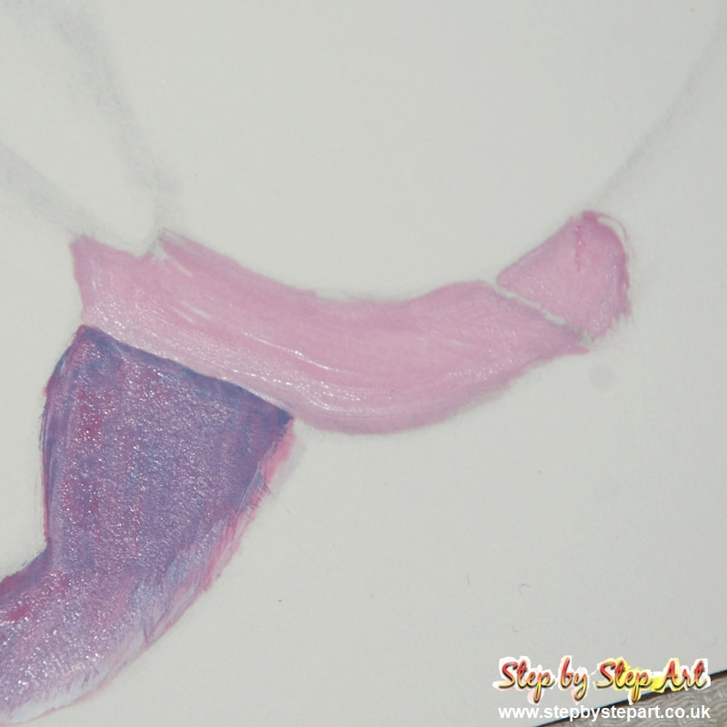
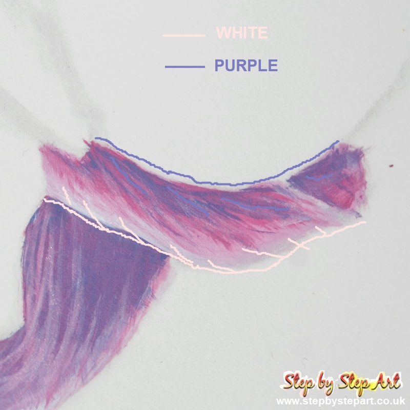
Wet the area first. Apply white paint at the base of the sepal using the angled shader (see image 1). Apply pale pink to the rest of the area. Whilst applying, define the shape using the edge of your brush. Overlap the white to achieve a smooth blend. Using the mid pink tone, first paint around the outline then continue on as recommended in the previous step. Start from the outer edge and work your way inwards and down to the white area. Blend the pink into the white slightly but do not cover entirely. Repeat using the lilac tone to complete this stage.
|