Beautiful Tonal Backgrounds - Acrylic Paints Tutorial
Written: February 2019
For All Artistic levels
Welcome to this step-by-step tutorial of how to create effective tonal backgrounds using acrylic paints.
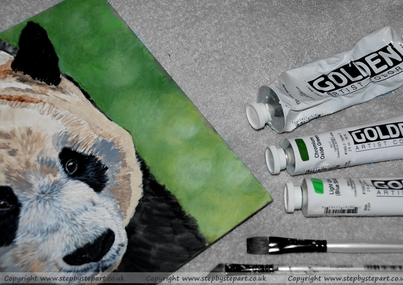
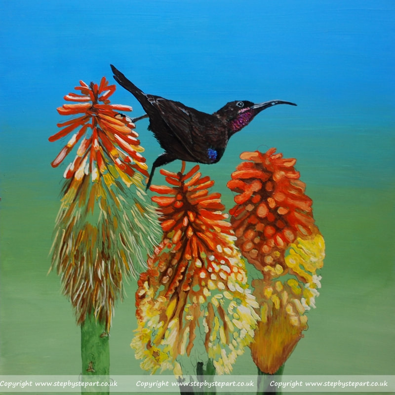
For this tutorial I used the GOLDEN Heavy Body acrylic paints and the support is the Ampersand Gessobord. I used one of my own paintings currently in progress for this tutorial as it needed a background and thought it would be ideal to show you how I achieved it. It is not necessary to use the same products I did but do be aware that different paints and surfaces may create different challenges and the finish will vary especially if using a weave canvas. Also know that creating tonal backgrounds with acrylics will take some practice to achieve those smooth, transitional tones and so trying a few surfaces before you find the best one for you, may be required.
For this tutorial I used the GOLDEN Heavy Body acrylic paints and the support is the Ampersand Gessobord. I used one of my own paintings currently in progress for this tutorial as it needed a background and thought it would be ideal to show you how I achieved it. It is not necessary to use the same products I did but do be aware that different paints and surfaces may create different challenges and the finish will vary especially if using a weave canvas. Also know that creating tonal backgrounds with acrylics will take some practice to achieve those smooth, transitional tones and so trying a few surfaces before you find the best one for you, may be required.
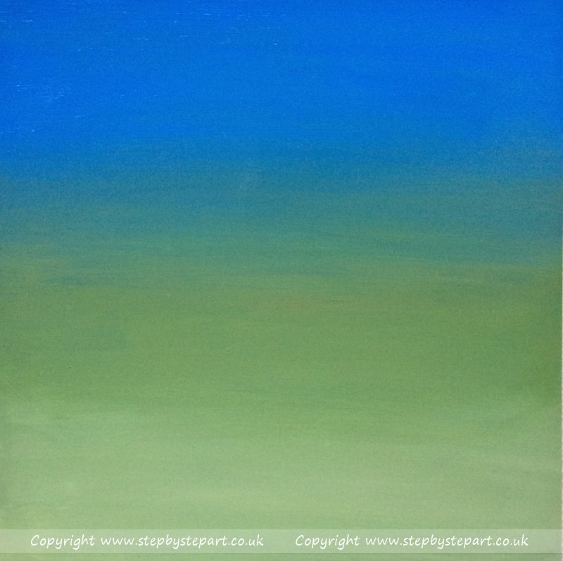
Sample tonal backgrounds
Tonal backgrounds are a mixture of colours where each colour blends seamlessly into another. Achieving smooth transitions using a medium like acrylics can be extremely challenging unless you opt to apply with an airbrush which, once mastered can offer some amazing results - however, this tutorial shows you how to create tonal backgrounds using only a paintbrush and the secret to achieving great results is by using as little water as possible.

|
|
|
Patience is a virtue...
Standard acrylics tend to dry quickly meaning you usually have to work quickly too, so you may find achieving good results takes a little longer than you thought, however do not worry about this! Art is all about patience and perseverance and you may find this tutorial helpful in the short term, but adapt your own way of getting better results in the long run. There's no right or wrong way as such, it's all about practice! you may find the Open/Interactive acrylics easier to work with as they do not dry as quick and are easier to blend. You can read about some of the differences between Acrylic paint brands HERE
I hope you enjoy this tutorial and that it offers a few great pointers to get you started on your journey to creating effective backgrounds for your own Acrylic paintings.
Where do I start?
Tools Needed
2 Paintbrushes 1 x wide width brush 1 x smaller width brush - the size you need will depend on the size of the coverage area
Acrylic Paints - Colours chosen for your background will require variants of your colour choices.
Palette - A porcelain palette is easier to clean - A Stay wet palette keeps paints moist for longer working times
Kitchen Roll/Paper - have a couple of sheets of heavy, absorbent tissue/Kitchen roll to hand
Water jar - Ideally have 3 water jars available, one for light tones, one for dark tones and a 3rd for clean water
Take a look at the Acrylic Paints product Recommendations page for some ideas
Choose your Paint Colours
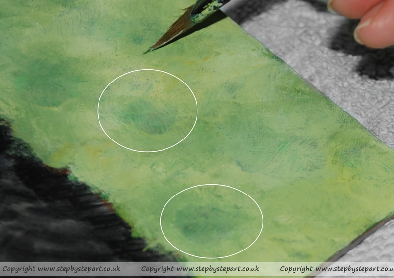
Dependant on the colour choices for your background, it is more effective if you use 3 or 4 tones of each colour you want to include into your background. For this example, I wanted my background to be mostly green with hints of yellow, so I used 5 different green tones (2 dark, 1 mid and 2 light), 2 yellow tones, a cream and White. I always apply a couple of drops of water into each section of the palette before squeezing the paint out (see Tip). If the paint is straight from the tube remember you can add more to the palette if you run out as opposed to wasting your paint and try and place each colour into a separate well to minimise colour mixing.
|
A Great Tip!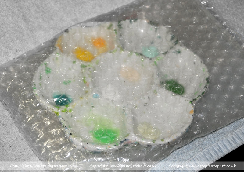
If you do not have a Stay wet palette, here is a tip to keep your Acrylics pliable throughout the process. Place a drop of water into each well of the palette before applying a small drop of paint over the top DO NOT MIX TOGETHER - this is to stop the paint drying out too quickly. If you need to take a break, you may need to apply a small drop of water over the paint (Do Not Mix) and then cover with cling film or place in a bubble wrap bag, ideally place in a cool place until you return or better still, place in the fridge until you have time to return to your painting. Acrylic paints can be stored for days, sometimes weeks in this cold environment (dependant on the amount of paint in the palette), without drying out.
|
Preparing the Foundations

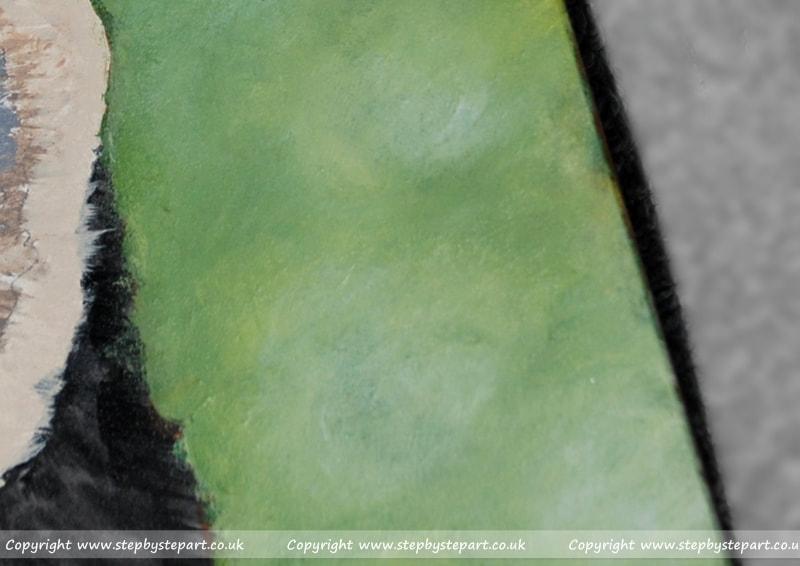
As the Gessobord I use is white, I apply a wash of Burnt Sienna to the area before creating the tonal background. I chose this colour as I wanted to achieve a warm foundation with which to lay my acrylics on. I do not use water in my acrylics except for when I need to create washes as I did here. I wasn't concerned about the uneven application as this will be covered by future layers and so applied it very roughly and left to dry before the next layers.
|
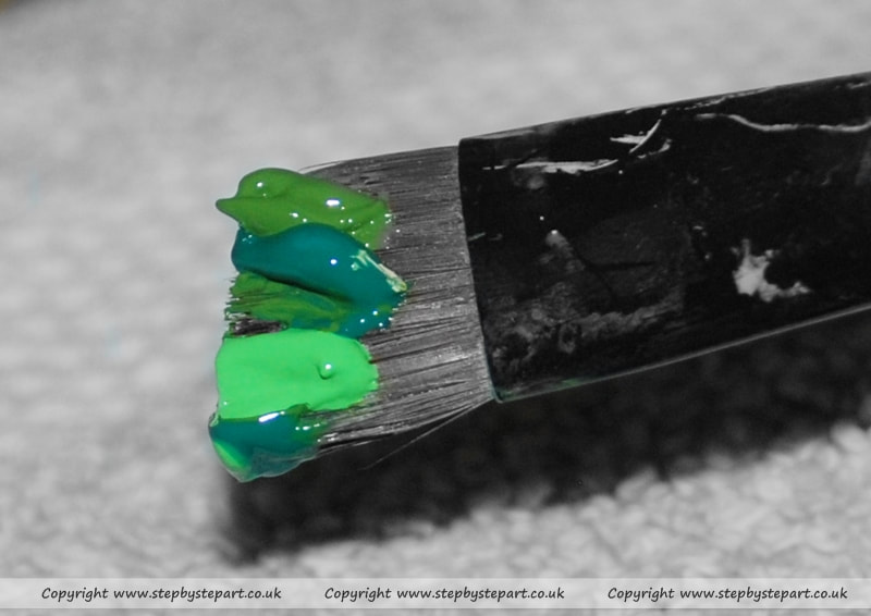
Once the foundation layer had fully dried, I then load my paintbrush with paint to create my next base layer. You can load paint onto the brush individually using a smaller paintbrush or dip the brush into each tone at a time although be careful as this may muddy the colours. Many acrylic paints are opaque (not transparent) which will fully cover previous layers, however there are some colours that are more translucent which create more of a wash and it is this where the foundation colours can play an important part in this process.
|
Applications
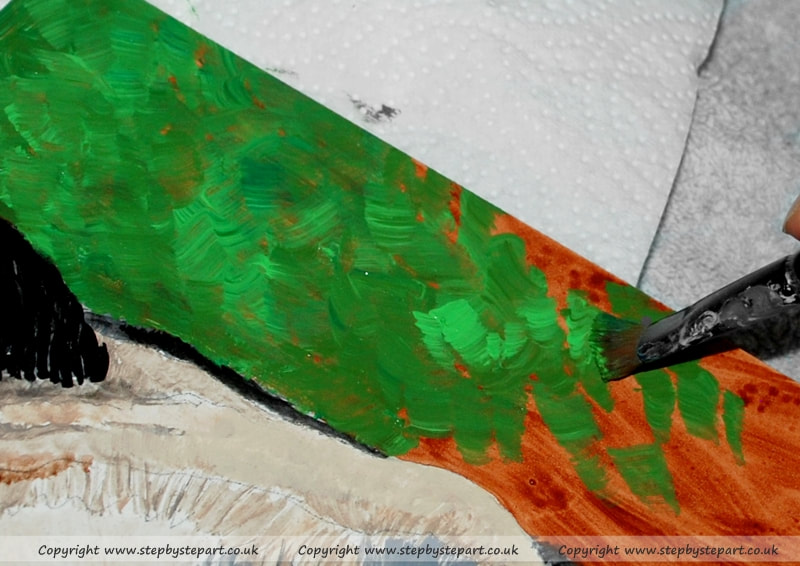
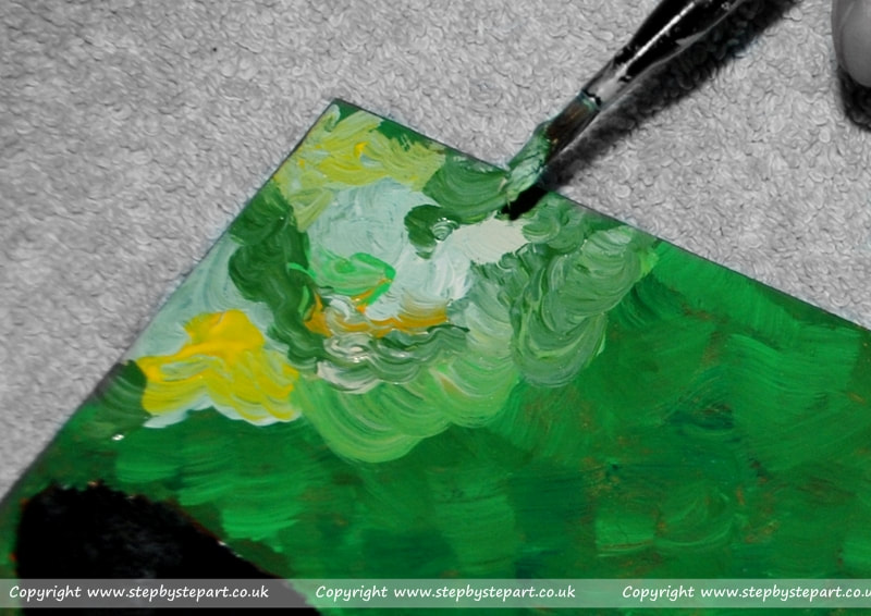
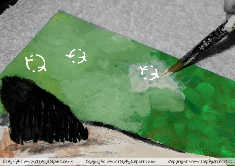
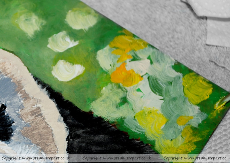
At this point, I simply dab the paint onto the canvas, attempting to cover all the Burnt Sienna wash underneath. I continue to alternate the application of the green tones but without mixing them together, always ensuring I work small areas at a time to avoid the paint drying out before completion. The application you use is not important but you can see how I have apply lighter tones over darker tones in areas to avoid the creation of one continuous colour. You may prefer to create this in 2 layers, the darker tones first followed by the lighter tones on top - always ensure you use 2 colours to avoid one flat tone. Leave to dry ready for the next layer.
|
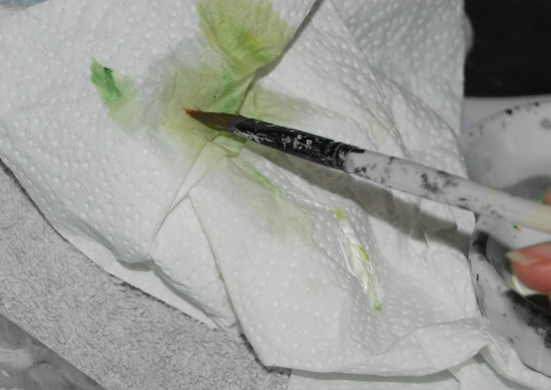
I always have a couple of sheets of kitchen roll to hand to absorb excess water. I simply hold the paintbrush on the kitchen roll so it grabs the excess water, leaving the acrylic paint on the brush slightly pliable for ease of application on the canvas whilst minimising the loss of any paint on to the kitchen roll. I find that acrylics work much better for me with minimal use of water, although you can safely mix acrylics and water together, contrary to some articles found on the Internet that watering down your acrylics will cause your painting to crack as the water evaporates, which is false (I checked this with an expert recently)
|