Creating a Violet flower in soft pastels
Artist level: All
Written: October 2020
This tutorial shows you how to create a violet flower using soft pastels on Colourfix smooth paper. Using a fine grain paper like C.S (or Pastelmat) minimises blending between layers as there is little pastel drop. Each stage is offered as a series of images and written explanations so you can see how each section is created. Using a lighter coloured pencil to blend out a darker tone will help to soften the finish.
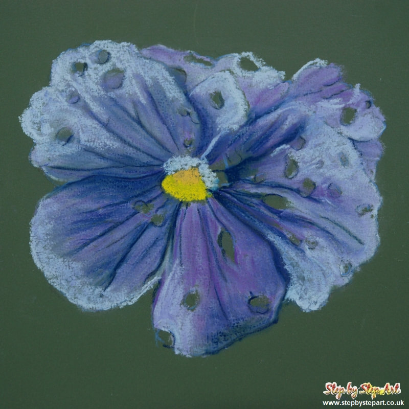
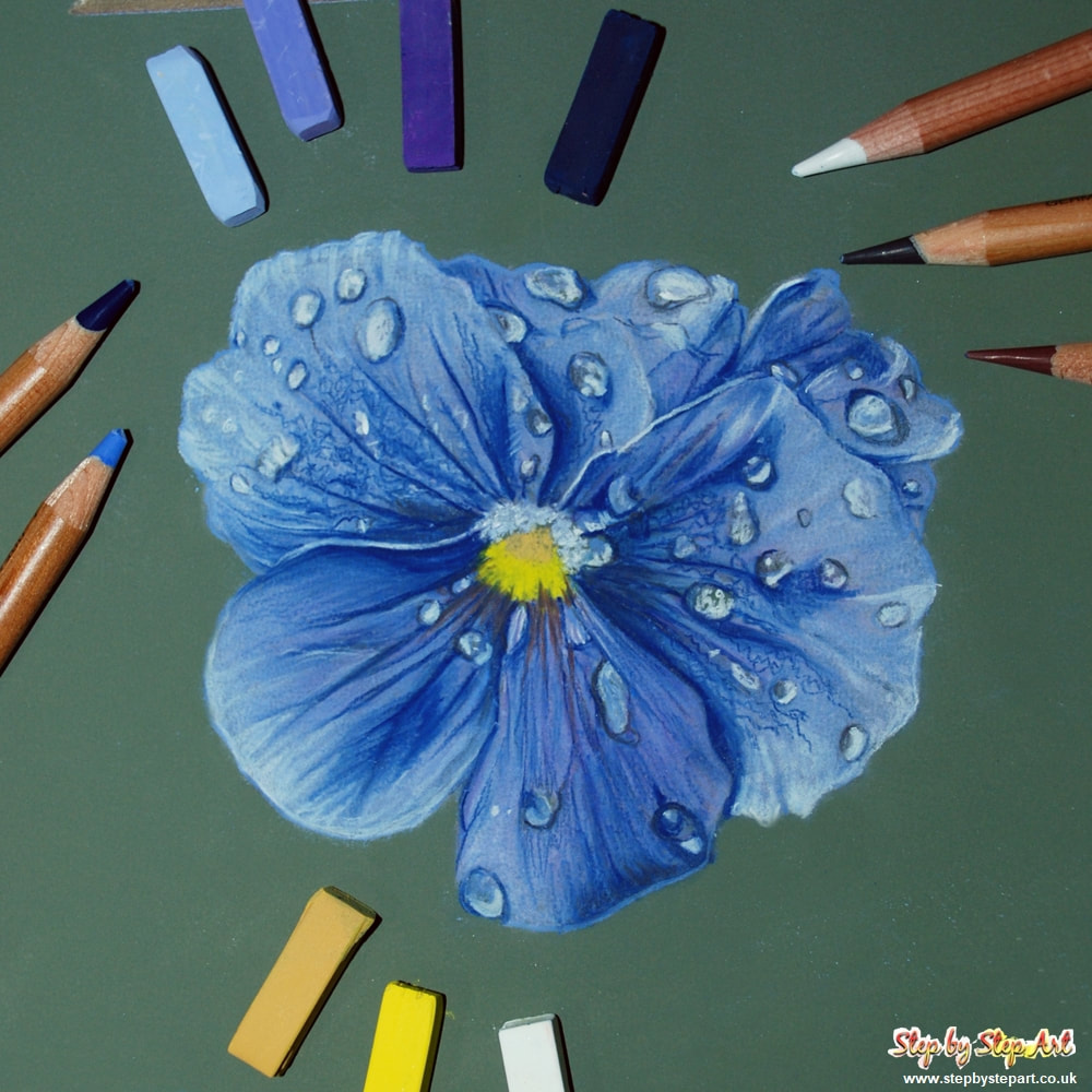
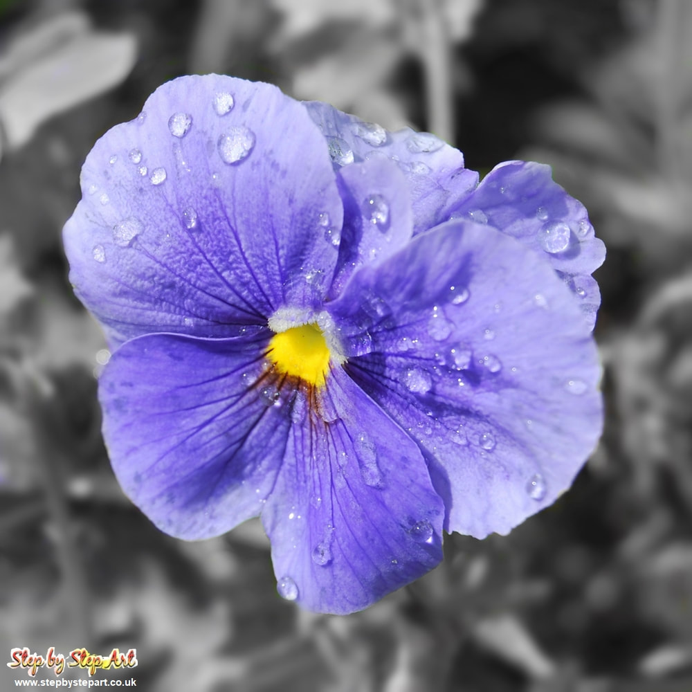
You can find the reference image below. You can screen grab and print out or view on a tablet whilst reading the instructions on a smartphone or computer. The colours used in this demo are from the Inscribe (aka Mungyo) range, but it is unnecessary to use these pastels, simply pick similar colours from your own collection.
I hope you enjoy this tutorial and if you would like to request a subject for inclusion of a future mini tutorial, please get in touch!
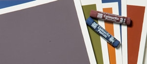
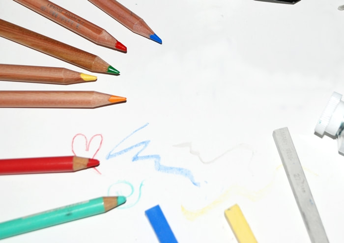
The Products you will need
Hard pastels - B/2B Pencil - Soft putty rubber - Face cloth/Wet wipes - Hand Towel - Pastel pencils
Paper Used: Art Spectrum Colourfix Smooth Pastels Used: Inscribe/Mungyo & Faber Castell PITT pastel pencils
Paper Used: Art Spectrum Colourfix Smooth Pastels Used: Inscribe/Mungyo & Faber Castell PITT pastel pencils
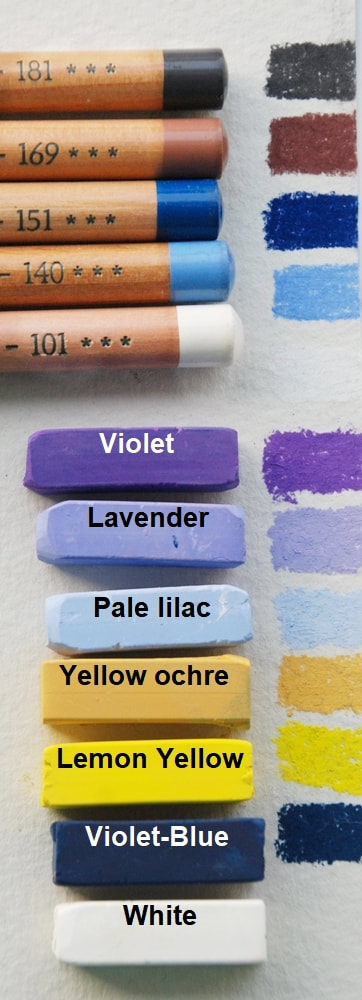
The reference image and colours used
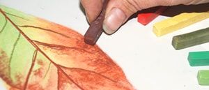
The Inscribe/Mungyo pastel half sticks were used in this tutorial. You can use any brand of pastel, but hard sticks tend to work better as they are easier to apply in small areas. If you have full length pastels, you may prefer to break them in half, which can make them easier to work with. Doing this also allows you to keep one side for fine lines and the other for applying base layers. It is not important that your colours are an exact match, and you may wish to use slightly different tones to the colours used in this tutorial. The colours used are provided below so you can select your own colours.
|
|
IMPORTANT TIPS:
* Avoid muddying colours by wiping your pastels and pastel pencils on a tissue between applications, useful to keep pale colours pure when applying lighter tones over darker ones.
* If you are working on a flat surface, pastels can easily get smudged by your hand. It is recommended that you keep a piece of clean paper beneath your working hand to avoid this. Glassine paper is especially useful for this. Replace if/when it becomes too saturated.
* If you have full length pastels, you may prefer to break them in half. This also allows you to keep one side for fine lines and the other for applying base layers.
* To shape your pastel blocks, run the edge of your pastel over a sheet of fine sandpaper to create a thin edge for applying fine lines. This is highly recommended if you do not have any pastel pencils.
IMPORTANT NOTE:
Soft pastels create dust so you may wish to wear a face mask whilst you work, which will protect you from inhaling dust particles. We highly recommend this for those who suffer with asthma or other respiratory issues. Soft pastels may not be suitable for everyone for this reason.
If you work with soft pastels on a regular basis, we recommend that you invest in a HEPA air filter.
OUTLINE
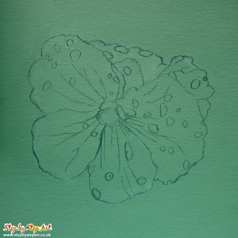
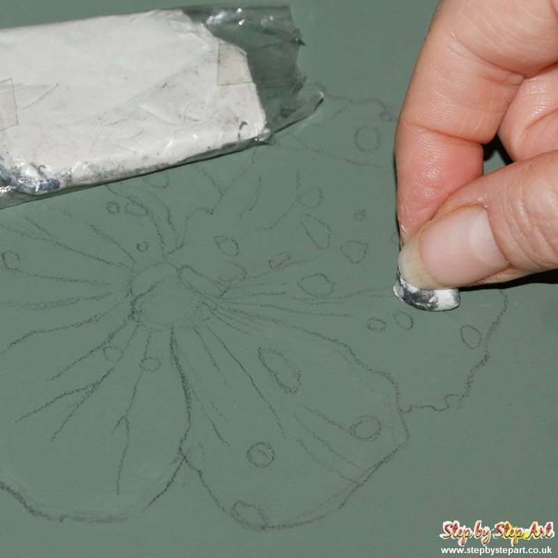
If you are using a paper like the smooth Colourfix (or Pastelmat), you only need to apply a very light outline. This makes it easier to erase any mistakes. Don't make your drawing too small as you will find it more challenging when creating the smaller details. A 6" or 8" square should allow you more space to work, and especially if this is your very first go with pastels, you'll find it more enjoyable.
|
The best grade of pencil to create your outline is a B or 2B pencil which will give you a thicker and slightly darker outline. If you are working on a lighter paper, a HB or B pencil may be more suitable. If you prefer, you can draw your outline with pastel pencils and skip the next two steps. Draw the outline and include all the detail seen in the image above.
|
If you used a graphite pencil for your outline, you may need to soften it before applying pastels over the top. Here I used a soft putty rubber to achieve this. It is quite pliable and you can break it up into pieces, placing over the area you need to soften and lift. Do this all over the outline, but do not make it too light that you can no longer see it.
|
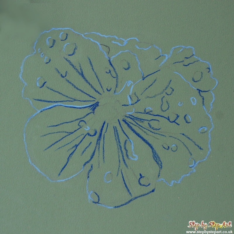
Next, re-apply the outline using pastel pencils. This will ensure you do not lose the shape during application. The PITT pastel Light Ultramarine (140) and the Helioblue Reddish (151) colours were used to achieve this. Apply the dark blue outline to accentuate the shaded areas and the light blue to accentuate the highlights.
|
BASE LAYERS - PASTEL STICKS
|
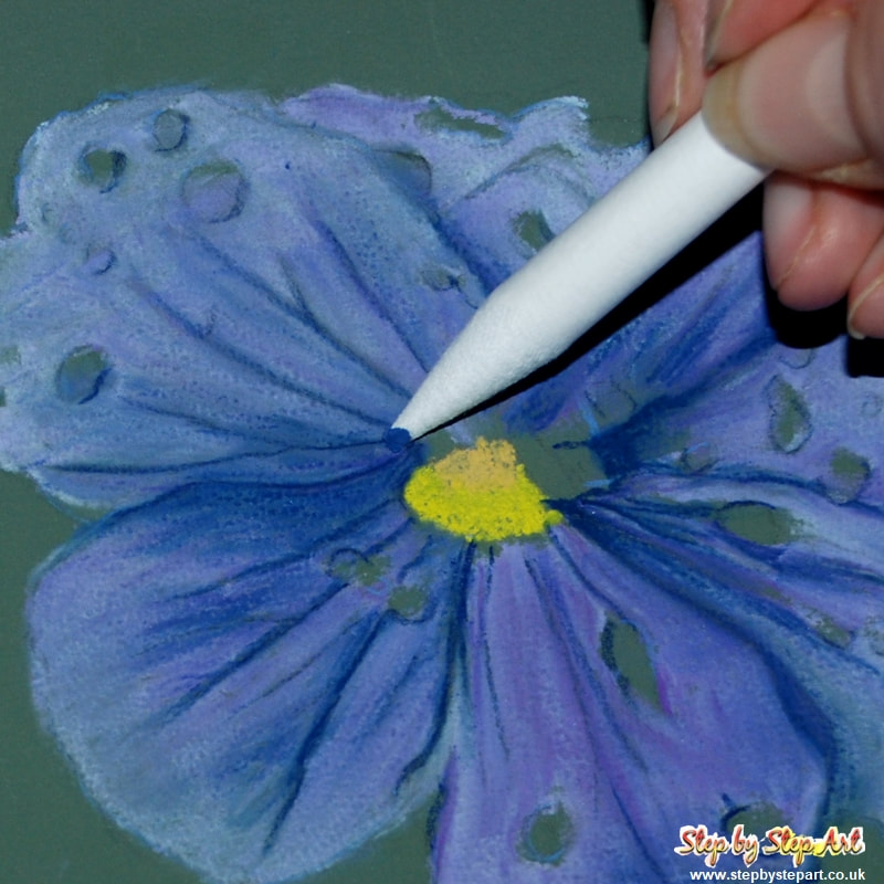
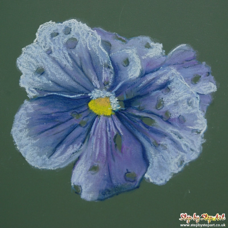
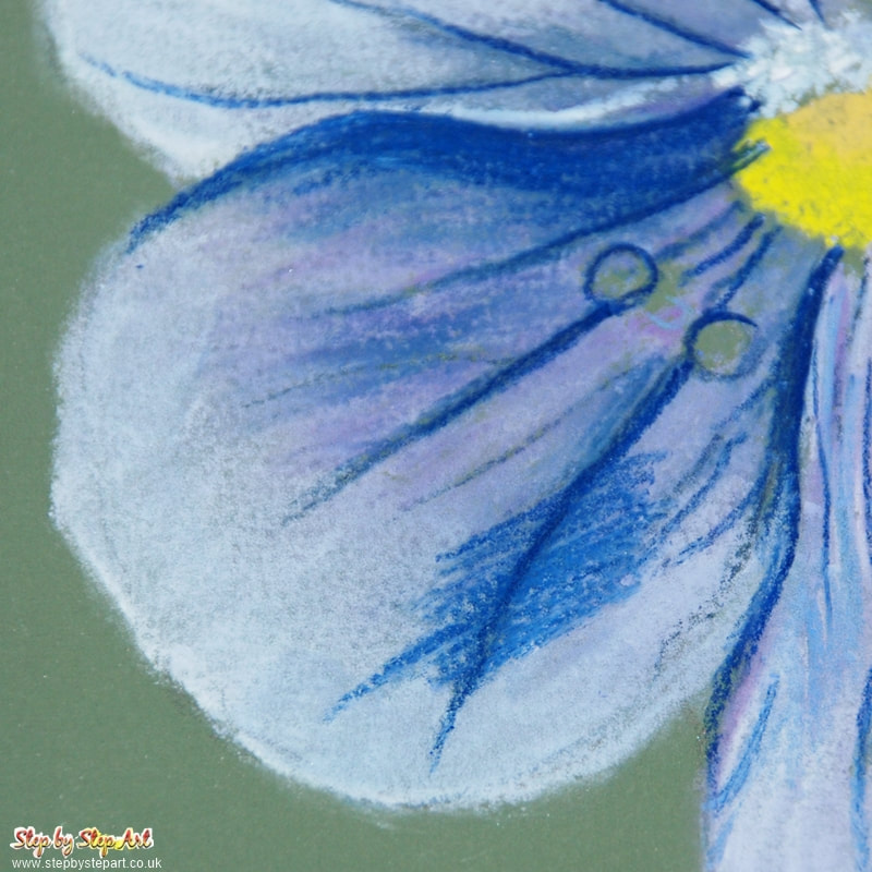
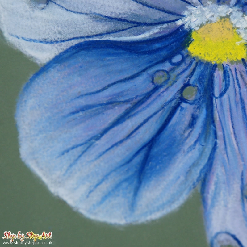
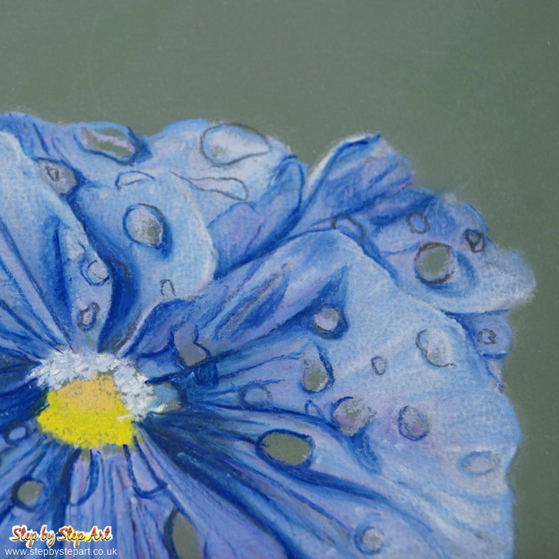
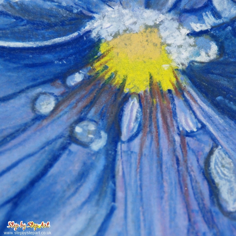
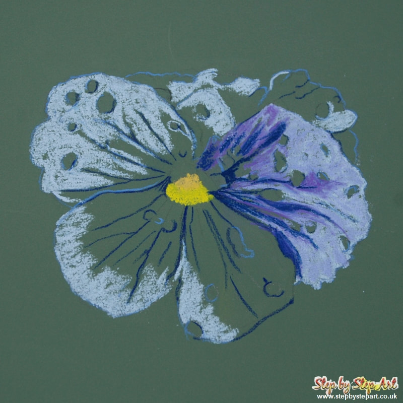
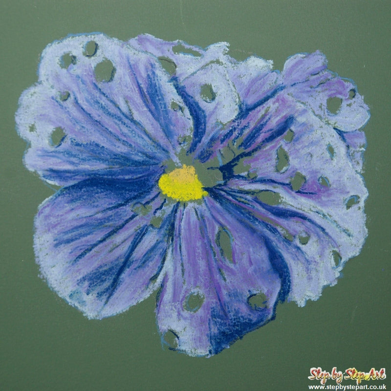
As with any medium, techniques vary from one artist to another. In this tutorial, base tones are applied starting with lighter tones finishing with the application of the darkest. Note I have already completed one petal so you can see what the petal should look like once complete. Begin by filling in the yellow centre using a Lemon Yellow at the bottom and a Yellow Ochre above. On to the petals, and begin with the pale lilac tone, loosely applying in the lightest areas. Work around the water droplets and avoid overlapping the shaded lines. It may be a little fiddly if your flower is small, but this ensures your perspectives are not lost. Do not blend.
|
The next stage is using the Lavender tone over the rest of the petals Cover around 90% of the pale lilac tone too. You should still be able to see the pale colour in areas, particularly at the tips. Applying one colour just makes the petal look flat, hence the two application at the start. As before, apply loosely. Begin from the centre of the petal and apply upwards, layering over the pale lilac tones. This will aid blending without the need to use your fingers or a blending tool.
|

|
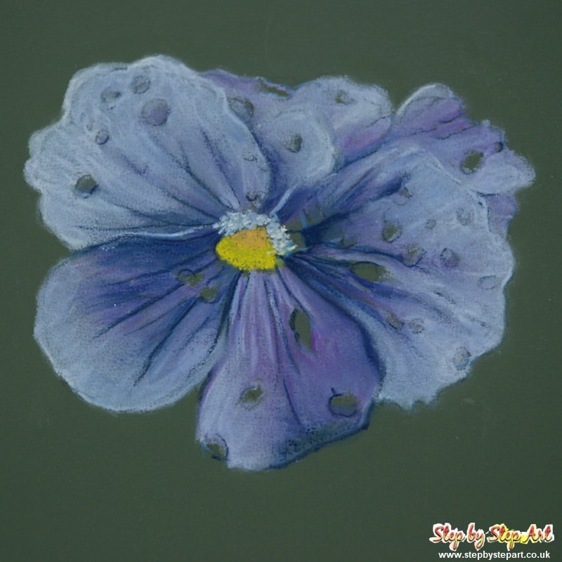
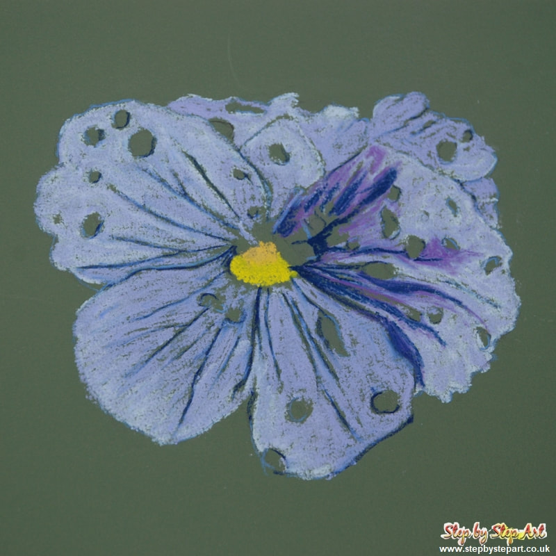
Next is the third colour. Apply the Violet tone, which should be somewhat darker than the Lavender but with a warm tint. As before, apply from the centre and pull outwards, to help the colours bind together slightly. Remember to keep your layers loose as this will minimise saturation. The highlights seen on the petals do not require this additional shade and should stay lighter. You will note in the image above that I am also defining the shadows at this stage, which helps to create depth. Blending is not required.
|
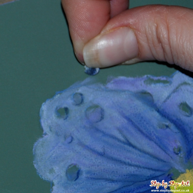
The final tone needed for the completion of the base layers is a violet-blue. Apply to all the deeper shaded areas to create additional depth. Pay particular attention to those areas where the petals overlap another. As before, a loose application is all that is needed. Apply with a little more weight in areas where you require a stronger application of colour or re-apply where needed. Do not blend until the next section.
|