STEP BY STEP ART | TUTORIALS, ARTICLES & ART WORKSHOPS
  • Home
  • Articles
    • Art guides for beginners
    • Coloured Pencils
    • Graphite Pencils
    • Soft Pastels
    • Acrylic Paints
    • Water based Products
    • Papers & Canvases
    • Art Accessories
  • Tutorials
  • Workshops
  • News
  • Kofi-blog
  • Subscribe
  • About
  • Mail Us
  • Site Map

Creating a Tonal sky in Soft Pastels Tutorial


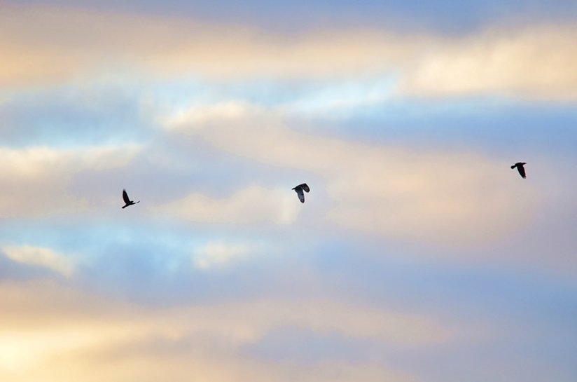
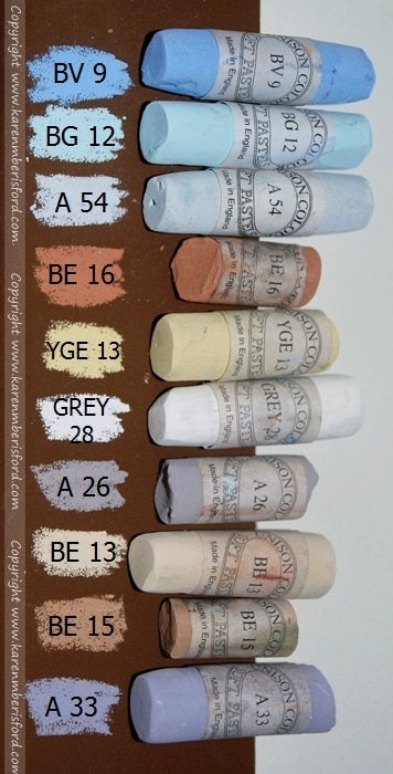
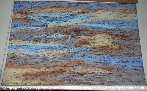
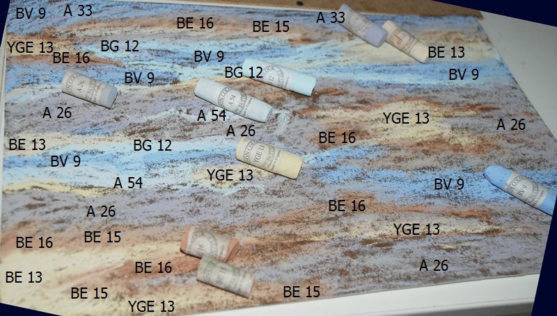
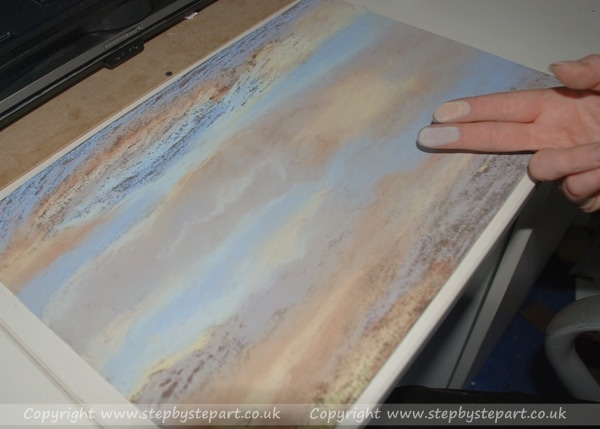
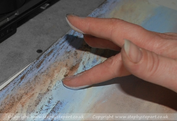
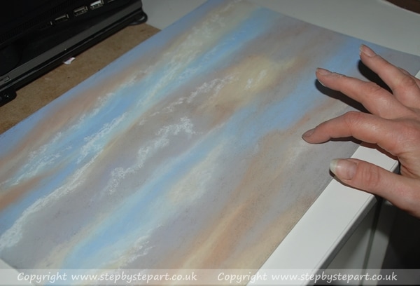
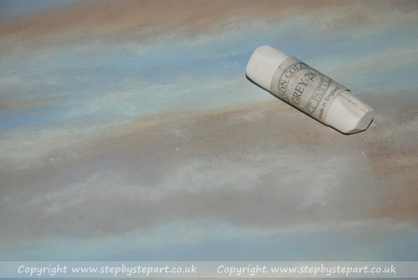
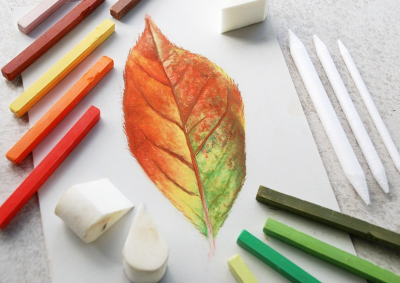
Welcome to this step by step tutorial of a Northumberland sky in soft pastels. Completed on Brown Canson Mi-tientes 'Touch' paper. The tutorial below is aimed at those interested in learning how to create soft and delicate tonal backgrounds in soft pastels and is aimed at those new to pastels. The high quality Unison pastels have been used for this tutorial but you can try this exercise out using any brand (not suited to pastel pencils) Use the colour guide next to the reference image to select your own pastel tones, however it is not important to match them precisely. Pastels work well on textured paper to minimise 'pastel drop' and are easier to blend on papers such as Pastelmat or Art Spectrum Colourfix smooth, but there are many others out there which suit other artists better due to their style. Although it is not the only way to work with pastels, this tutorial is based on my own preference that I have found works best for me. Pastels are a great medium in that you can easily cover up mistakes by simply applying another colour over the top and are fun to work with. Obviously they can be messy and I do always stipulate that this medium can produce a lot of dust, so ideally wear a mask or if you plan on working with pastels on a regular basis and ensure you work in a well ventilated room. Some online research will help you set up a safe, working space for you.
​ 
This reference image was chosen because we really do get some stunning, colourful skies here in Northumberland and it makes an ideal subject to trial soft pastels, especially if you have never tried them before. The three birds in the image are so small that they don't really add anything to the composition which is why I did not add them, but if you're feeling expressive you can elaborate and maybe add a larger scale bird to your pastel painting which will offer additional interest. Make sure you draw the outline on to your paper first and work around the outline when applying the pastel background. Why not draw and cut the shape of the bird onto a piece of masking tape so you can simply stick it onto the paper. You can gently peel it off after completing the background without losing the outline. This works exactly the same way as masking fluid but do check your paper will not tear when removing it.
​
Pastel sky in Northumberland showing 2 Carrion Crows flying after a Short Eared Owl
2 Crows (back and front) chasing a Short Eared Owl - captured in Newbiggin-by-the-Sea, Northumberland
Unison pastel colours for a Northumberland sky painting
​Although it does not matter which colours you apply first, it is recommended that by applying light to dark, especially where colours overlap another. This will avoid colours blending together leaving a muddy tone behind. Use the photograph to work from and feel free to E-mail me your drawing upon completion. I would love to add them to a gallery on this page.
​I hope you enjoy this tutorial!

Stage 1 - Application

Picture
The idea is to place all the colours on the paper until about 95% has been covered with pastel. If you are covering larger areas, use the side of the pastel which will allow you to cover the surface much quicker. For tonal backgrounds such as this, it is better to use softer pastels (such as Unison or PanPastels) rather than harder pastels (such as Conte or Polychromos) simply because they glide on better, cover quicker and blend easier. Hard pastels have less pigment and it can take longer to cover the paper. In the early stages, it may look untidy but this will be smoothed out once blending has been completed.
Picture
​ If you need an idea as to where you should place the colours, the image above offers you a rough guide. Not that colours overlap slightly into other colours which will help the blending process once you have applied your tones. You do not need to be precise. You are creating a representation of the image rather than a photocopy and you can always use a bit of artistic licence by adding in other colours if you wish. Once you have selected your colour palette, start by applying the darker tones first and work up to the lightest ones. Do not saturate the paper. Leave small patches of the paper tone visible, this will be filled once you finish blending. Over saturation is a waste as it will create a build up of pastel dust that you need to remove. 

Stage 2 - Blending

Picture
Once you have laid down all the Pastel tones, with clean hands begin blending each section individually - wherever you begin blending is entirely up to you but if you are working on an upright easel, to avoid pastel drop in already worked areas it may be helpful to blend beginning top to bottom. In this image I have used two fingers to avoid muddying your colours. One for the blue areas and the other for the brown areas.
Picture
How you blend your pastel painting is a personal preference but you may find it easier to blend in circular motions - as Pastel papers tend to be textured (some more than others) this will ensure that the pastel is pushed into all those tiny peaks of the paper and can offer a much smoother finish. ​You can keep a damp cloth close by to keep your hands clean of excess pastel but make sure you dry them on a towel before going back to the blending.

Related articles that may be of interest
​

Canson Mi-tientes tonal paper
Canson Mi-tientes Touch paper review
colourful pastels
Starting out with Soft Pastels
Unison soft pastels
About the Unison Pastels
artist working with paints at a table
Advice for those looking to start their own art commission business

Stage 3 - Additional Detail

Picture
Once you have completed your blending you may wish to go over any grainy areas where you can still see the base paper showing through if you want a really smooth finish or you may wish to leave them showing if you feel it adds to the effects. If you do choose to apply more pastels, you may not need to put on as many layers. Grainier paper will take more layers and may need further layers too.
Picture
Once you have finalised your tonal colours and have achieved a smooth finish, this is the part where the finer detail can be added either with pastel sticks or with pastel pencils. As this is a tonal portrait, a softer pastel will be the best choice and here I use a light tone of colour to add highlights into the clouds or lighten up  those bright sunlit clouds. Ensure transitions of colour are blended together well to avoid harsh edges which can spoil the effect.

Finally....

The 3 steps in this tutorial can be applied to any tonal subject you create in soft pastels although it will depend on the amount of detail in a composition, this tutorial was selected for its simplicity, especially if this is your first trial with soft pastels. I hope it helps to distinguish any concerns about working with this medium for someone who has never used them before. Maybe it is the start of a 'love-affair' with a new medium!  Thank you for giving the tutorial a go and if you wish to share your completed painting with me, please drop me a line as I would love to add it to a gallery on this page.​

​

View our other Soft pastels tutorials

Autumn leaf drawing using prismacolor NuPastels
Layering with soft pastels
Base layers and high detail creation
Drawing a flower with water droplets
View all other tutorials >>>>

QUICK LINKS


​Articles

Art Tutorials

Art Workshops  
​
Art Blog

About ko-fi
​Our social media page


About the Tutor  

Workshop Gift Vouchers

Subscribe 

Contact  

Links 
  
Site Map
Vertical Divider

HOW TO SUPPORT US

Picture
This website was designed to offer useful content to artists worldwide. We prefer to keep it ad-free to provide positive user experience. As we do not receive revenue through this website, if you appreciate what we do, you can help support us by buying us a coffee at ko-fi.com. Click the 'support' buttons below to donate. Thank you for visiting today!
What is Ko-fi?
Vertical Divider

Picture
Follow us on Instagram
You Tube logo
Join our new You Tube channel (Content to follow)
Picture
See which art products are vegan

    SUBSCRIBE TO OUR NEWSLETTER

Subscribe
Our quarterly newsletter is filled with reviews, recommendations, hints and tips on various art products as well as new tutorials that you may enjoy.  ​Please note we NEVER spam
No part of this website should be copied or re-used anywhere without written permission by Karen M Berisford - 2011 - 2022
All images on this website are copyright of Karen M Berisford unless otherwise stated - Website design by Karen M Berisford. All rights Reserved.
  • Home
  • Articles
    • Art guides for beginners
    • Coloured Pencils
    • Graphite Pencils
    • Soft Pastels
    • Acrylic Paints
    • Water based Products
    • Papers & Canvases
    • Art Accessories
  • Tutorials
  • Workshops
  • News
  • Kofi-blog
  • Subscribe
  • About
  • Mail Us
  • Site Map