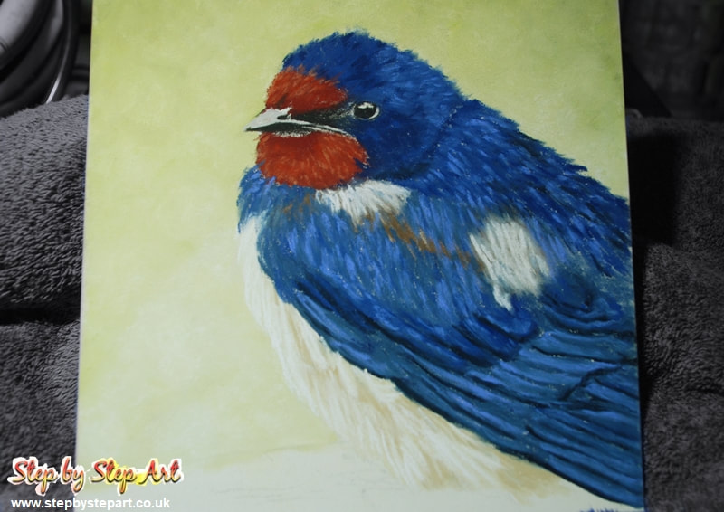
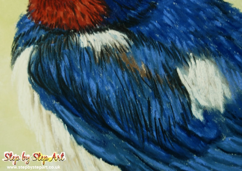
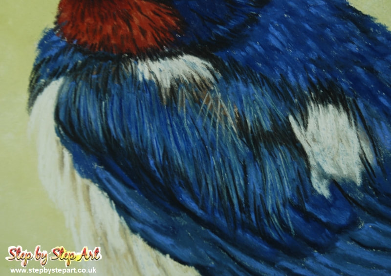
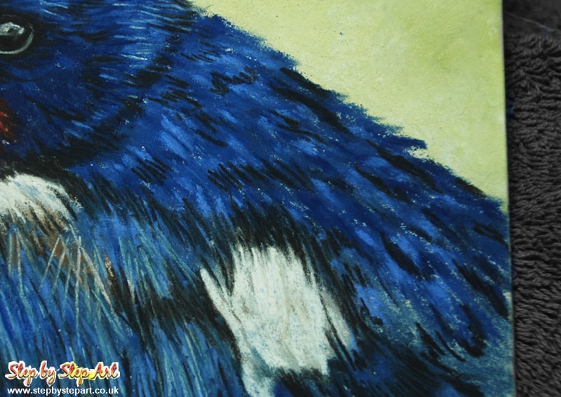
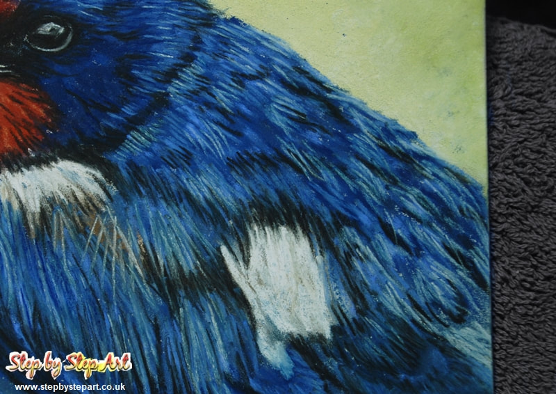
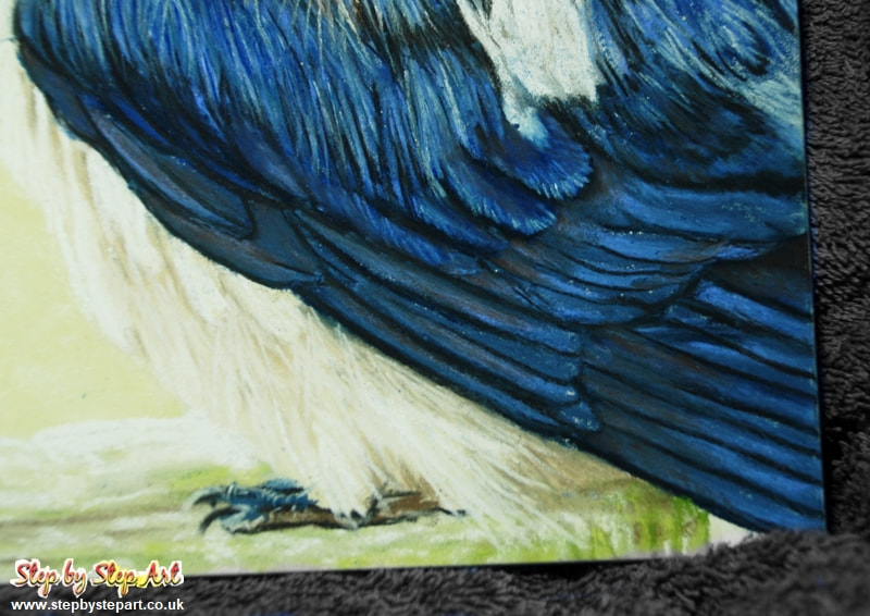
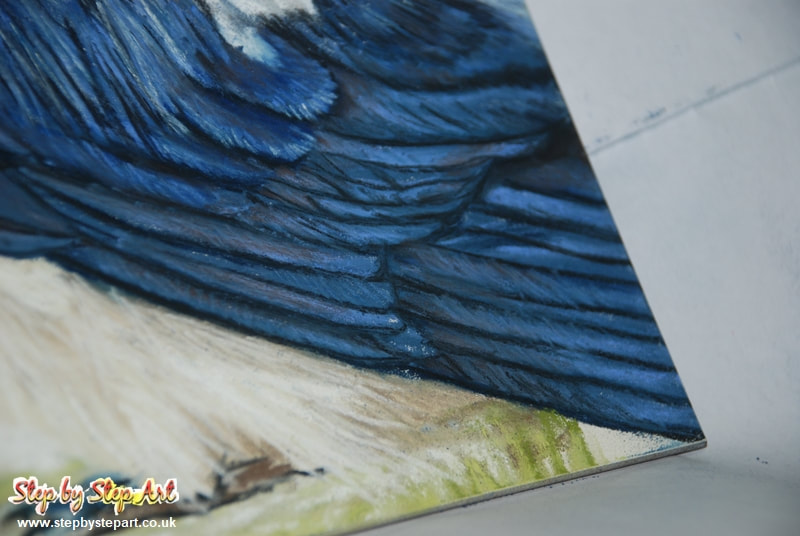
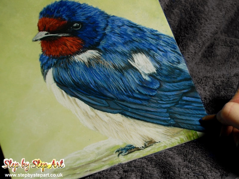
Swallow
Soft Pastels Tutorial
Written: February 2020
Artistic level: Beginner- Intermediate
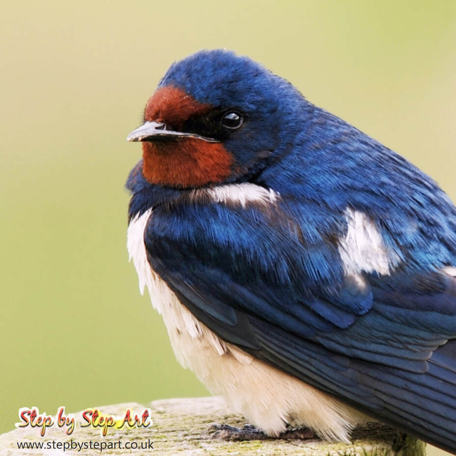
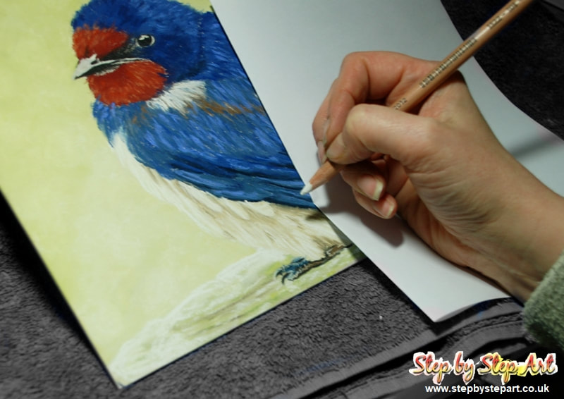
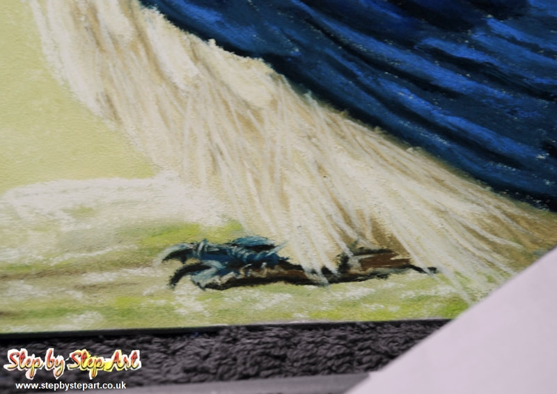
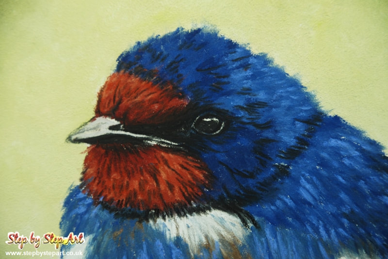
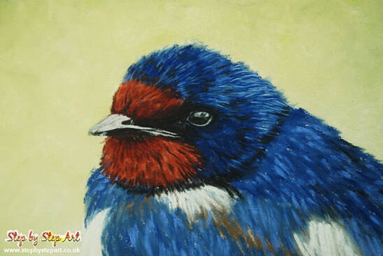
Welcome to this tutorial showing you how to create a Swallow using Unison Soft pastels. This tutorial is for artists of all calibre and none with step by step images and written sections showing you how to create this bird using soft pastels alone which offers a looser interpretation of the subject however, I have added an additional section at the end for those who prefer to increase the detail in their portrait using pastel pencils (Faber Castel PITT pencils are used here). As Unison pastels are one, if not the, softest pastel out there, it will create thicker lines, but this brand is highly pigmented and gives immediate results. If you are using another brand that is harder in texture, this will achieve a more defined drawing than the base version seen here before pastel pencils are added and you may wish to keep your drawing loose.
The support used here is the Ampersand Pastelbord which is very much like Colourfix or Mi-tientes 'Touch' paper, so if you are unable to source the Pastelbord or have some other pastel paper/board to hand, you can use that instead. Results may differ slightly to ours, but you are encouraged to deviate somewhat and change the background colours should you wish or simply create your own style - we would love to see it and feel free to email us so we can add it to a gallery on this page!
The reference image can be found below, which you can screen grab and print out or view on a tablet whilst reading the instructions on a smartphone or computer.
I hope you enjoy the tutorial!
Product requirements & colour chart
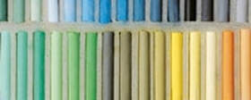
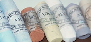
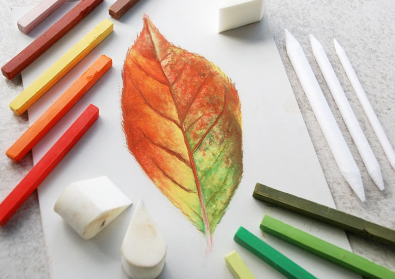
Set of soft pastels, Blender sponges, Face cloth, Hand Towel.
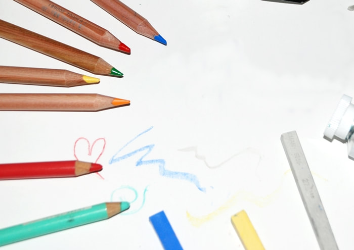
Pastel pencil range (optional)
The damp cloth is used to wipe the pastel of hands between use and the hand towel is to dry hands before
Paper Used: Ampersand Pastelbord Pastels Used: Unison & Faber Castell PITT pastel pencils
Pastel pencil range (optional)
The damp cloth is used to wipe the pastel of hands between use and the hand towel is to dry hands before
Paper Used: Ampersand Pastelbord Pastels Used: Unison & Faber Castell PITT pastel pencils
Colours Used:
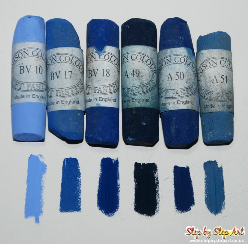
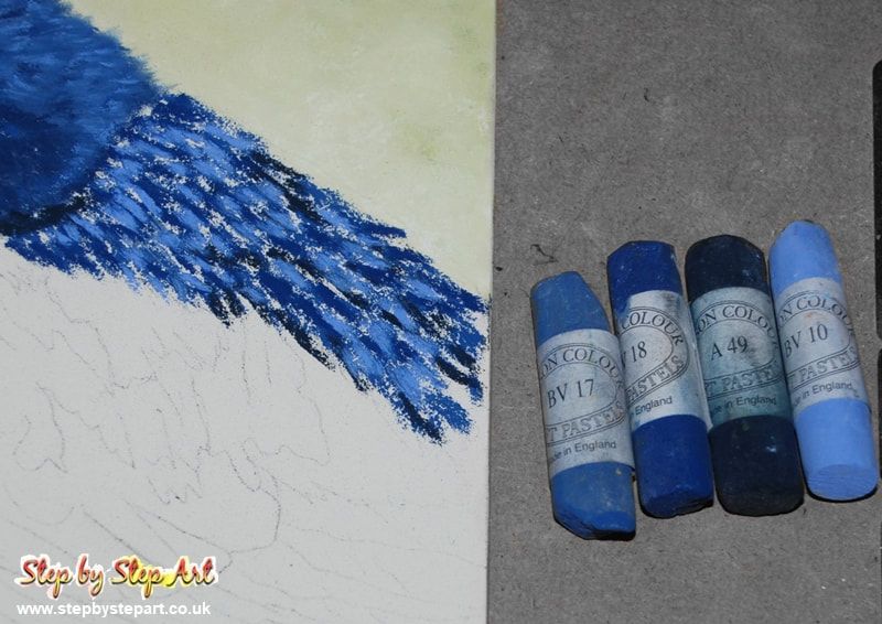
Blues: BV10, BV17, BV18, A49, A50, A51
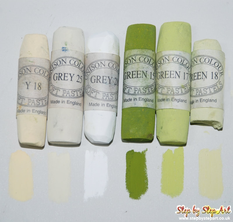
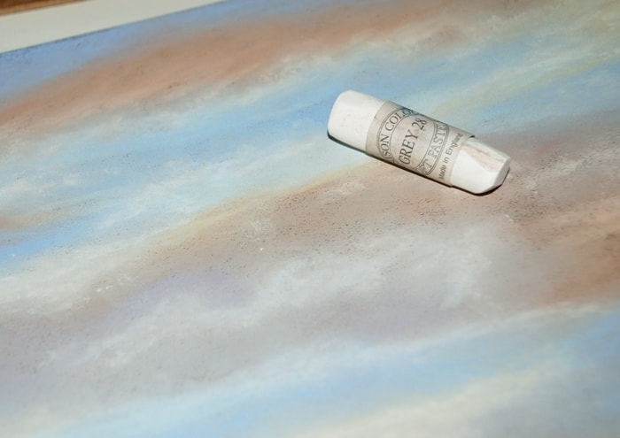
Greens/Yellows/Greys: Y18, GREY 25, GREY 28 (white), GREEN 15, GREEN 17, GREEN 18
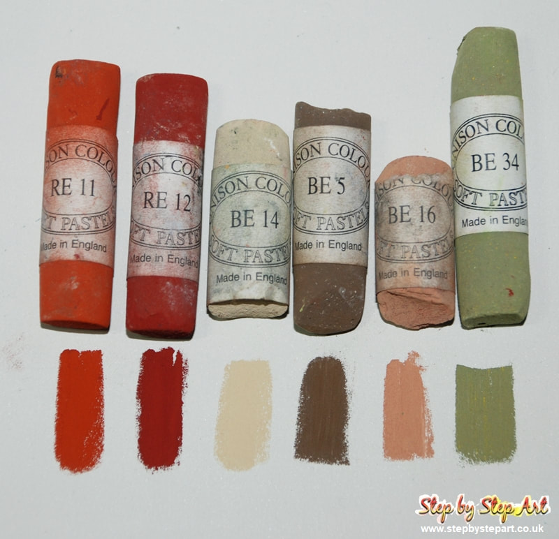
Reds/Browns: RE11, RE12, BE14, BE5, BE16, BE34
If you are using a support like Pastelbord with a noticeable tooth, you will find that this can be somewhat abrasive on the fingertips during blending and recommend you use a sponge (a make up sponge is ideal!) when blending and avoid using your fingers wherever possible.
Use the colour charts above to select your own pastel tones for this tutorial (either Unison or another brand). Unison have around 400 colours available so you may own some of the colours above but not all and so just select the colours closest to those you see above, but do not worry about them being an exact match.
IMPORTANT TIPS:
* Keep your pastels and pastel pencils clean by wiping on a tissue in between applications, especially if applying over other tones
* If you are working on a flat surface, pastels can easily get smudged by your working hand and it is recommended that you place a piece of clean paper beneath your hand and the surface to avoid this. You may need to change it regularly to keep it clean and avoid transferring pigment around your drawing.
* Rub the edge of your pastel on a sheet of sandpaper to shape into a thinner edge and use for adding finer details if you do not have pastel pencils.
IMPORTANT NOTE:
Soft pastels create dust so you may wish to wear a face mask whilst you work, which will protect you from inhaling dust particles. We highly recommend this for those who suffer with asthma or other respiratory issues. Soft pastels may not be suitable for everyone for this reason.
If you work with soft pastels on a regular basis, we recommend that you invest in a HEPA air filter.
BACKGROUND
UNISON pastels
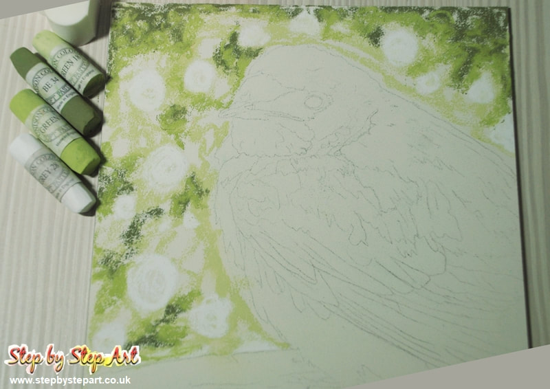
Colours Used: Grey 28/White - Green 17 - Green 18 - Y18 (Lemon Yellow) - BE34 (Moss Green/brown)
Colours Used: Grey 28/White - Green 17 - Green 18 - Y18 (Lemon Yellow) - BE34 (Moss Green/brown)
|
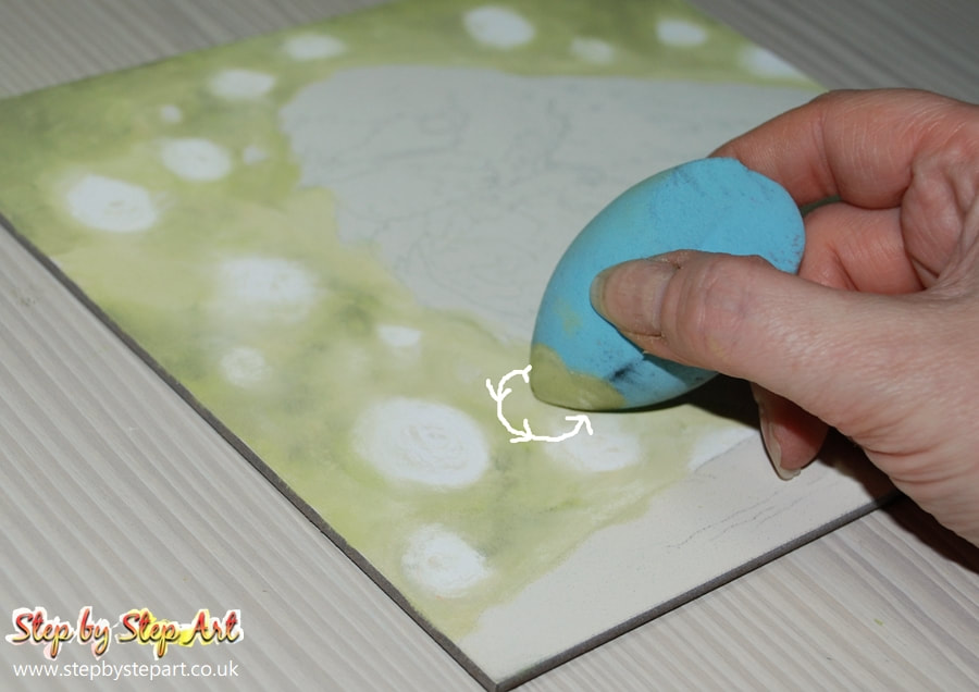
Build up your base layers using Green 17 + 18 plus Y18. Apply in circular motions and add the darker tone (BE34) in small patches around the outer edges. Do not apply darker colours too heavily or they will muddy the lighter tones up. Blend together. You may need to spend a little time getting the tonal balance to your liking before adding any highlights (if needed)
|
The best way to fill the tooth on a surface like Pastelbord is by applying and blending in circular movements. The best sponge for this is one without edges (as seen above) This is actually a make up sponge that can be purchased cheaply from most beauty stores or online.
|
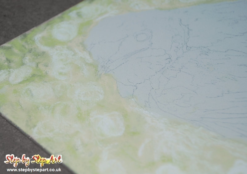
For the highlights, apply circles of varying sizes, using Grey 28 (you can use white instead) Blend with the clean edge of the sponge to avoid lightening already placed tones. You may need to overlay a few times to ensure you get the right balance. The highlights are concentrated around the outline of the bird and below the belly.
|
HEAD - CAP
UNISON pastels
Blue colours used: BV17 - BV18 - A50
Blue colours used: BV17 - BV18 - A50
|
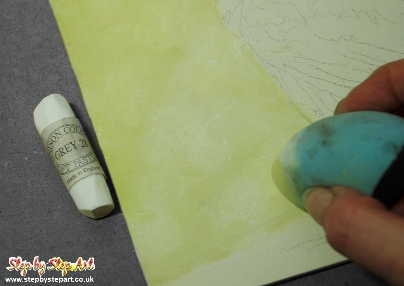
Before continuing on, ensure your background is smoothly blended. To soften harsh edges, the circular sponge will help to achieve this.
You can view samples of blending sponges at the top of this tutorial. Both the pink and blue blenders would be ideal for this situation. |
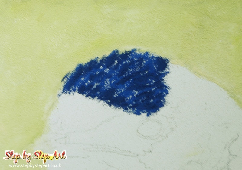
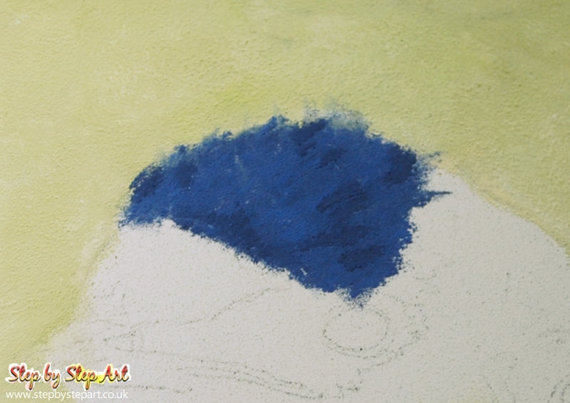
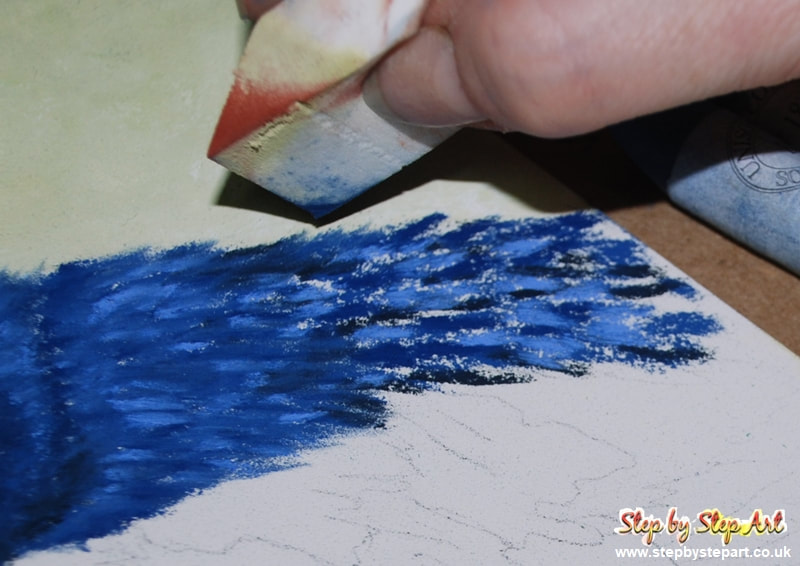
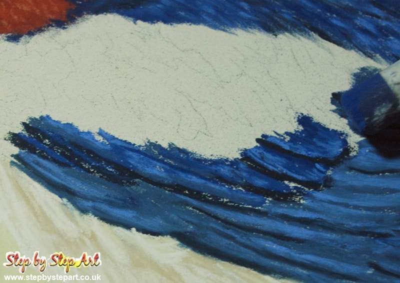
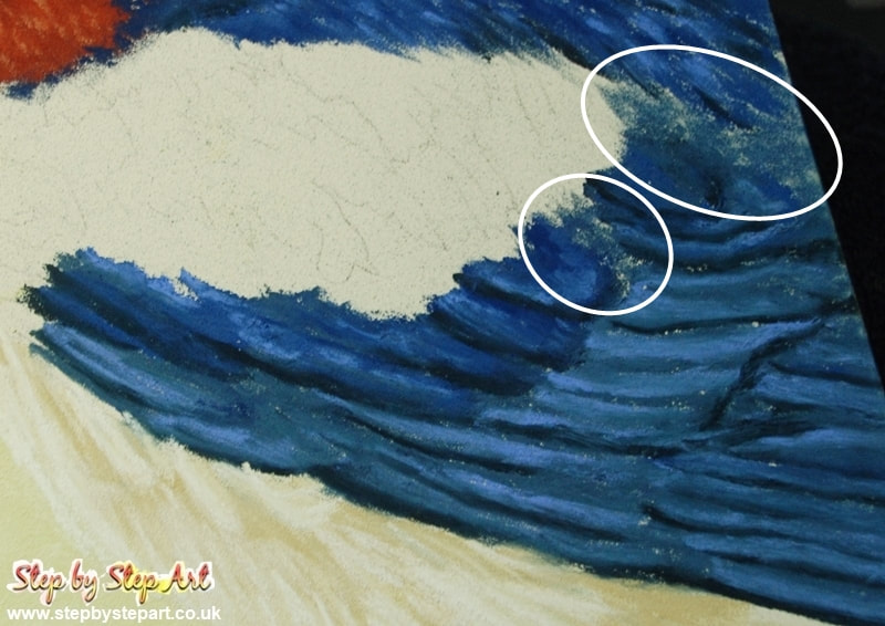
Once the background is finalised, time to move onto the cap. So the outline isn't lost, it is best to work on each section separately. Using the BV17 & BV18, apply loose lines in the direction of the feathers in the photo. Finish by adding a few shadows using A50. Do not saturate the board with pastel at this stage as blending will do that.
|
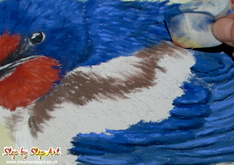
When softening harsh lines, a wedge shaped sponge (straight edges) works best and allows far more control, particularly in small areas. Blend using the corner of the sponge, smoothing out gently. Avoid blending beyond the outline too much as you may muddy the background.
|
FACE & BIB
Unison pastel colours used: RE11 - RE12 (Reds) - BE16 (Beige)
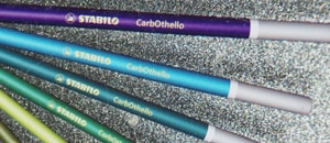
Stabilo CarbOthello pastel pencils used: Black (750) and Light grey (720)
Unison pastel colours used: RE11 - RE12 (Reds) - BE16 (Beige)
Stabilo CarbOthello pastel pencils used: Black (750) and Light grey (720)
|
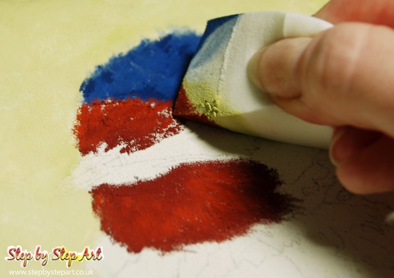
Using the russet tones RE11 and RE12, apply the RE 12 in the darker areas and the R11 in the lighter areas. Again, apply loosely so that the gaps are filled during blending, minimising pastel overload.
|
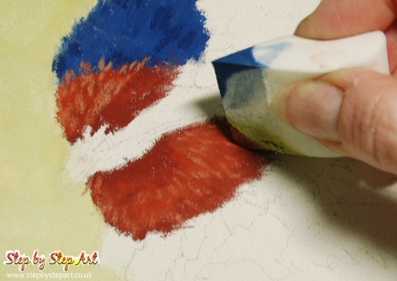
Blend the two tones gently before applying some highlights to the areas using the BE16 tone, the markings are placed to create the effect of lighter feathers in the area. Soften these too but avoid blending too harshly as the lines need to stay noticeable.
|
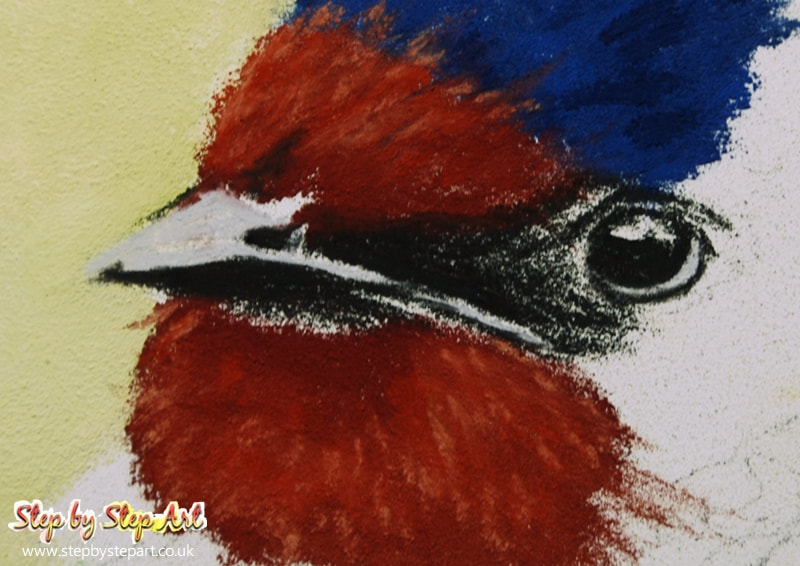
Using a pastel pencil, fill in the pale grey areas on and around the beak and eyes using the PITT pastel cold grey (230), follow this up with the Black (199) around the beak and the eye. Note I soften the black application as I move towards the eye itself as I do not want to create a solid block which will look flat and blend with the eye.
|
NAPE
UNISON pastels
Blue colours used: BV17 - A50 - BV10
UNISON pastels
Blue colours used: BV17 - A50 - BV10
|
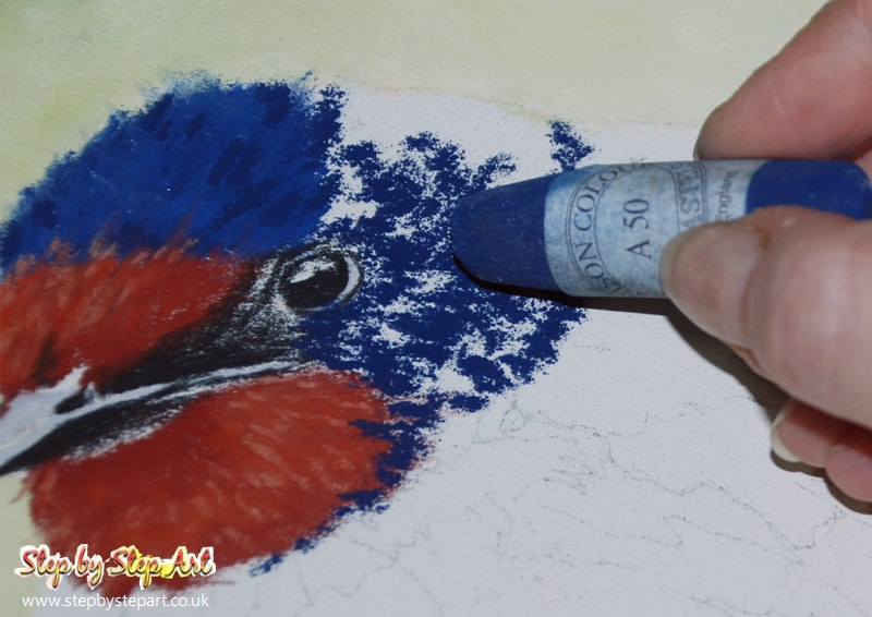
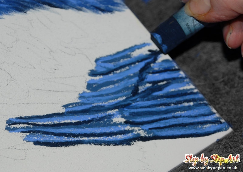
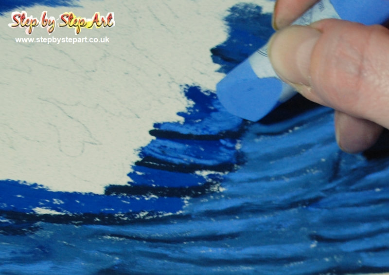
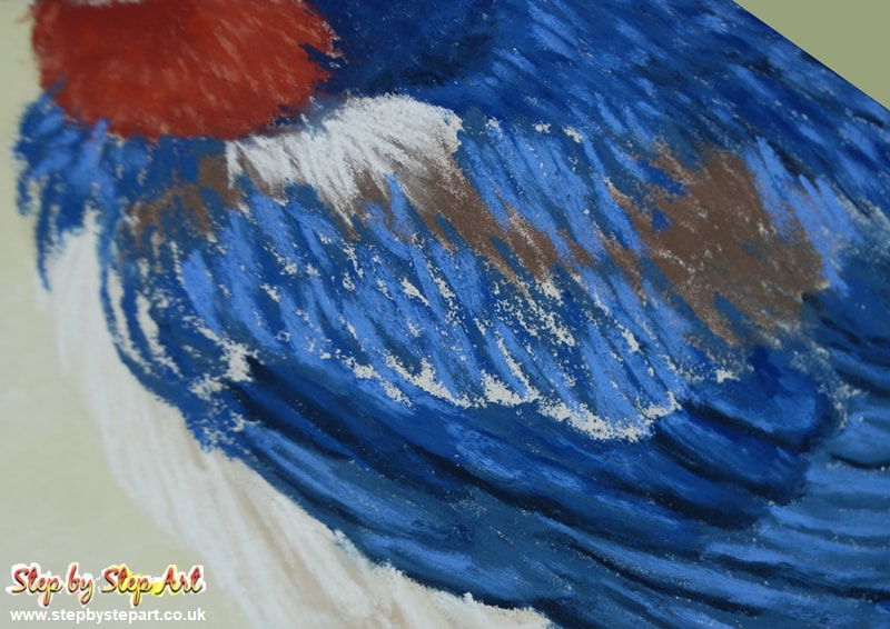
Using the A50 tone, apply some loose markings over the back of the head. Avoid applying too thickly, leave spaces in between for the next layer of BV17 in between A50 lines and add BV10 highlights concentrating at the base of the nape more than the rest of the area.
|
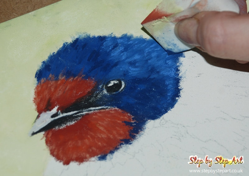
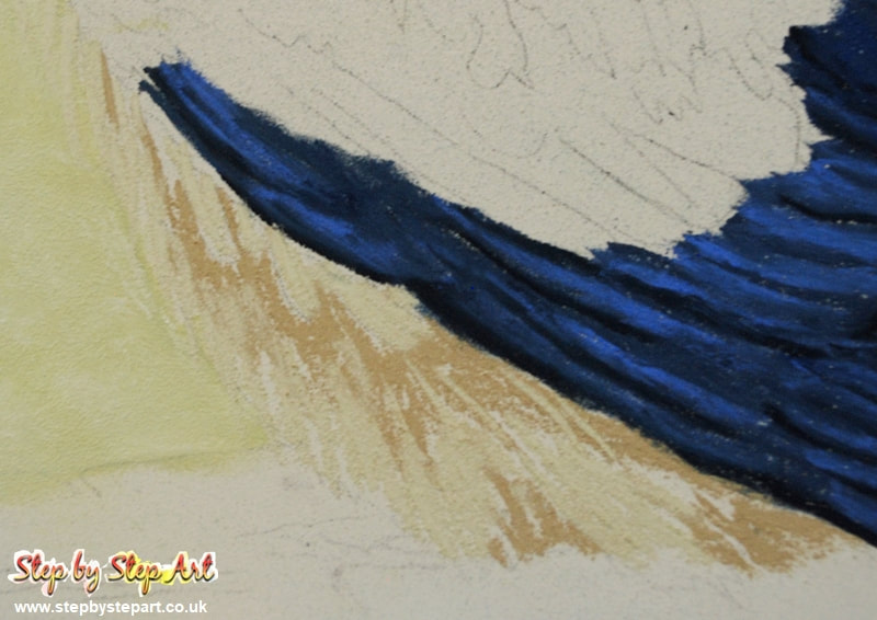
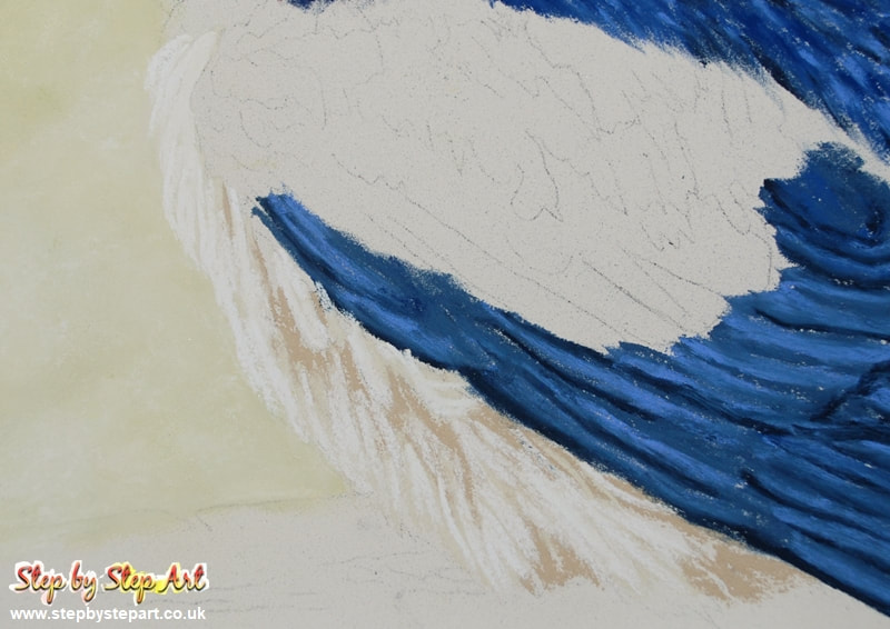
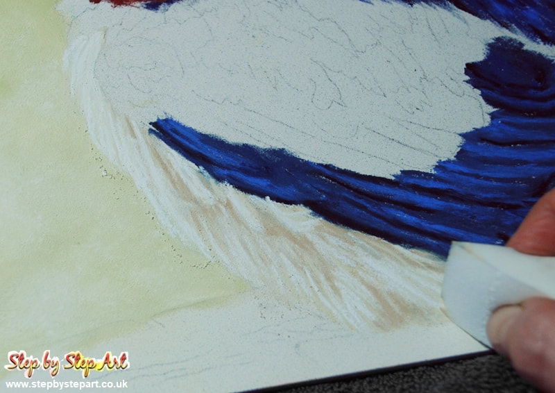
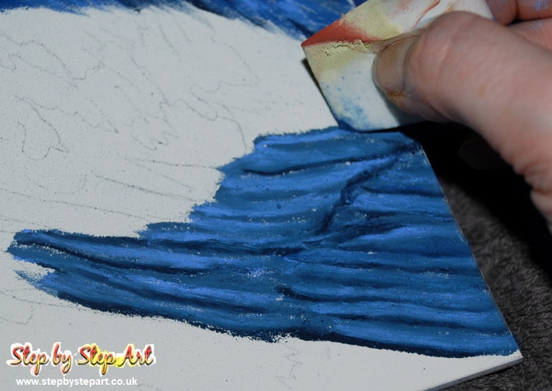
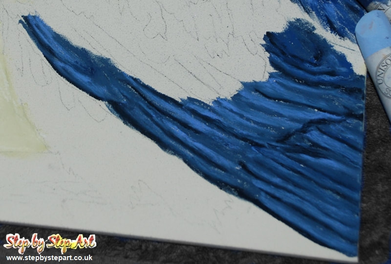
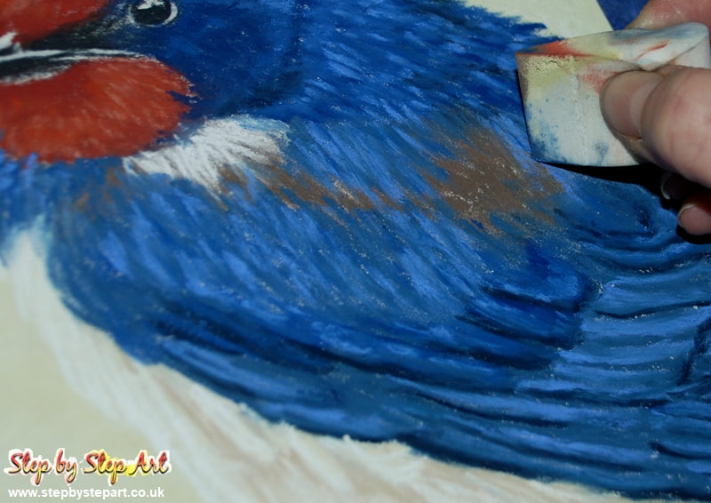
Blend the tones using the wedge and reapply any darker shading using the A50 should you need to define the shadows a little more. Avoid dragging the pastel outside the outlines as it will easily smudge and could damage the background.
|
