Peacock feather in Coloured pencils Tutorial
Written: July 2020
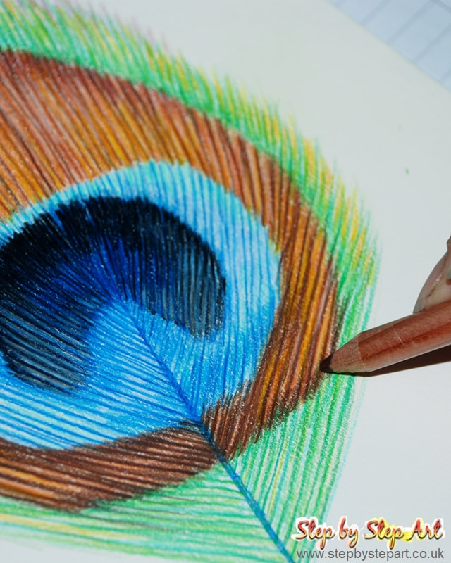
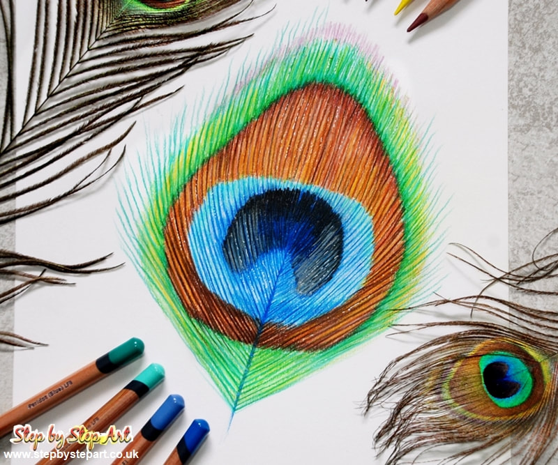
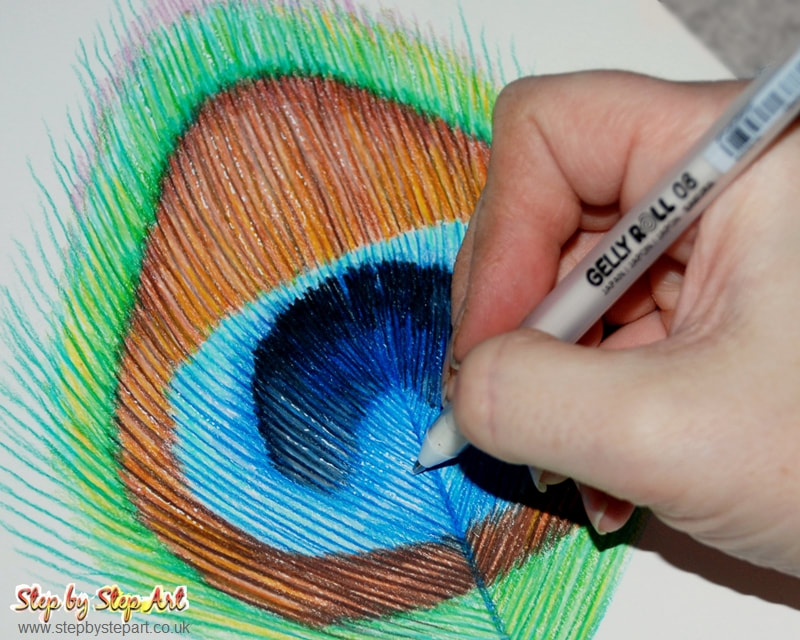
This tutorial was created for the Colored Pencil Magazine's Workshop Series in December 2019. It has been reprinted here to be included in my mini tutorial sections. The tutorial provides a detailed breakdown of the process involved in creating a colourful subject. It explains the steps involved in applying tonal layers and why this approach helps to achieve a realistic result.
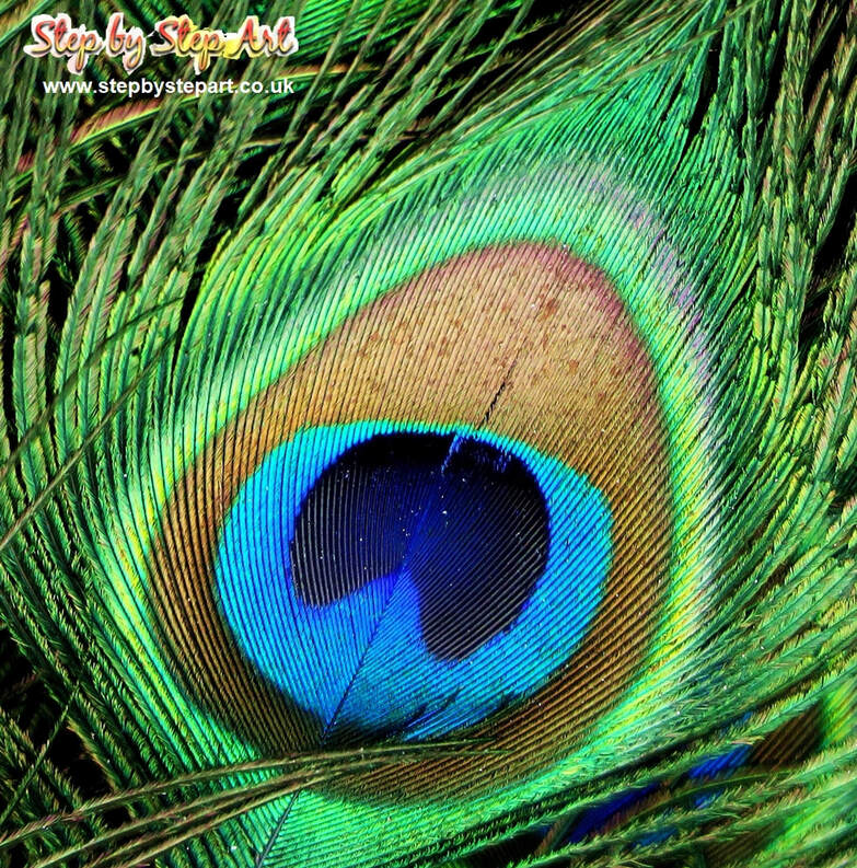
You can find the reference image below. You may print it out or view it on a tablet while following the instructions on a smartphone or computer. The colours used in the tutorial are from the Derwent Lightfast pencil range. However, you can use similar colours from your pencil collection if you don't have the Lightfast brand.
I hope you find this tutorial helpful. Please don't hesitate to contact me if you have any requests for future mini-tutorials.
The Products you will need
Smooth white paper - Coloured pencils
Spare sheet of clean paper - Clean Eraser - Soft brush
Paper Used: Daler Rowney Smooth (220gsm) Pencil range Used: Derwent Lightfast
Spare sheet of clean paper - Clean Eraser - Soft brush
Paper Used: Daler Rowney Smooth (220gsm) Pencil range Used: Derwent Lightfast
The reference image
IMPORTANT TIPS:
* Ensure you have a spare sheet of paper underneath your hand throughout to avoid smudging
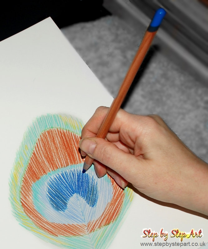
* Each successive layer requires more pressure than the last (unless you prefer a looser finish)
* To achieve the finest lines, hold your pencil as vertically as possible to ensure you are using the finest point of the pencil
* Keep your pencils sharp throughout if you prefer to create fine detail, which helps achieve more realism
Outline and base layers
|
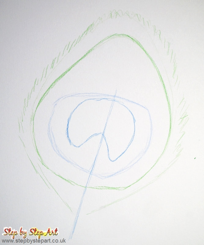
Usually, a graphite pencil is a go-to for creating the initial outline. However, for a simple study like this, coloured pencils are better. You can overlay colours without the need to erase the graphite outline first. To create the outline, use the GRASS GREEN to apply the outer edges, follow up with the MID ULTRAMARINE to make the stem and mid-centre outline and finally, the SAPPHIRE for the eye.
|
TIPS BEFORE STARTING: When applying your initial layers, use a light touch so that mistakes can be easily corrected. As you add more layers, apply slightly more pressure each time until the paper is fully covered with colour unless you prefer a more loose finish. When creating the base layers, use individual lines, leaving gaps between them to avoid creating blocks of colour which will make your work look flat. Keep your pencils sharp throughout. Each coloured line should meet the next, creating one continuous line.
|
|
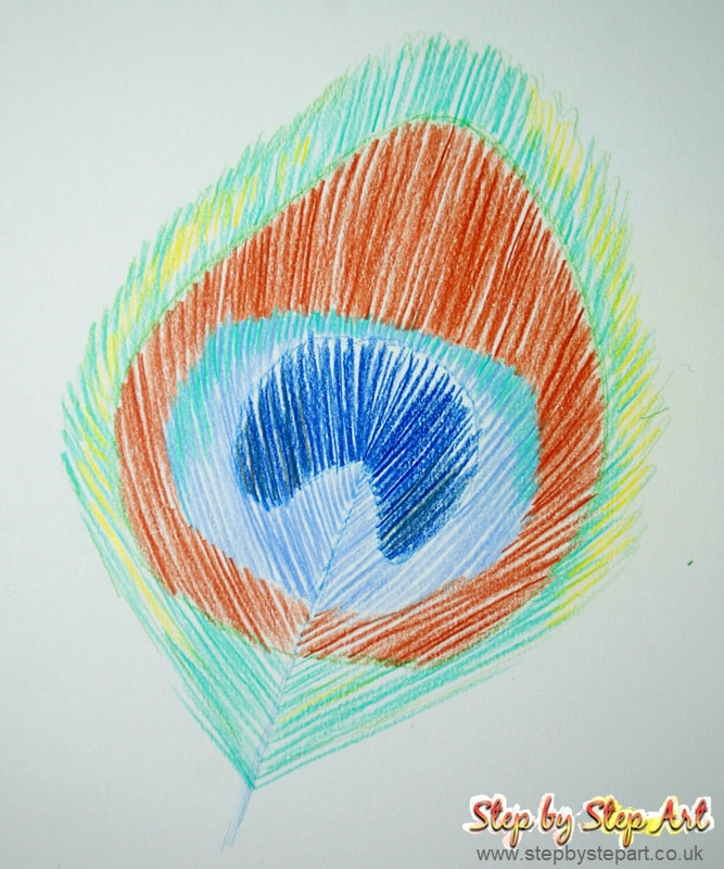
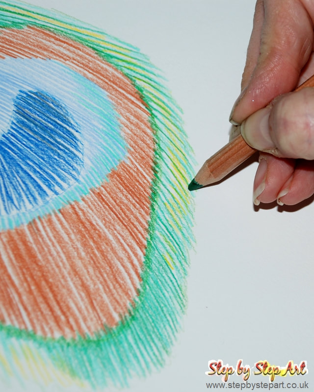
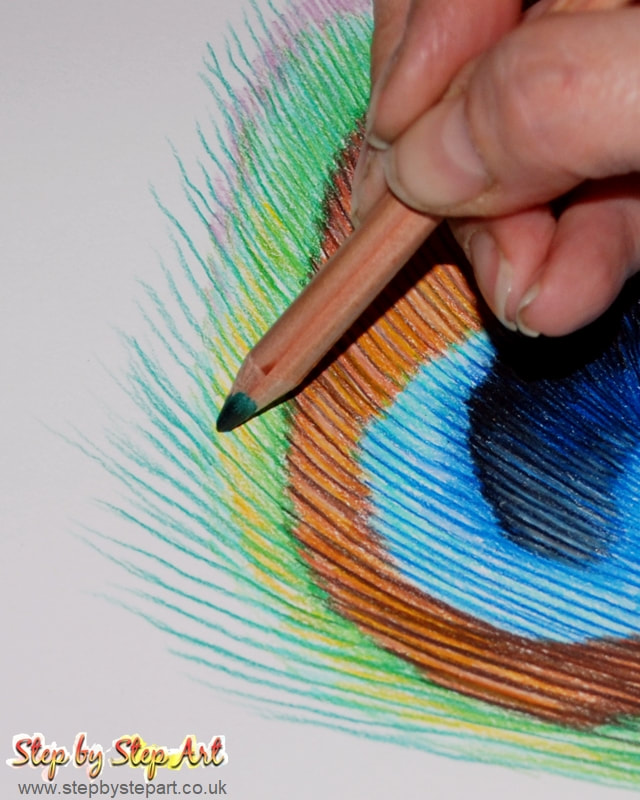
To create the base layers, start from the outer edge and work towards the centre. Make sure to follow the same direction as the lines in the reference image. Use a sharp pencil and hold it vertically to achieve fine lines. Use TURQUOISE GREEN for the exterior lines and leave spaces between each line. Add SUN YELLOW highlights between some of the spaces. For the brown area, use BURNT SIENNA; for the pale blue area, use MID ULTRAMARINE while following the direction of the lines. Use short lines of turquoise green for the exterior edges of the light blue area. Apply SAPPHIRE BLUE in the centre zone, followed by GRANITE (which has a silvery lustre) at the outer edges in the spaces between the sapphire blue.
|
At this stage, make sure your base layers are loose in appearance. As you move on to the mid-layers, apply heavier pressure to create a realistic effect. To create a row of individual lines around the feather, use green PERIDOT (BLUE) and leave larger spaces between each line. For the joins between Burnt Sienna and Peridot (Blue) edge, use short, jagged lines with green PERIDOT (YELLOW) and avoid making them uniform. Finally, add yellow highlights between the Peridot (Blue) lines using AMBER GOLD to complete the process.
|
Building up the layers
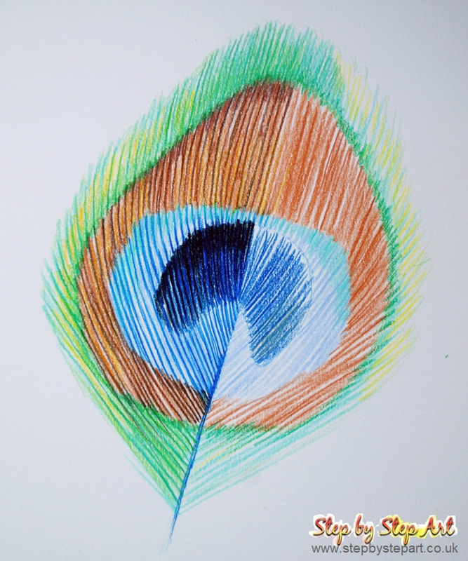
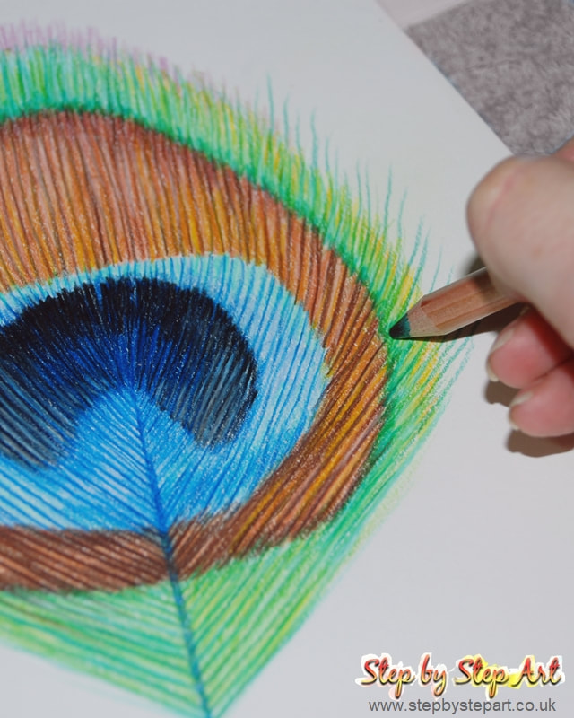
To enhance the Burnt Sienna base tones, use the NATURAL BROWN tone to create thicker lines. For a warm, sunny effect, add a touch of AMBER GOLD to the desired areas. To create depth, use the RUBY EARTH tone to draw lines of varying lengths along the edges and towards the pointed section of the brown site. Use SAPPHIRE to draw two fine lines next to each other to create the quill (ensure a sharp pencil for finer lines). For the next section, use the SAPPHIRE tone to draw lines between the previously laid mid ultramarine lines, ensuring that each line connects to the adjoining ones for a smooth flow of colours. Finally, use the HEATHER tone to add individual lines at the point of the feather.
|
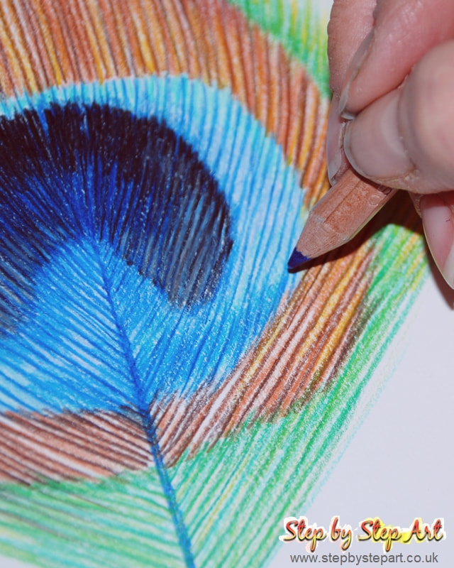
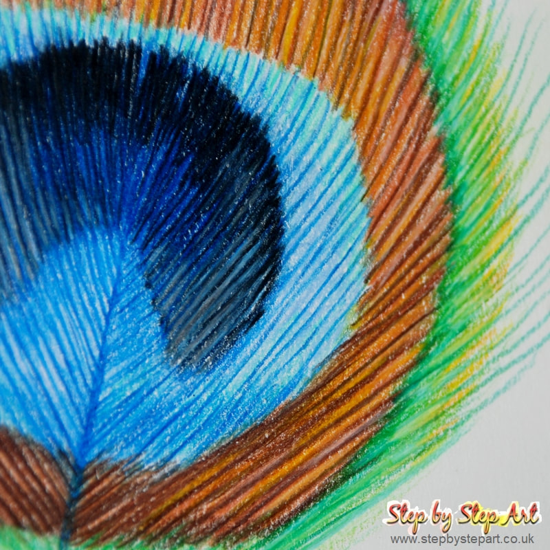
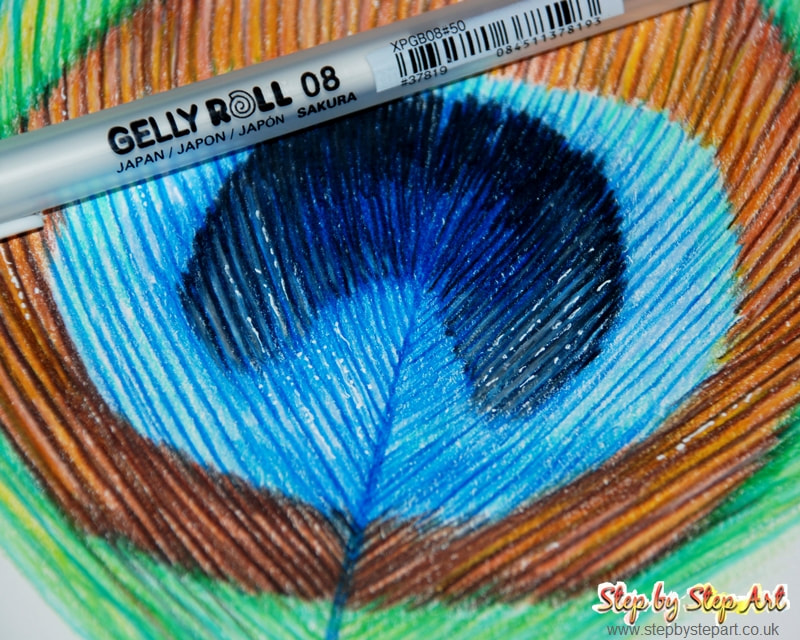
To add depth to the inner eye area, use MID BLUE (70%) to create shading, as shown in the reference image. For highlighting, you can use Derwent's CLOUD GREY, which has a silver sheen, or any silver pencil you have. For a darker effect, apply MIDNIGHT BLUE to the top of the eye area as individual lines, then add BLACK to the tips to achieve a balanced and realistic tone. Try to apply the pencils irregularly for a natural finish. Lastly, use WHITE to highlight a few of the grey lines to create an accent.
|
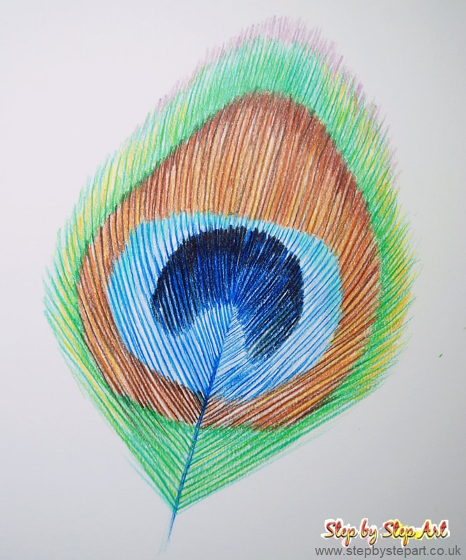
To improve the overall colour consistency, use the TURQUOISE green to apply a thicker layer over the initial application at the top of the light blue section. Soften the blue tones in this area by reapplying the MID ULTRAMARINE and creating a smooth transition. Use SAPPHIRE (as shown in the reference image on the left) for deeper shadows and gradually build up the colour to avoid harsh edges. Fill in any gaps in the brown area with SANDSTONE and add highlights with FLESH PINK. Finally, use NATURAL BROWN to create the darkest lines at the base (as seen in the reference image on the right) to finish the piece.
|
