STEP BY STEP ART | TUTORIALS, ARTICLES & ART WORKSHOPS
  • Home
  • Articles
    • Art guides for beginners
    • Coloured Pencils
    • Graphite Pencils
    • Soft Pastels
    • Acrylic Paints
    • Water based Products
    • Papers & Canvases
    • Art Accessories
  • Tutorials
  • Workshops
  • News
  • Kofi-blog
  • Subscribe
  • About
  • Mail Us
  • Site Map

Watermelon
​Learn how to layer effectively using  Coloured pencils

Artist level: Beginner
Written:  March 2017
Welcome to this step by step tutorial of a watermelon in coloured pencils on Saunders Waterford hot pressed paper. The tutorial below is aimed at those interested in learning how to layer with coloured pencils to create detailed and effective Art which has been written for use with Derwent Coloursoft pencils, however regardless of which coloured pencil range you use, you can use the colour guide below the coloured pencil images to pick out your own colours for this exercise but it is not necessary to match them exactly. For a brightly coloured subject such as this Watermelon, a smooth white paper will be the best choice - any hot press watercolour paper will work well. Achieving effect in coloured pencil portraits are created by layering a selection of colours, light to dark first starting with a light application and building up to heavier ones - too much pressure of initial layers may saturate the paper too early and you will not be able to apply consecutive layers. This tutorial is aimed at beginners to coloured pencils but if you are an Intermediate user you can add more detail by using further colours than those shown here. ​

The reference image can be found below, which you can screen grab and print out or view on a tablet whilst reading the instructions on a smartphone or computer. The pencils used in this demo are the Derwent Coloursoft range, however you can pick similar colours from your own preferred pencil collection if you do not have the Coloursoft ones. Highly pigmented pencil ranges such as Prismacolor Premier or Derwent Lightfast would be ideal for this.

I hope you enjoy this tutorial and if you would like to request a subject for inclusion of a future mini tutorial, please get in touch!


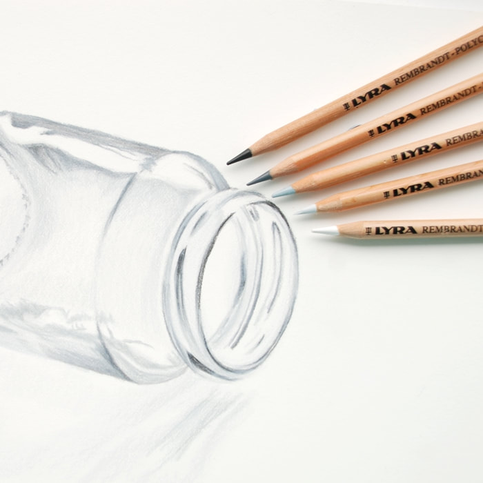
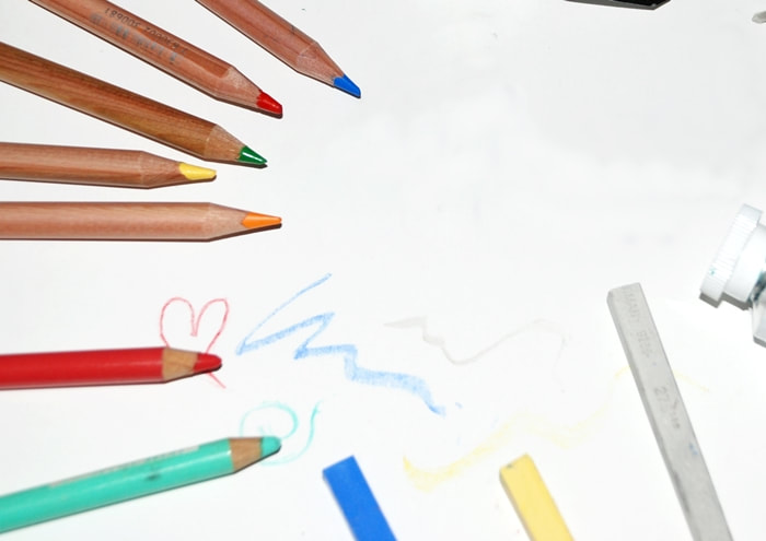
The Products you will need

Smooth white Art paper   -    Coloured pencils
Spare sheet of clean paper   -   Clean Eraser    -    Soft brush
​Paper Used: Saunders Waterford Bright White        Pencil range Used: Derwent Coloursoft


Derwent Coloursoft pencils White, Pale peach, Soft Pink, Peach
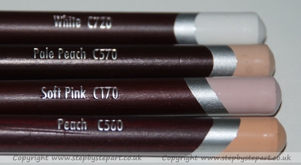
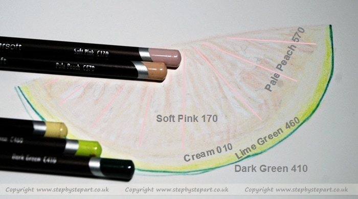
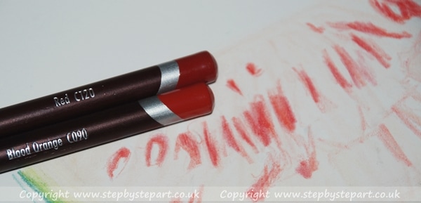
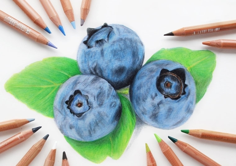
White  C720,  Peach  C560,  Pale Peach  C170,  
​​Soft Pink C170
Derwent Coloursoft pencils Red, Blood Orange, Orange and Peach colours
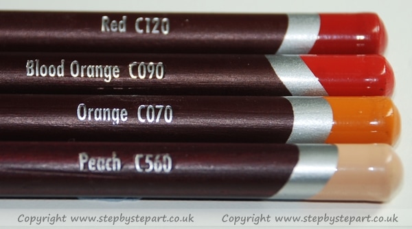
Red  C120,  Blood Orange  C090,  Orange  C070,  
Peach C560
Derwent Coloursoft pencils Dark Green, Light Green, Yellow Green, Lime Green and cream pencils
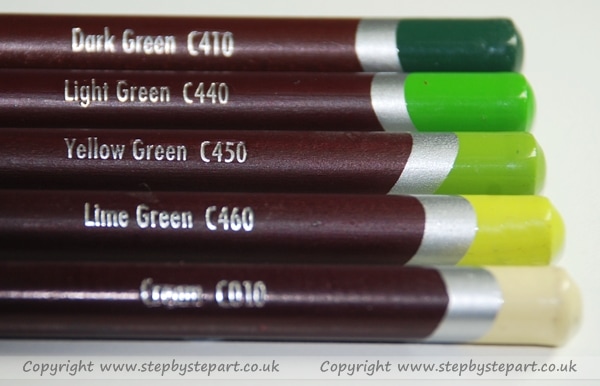
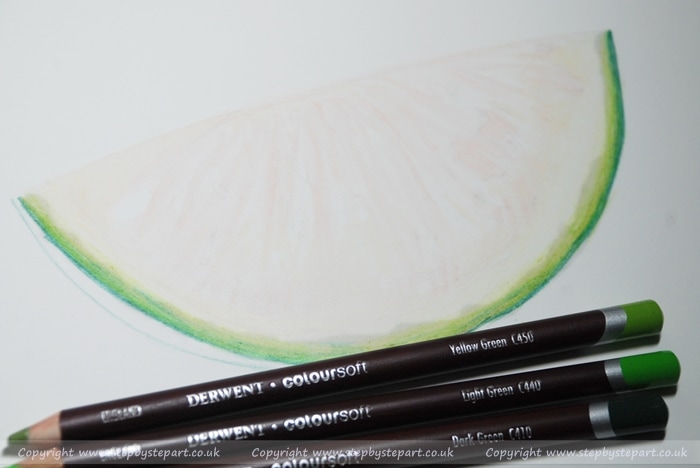
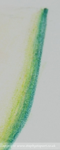
Dark green  C410,  Light Green C440, Yellow Green  C450,  Lime Green  C460  
Optional Extra: Brown 510

IMPORTANT TIPS:  
* Ensure your pencils have a long lead before starting, the side of the lead will be used as opposed to the point of the lead.​
*  To avoid transferring natural oils onto your drawing from your hands, have a clean sheet of paper to lean on whilst applying colour.  Natural Oils from your skin and saliva can damage your Artwork which you may not be able to repair.
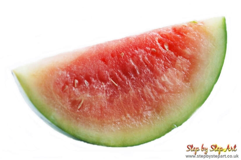
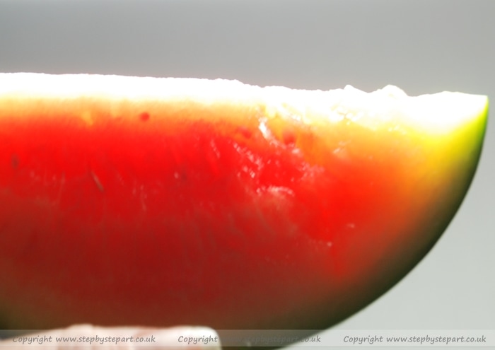
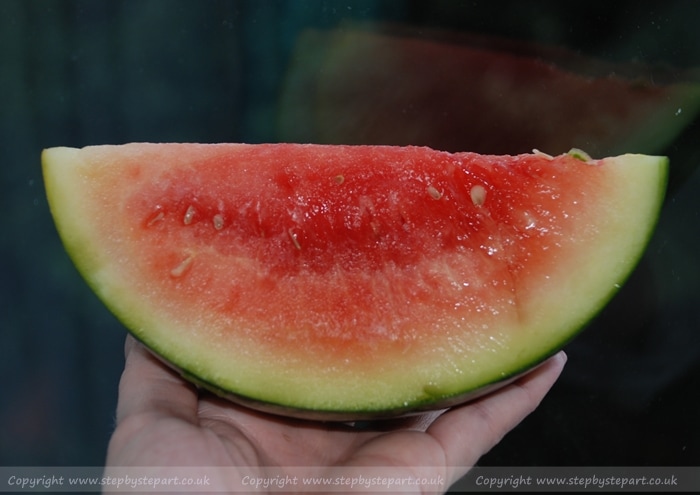
​

The reference image

watermelon slice


​Before you start....

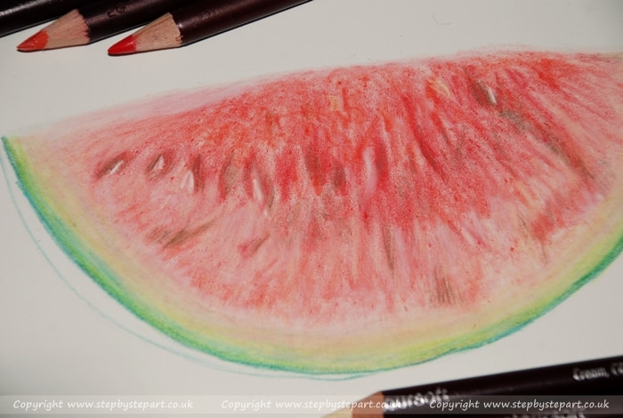
Studying your subject before you even begin putting pencil to paper it may help to create a colour chart of the pencil colours you have so you can easily match tones, picking out the pencils you will be using before you begin. If you are working from still life, the first thing to do is choose the colours you will need. A simple subject like this watermelon may look like 4 or 5 colours will suffice but look carefully....how many colours actually make up the pulp of the fruit?​
Watermelon held under lighting photo
Watermelon held in hand photograph
A tip I recommend for anything that is semi-translucent is to hold the subject up to natural lighting, how many more colours can you see now? Take a flash photo of the subject when possible, this can strengthen colours making it more vibrant which in turn will make your Artwork even more effective, it can also define those darker areas even further. How many colours can you see in the inner rind and the outer rind? What about the colours of those highlights of the fruit pulp. For this simple study, I opted to keep the colours I used to a minimum so as not to complicate this exercise too much, especially important if this is your first drawing with Coloured pencils, keep it simple as you may be able to add to it at a later date if the layers are not applied too thick and heavy.
​

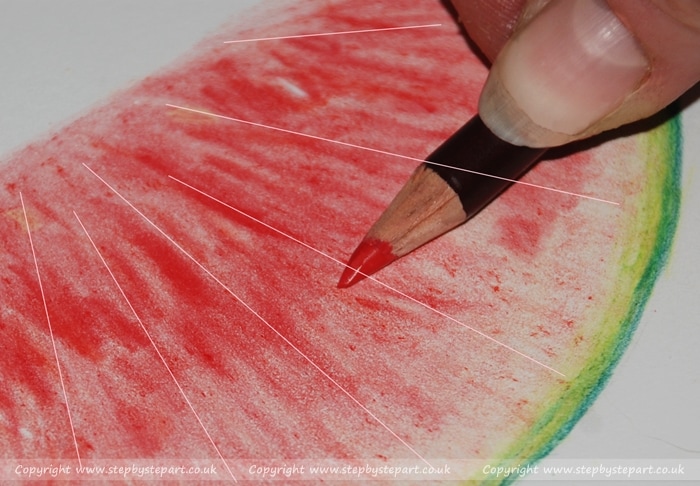
IMPORTANT TIP:  Coloursoft pencils are, as their name suggests soft, and it is recommended when layering colours that you begin by applying colours lightly using a softened point or the side of the 'lead' (see Stage 4 below) to avoid applying heavy lines to the paper which can spoil the soft and natural looking effect you are attempting to achieve - Using a BLENDER can help create a smooth transition of colour too but if pencil lines are applied too heavily, a blender will not be able to smooth them out.

Where do I start?

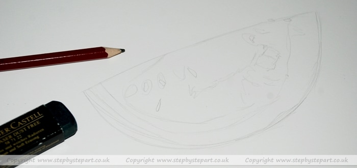
For a subject as colourful as this watermelon, working on a bright white paper will be ideal as it will really show off its colours. Begin by drawing your outline using a HB or B pencil.  It does not have to be perfect in shape, but do ensure you apply all the important sections such as the 'pips', marking out the edges of where the rind meets the pulp as well as defining the markings in the pulp and the highlights too. Avoid drawing a heavy outline so it can be erased as you go along, do not apply colours over the graphite outline as you will seal them below the colour and may spoil your work. Remember to keep early colour applications relatively loose and light.

Other related articles that may be of interest
​

Derwent coloursoft pencils
Derwent Coloursoft pencils review
Comparing coloured pencil brands
Compare Coloured pencil ranges
Snow leopard eyes drawn in coloured pencils
Try one of our other Art Tutorials
Saunders waterford paper
Saunders Waterford 'High White' paper - no link available.

Stage 1 - Laying the Foundations

Outline of a watermelon drawing for a step by step art tutorial
Derwent Coloursoft pencils and a watermelon drawing for a step by step art tutorial
COLOURS: ​ 560 Peach, 170 Soft Pink, 010 Cream, 460 Lime Green, 410 Dark Green
Achieving great effect using coloured pencils are achieved by layering colours together, ideally light to dark - starting with a gentle application of pressure and building up to heavier ones is the best way if you wish to create detailed art but beware as adding too much pressure early on could saturate the paper so you will not be able to add further layers and may spoil your work. Begin the undertones to this watermelon by starting with the Soft Pink first, applying a loose application from top to bottom following what I call the 'sunshine' direction, (see the pink lines) Apply the Pale peach around the edges of the pulp where you can see warmer tones and follow this up with a light application of the Cream to the inner rind section. Onto the outer rind, apply a heavy line using the Dark Green as this is a hard edge so pressure can be used here. Apply a layer of Lime Green between the dark green & the Cream tone. The foundations have now been laid.

Stage 2 - The Rind

derwent coloursoft pencils and watermelon drawing for a tutorial
Green rind of a watermelon coloured pencil tutorial
Begin the build up of the fruit at the rind for this exercise, for better effect, using 4 tones of green is going to give more realism than say, using only two and so for this I have picked out the Dark Green, Light Green, Yellow green & Lime Green. Begin by applying a gentle application of Lime green immediately above the Dark green of the rind already placed, follow it up by gently applying the Lime Green over the top and finally the Yellow Green in the line between the lighter green tones and the Dark green edge, this will give a smooth transition. You may wish to reapply the Dark green to the rind to make the colour stronger if your initial application was light.
COLOURS:  410 Dark Green, 440 Light Green, 450 Yellow green, 460 Lime Green​

Stage 3 - Define & Apply - Mid layers

Looking closely at the mid section of the fruit itself, you can see a few pale seeds in places which you should define using the white & cream pencils before applying any other colour to the pulp. Once completed take note of the dark red areas where the pips usually sit and it is helpful at this stage to apply the Red pencil defining these areas. As this needs to stay the darkest point of the fruit, you can apply heavier applications of colour, including the Red Orange to areas too for added effect.  These areas need to stay darker than the rest of the colours so you may need to darken them further as you add more layers.​
Derwent Coloursoft pencils over a watermelon tutorial
COLOURS:   720 White, ​090 Blood Orange, 120 Red
watermelon pencil drawing for a step by step art tutorial
COLOURS:  070 Orange, 090 Blood Orange, 120 Red
The next part is to create the tones of the red fruit - I have only used a couple of colours in this quick example but you can create more realism by adding more colours such as the Orange, Salmon Pink and even a yellow tone too - remember whatever colours you choose to add, make sure you apply the lighter tone first up to the darkest colour.  The 2 tones I used, Red & Blood Orange were both applied following the same 'sunshine' application as previous (see the direction of lines on the image) I worked from the top point of the watermelon to the bottom simply to avoid creating an untidy section at the top of the fruit that should be flat, but whichever way you choose to do it will make little difference if you are careful.  You can see from the image that the central section is much darker than the bottom section where pulp meets rind and the colour lightens up considerably.

Stage 4 - Applying highlights and final details

Watermelon drawing step by step tutorial
COLOURS:  570 Pale peach, 170 Soft Pink,  010 Cream, 720 White, Brown 510
The final stage is applying the 'top layer' of detail. This is the last part where you have completed the build up of tones and are now looking to apply the highlights or additional shading that adds to further realism. Looking at the watermelon photo, there are many highlighted areas/markings that need to be put in and the white is very good for this subject in particular but adding shades in Pale Peach, Soft Pink and even Cream will also help to add to the effect. White will create one tone, so these additional colours will help to create further highlighted tones adding to the authenticity of a natural subject. You may wish to blend the lighter section of the rind using the white or even the cream pencil to create a smooth, transitional distinction between that and the pulp itself and as an added point of definition, I added some light layers of the Brown pencil to define the pip 'pockets' even further.
The main pointers in this tutorial can be applied to any subject you create in coloured pencils, although this tutorial is certainly not the ONLY way you should work with them, different artists have different techniques and this one is mine, in time you may adapt your own technique in coloured pencils or maybe even find that coloured pencils aren't really for you but it is always good to try it out from another's perspective. I am sure that this subject may not appeal to every artist but it can be a very good learning curb especially if you have never used coloured pencils before and I hope this has been an interesting, even enjoyable practice session.

Found it too Easy?  Why not try our SNOW LEOPARD EYE tutorial​
In the UK? Why not come to one of our Coloured pencil Workshops - Find out more

View our other coloured pencil tutorials

Drawing a Peacock feather
Creating three-dimensional art
Achieving realism in your work
Creating movement in water
Layering and blending for high detail
View all other tutorials >>>>

QUICK LINKS


​Articles

Art Tutorials

Art Workshops  
​
Art Blog

About ko-fi
​Our social media page


About the Tutor  

Workshop Gift Vouchers

Subscribe 

Contact  

Links 
  
Site Map
Vertical Divider

HOW TO SUPPORT US

Picture
This website was designed to offer useful content to artists worldwide. We prefer to keep it ad-free to provide positive user experience. As we do not receive revenue through this website, if you appreciate what we do, you can help support us by buying us a coffee at ko-fi.com. Click the 'support' buttons below to donate. Thank you for visiting today!
What is Ko-fi?
Vertical Divider

Picture
Follow us on Instagram
You Tube logo
Join our new You Tube channel (Content to follow)
Picture
See which art products are vegan

    SUBSCRIBE TO OUR NEWSLETTER

Subscribe
Our quarterly newsletter is filled with reviews, recommendations, hints and tips on various art products as well as new tutorials that you may enjoy.  ​Please note we NEVER spam
No part of this website should be copied or re-used anywhere without written permission by Karen M Berisford - 2011 - 2022
All images on this website are copyright of Karen M Berisford unless otherwise stated - Website design by Karen M Berisford. All rights Reserved.
  • Home
  • Articles
    • Art guides for beginners
    • Coloured Pencils
    • Graphite Pencils
    • Soft Pastels
    • Acrylic Paints
    • Water based Products
    • Papers & Canvases
    • Art Accessories
  • Tutorials
  • Workshops
  • News
  • Kofi-blog
  • Subscribe
  • About
  • Mail Us
  • Site Map