Learn how to draw a glass jar in 3-D using just 5 colours
Artist level: Beginner
Written: April 2020
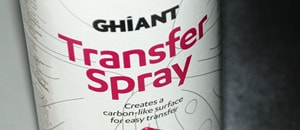
This mini-tutorial shows you how to create a three dimensional drawing. Using only 5 colours, learn how to shade and achieve depth in your work. You can find the reference image below. Screen-grab, print out or view on your mobile whilst following the visuals on a second device.
The colours used in this demo are from the Lyra Rembrandt Profi-plus collection. You can use cool greys from any pencil collection.
I hope you enjoy this tutorial. If you wish to request a subject for a future mini-tutorial, please get in touch!
The colours used in this demo are from the Lyra Rembrandt Profi-plus collection. You can use cool greys from any pencil collection.
I hope you enjoy this tutorial. If you wish to request a subject for a future mini-tutorial, please get in touch!
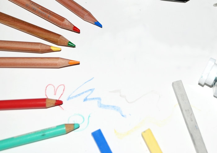
The Products you will need
Smooth white paper - Coloured pencils in cool grey tones
Spare sheet of clean paper - Clean Eraser - Soft brush
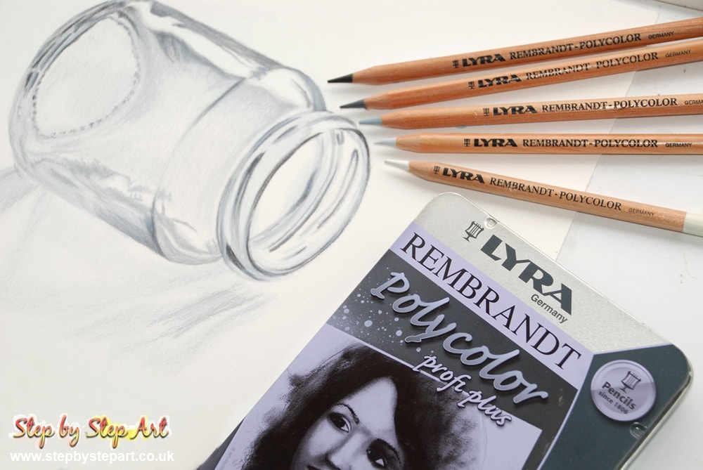
Paper Used: Strathmore 500 Bristol Vellum Pencil range Used: Lyra Rembrandt Polycolor Profi-plus coloured pencils
Spare sheet of clean paper - Clean Eraser - Soft brush
Paper Used: Strathmore 500 Bristol Vellum Pencil range Used: Lyra Rembrandt Polycolor Profi-plus coloured pencils
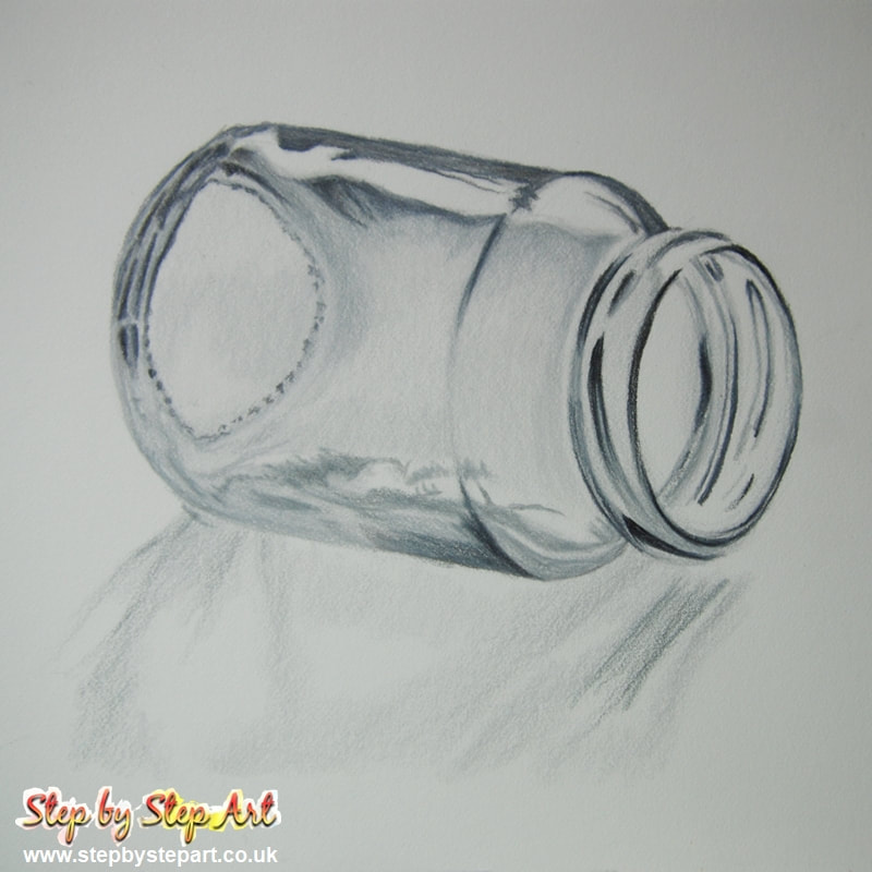
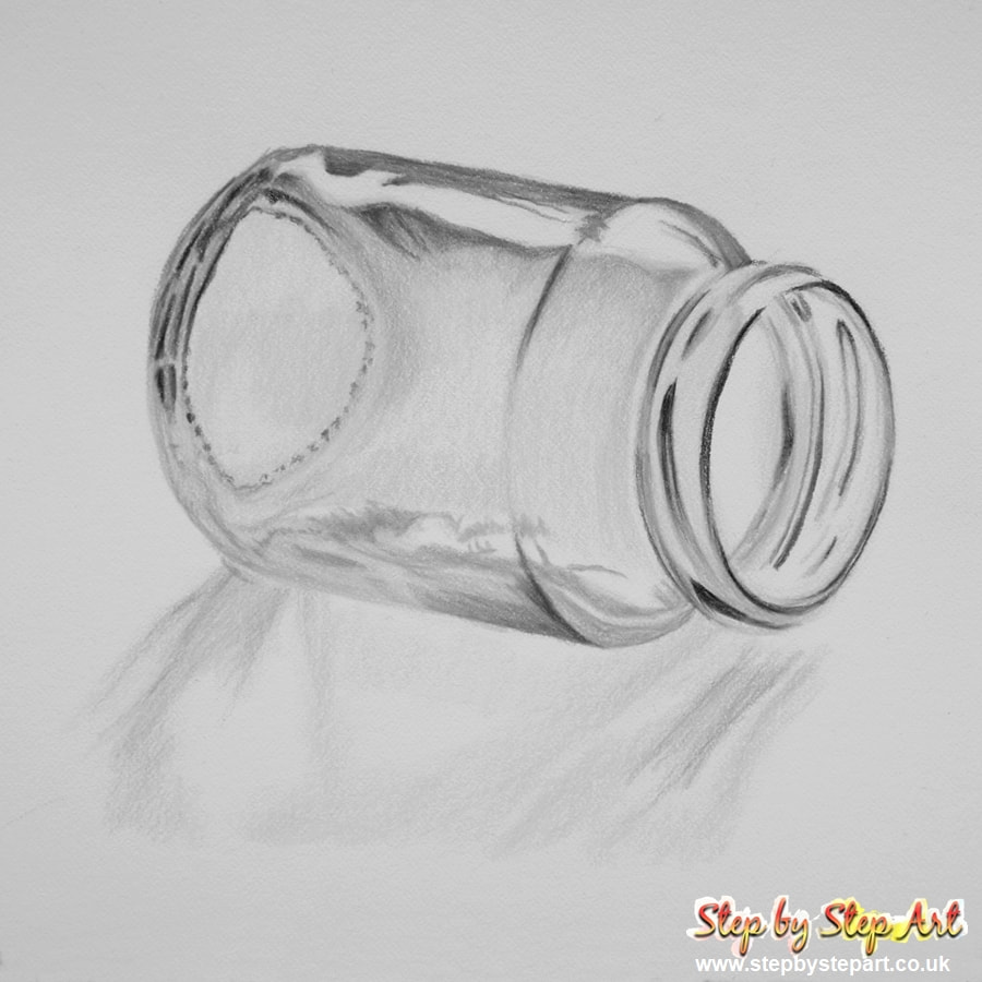
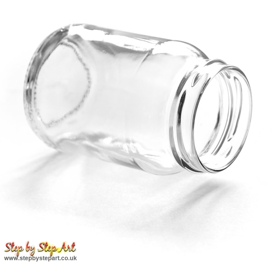
The reference image
IMPORTANT TIPS:
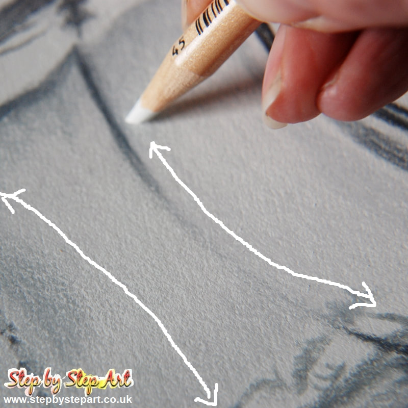
* If you use a lead pencil to draw the outline, soften it with a rubber before applying colour over the top. This will avoid sealing in the outline.
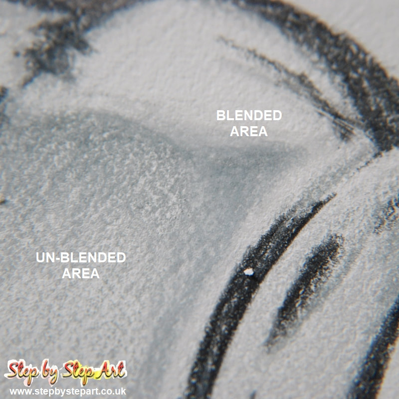
* Base tones should be built up slowly, so do not over-saturate your paper too fast. The amount of layers you can apply will depend on the paper you use.
* To avoid transferring natural oils from your hands on to your paper, use a clean sheet of paper to lean on throughout so you do not touch the paper at all. Natural oils from your skin can damage your artwork which you may not be able to repair.
* If you use a lead pencil to draw the outline, soften it with a rubber before applying colour over the top. This will avoid sealing in the outline.
* Base tones should be built up slowly, so do not over-saturate your paper too fast. The amount of layers you can apply will depend on the paper you use.
* To avoid transferring natural oils from your hands on to your paper, use a clean sheet of paper to lean on throughout so you do not touch the paper at all. Natural oils from your skin can damage your artwork which you may not be able to repair.
|
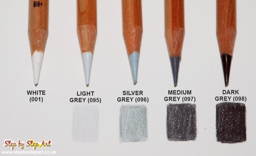
Colours Needed:There are just 5 colours used in this tutorial. Choose cool greys from your brand, avoid using warm or french greys. I used the Lyra Polycolor Profi-plus for this tutorial which is a set of 12 monotones.
It is not important that your colours match ours. The two lighter greys are also used for blending which helps to create a balanced finish. |
Outline & shading
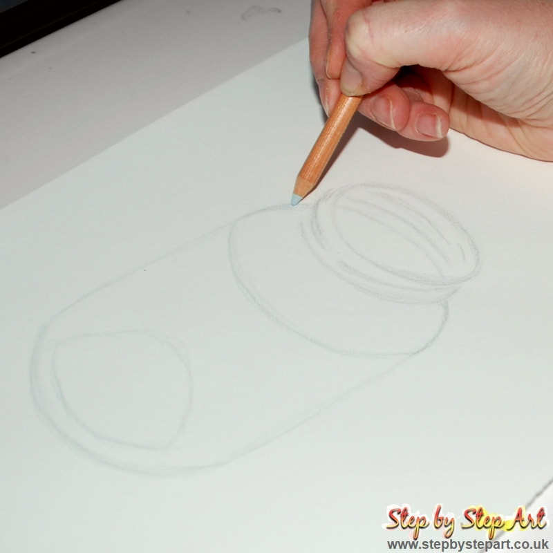
Outline - Silver Grey (096)Although you can use a graphite pencil to draw your outline, it is better to use a coloured pencil instead. I used the silver grey tone to create a simple outline. If softly applied, it is easier to erase mistakes.
|
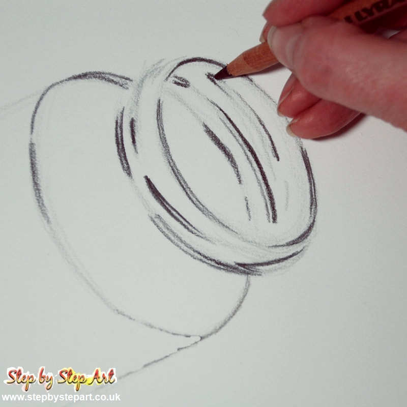
Shading lines - Dark grey (098)For the next stage I apply darker shadows on the rim of the jar. Ensure your pencil is sharp before starting. Use a dark grey tone to define the outline of each thread. Loosen the pressure of your pencil from the paper where the colour tapers out. These edges will be blended later.
|
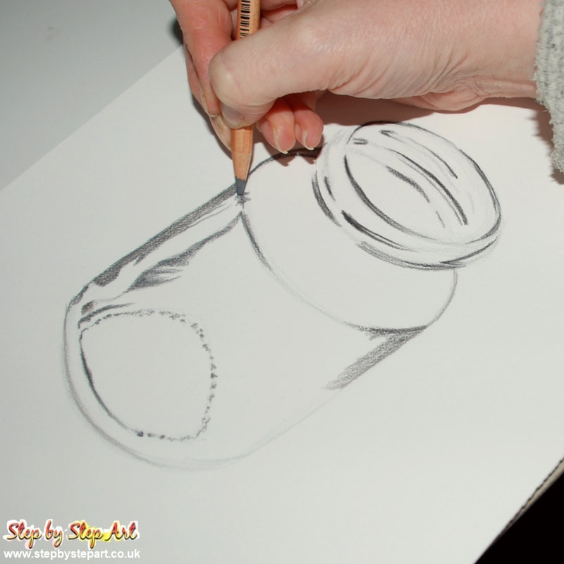
Shading bottom of jar - Medium Grey (097)Using the medium grey tone, begin filling in the details to the mid section and also at the base of the jar. Apply darker markings on the outer edges and apply irregular dots/markings on the base. Note how this simple step already adds a dimension to your drawing.
|
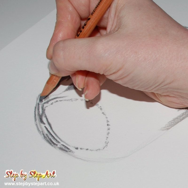
Shading bottom of jar continued - Medium Grey (097)Using the same colour, place marks below the dots previously placed. You do not need to press on hard with your pencil as you need to blend it later. Heavy applications can be difficult to smooth out.
|
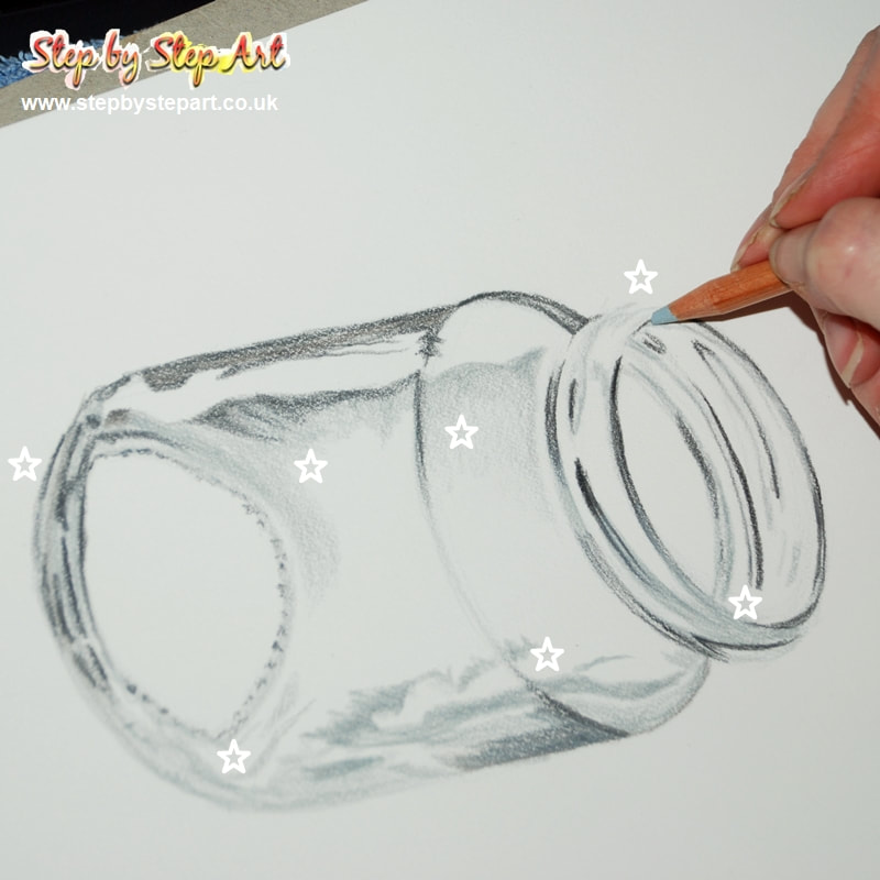
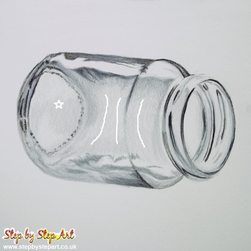
Mid shading - Silver Grey (096)Use a lighter grey (silver grey) to help create the shape of the jar. I have placed a star in the areas where I applied this tone. You may notice that some areas look darker, this is where I applied more pressure to achieve this.
|
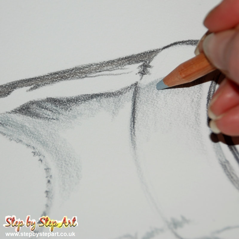
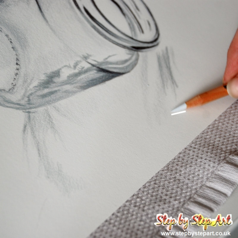
Mid Shading close upUsing the palest grey (Light grey), soften the transitions on the shoulder of the jar. The lighting on the reference image is over exposed in some areas. If you are working on white paper, these areas can be left untouched. If you are using tonal paper, use a white pencil to cover these areas.
|