OUR TWO LATEST ARTICLES
UPCOMING VENTURES
Ko-fi is a fun website where you can stay updated with all the exciting updates from Step by Step Art. Originally designed for donations, it has now grown to provide even more features. On our page, you can enjoy regular posts, articles, reviews, videos, and in time, you'll be able to shop for any goodies that may be available in our store. Plus, you'll get every post delivered straight to your inbox as soon as they're published. It's a super easy way to keep up with the latest information. It’s free to join, so feel free to follow our page, leave comments, or ask us any questions you may have. If you're curious about how to sign up for Ko-fi, just click the button below to find out more. Let us know in the comments if there are certain subjects you would like us to include in our future articles, art tutorials or on our YouTube Channel.
0 Comments
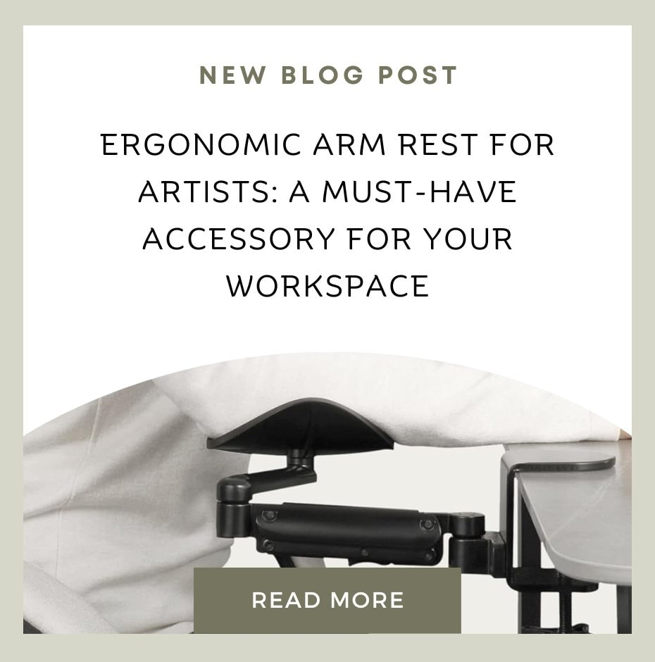
Ergonomic arm rest review by Karen M Berisford
As a professional artist, I spend significant time working at my desk. While I have an easel, I only use it when working on large paintings. The easel's adjustability, both horizontally and vertically, is impressive. Still, it lacks arm support, making it uncomfortable to work on for extended periods.
Working at an easel for long hours can be challenging for artists, as it can cause pain and stiffness in the shoulders, arm and wrist. This can affect the quality and enjoyment of the art, as well as the health and well-being of the artist. 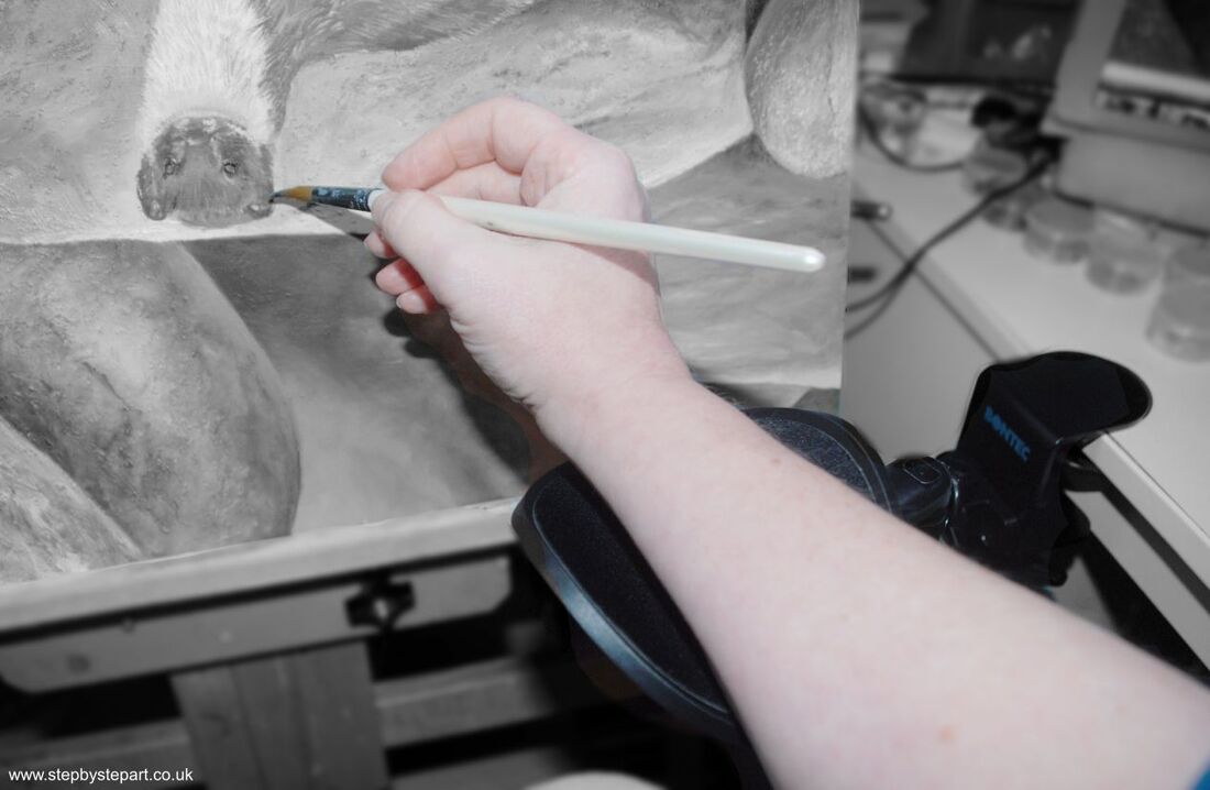
A while ago, I bought an ergonomic arm rest which attaches to a solid surface, and use it to support my forearm and wrist when working from my easel. It provides the necessary support to reduce the strain on my hand and wrist as I work and it has helped to improve my posture and reduce the stress on the muscles and joints. It also allows my hand and arm to move freely and smoothly, giving more control and precision over the strokes.
I have provided a video below showing how the arm clamp operates.
My armrest is constructed of metal, which is necessary to support the weight of my arm. The armrests need to have some weight behind them to clamp onto a desk securely while also supporting the weight of your arm. A few companies sell ergonomic armrests, and as I am not endorsing any particular brand, the fittings may differ from one brand to another.
An ergonomic arm rest is adjustable and flexible and the height of the arm rest can be changed to suit the preferences and needs of the artist. There are five different height settings, up to 4 inches, to choose from. The arm rest can also swivel and move with the arm as the artist works. The arm rest has a clamp that fits most easels, and can be attached and detached easily.
The one I have is from BONTEC which I purchased on AmazonUK, however there are others brands available which may differ slightly in their design. There are numerous arm rest designs available if this style is not suitable. Here is the link on Amazon.
By sharing this information, I hope others may also benefit from its usefulness. Please note that I am not promoting or endorsing this product but offering friendly advice for those who may find it beneficial.
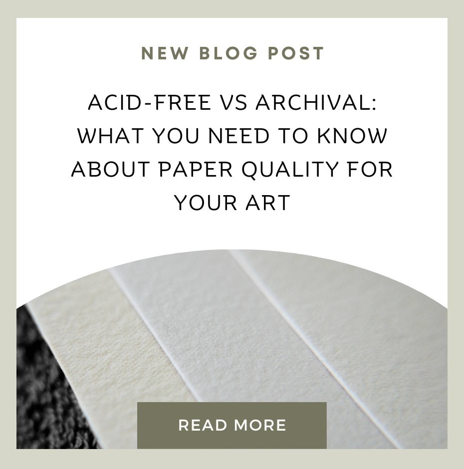
If you are an artist who cares about the longevity and preservation of your work, you might have heard of the terms “acid-free” and “archival” when it comes to paper quality. But what do they mean, and how do they affect your art? Let's take a look. 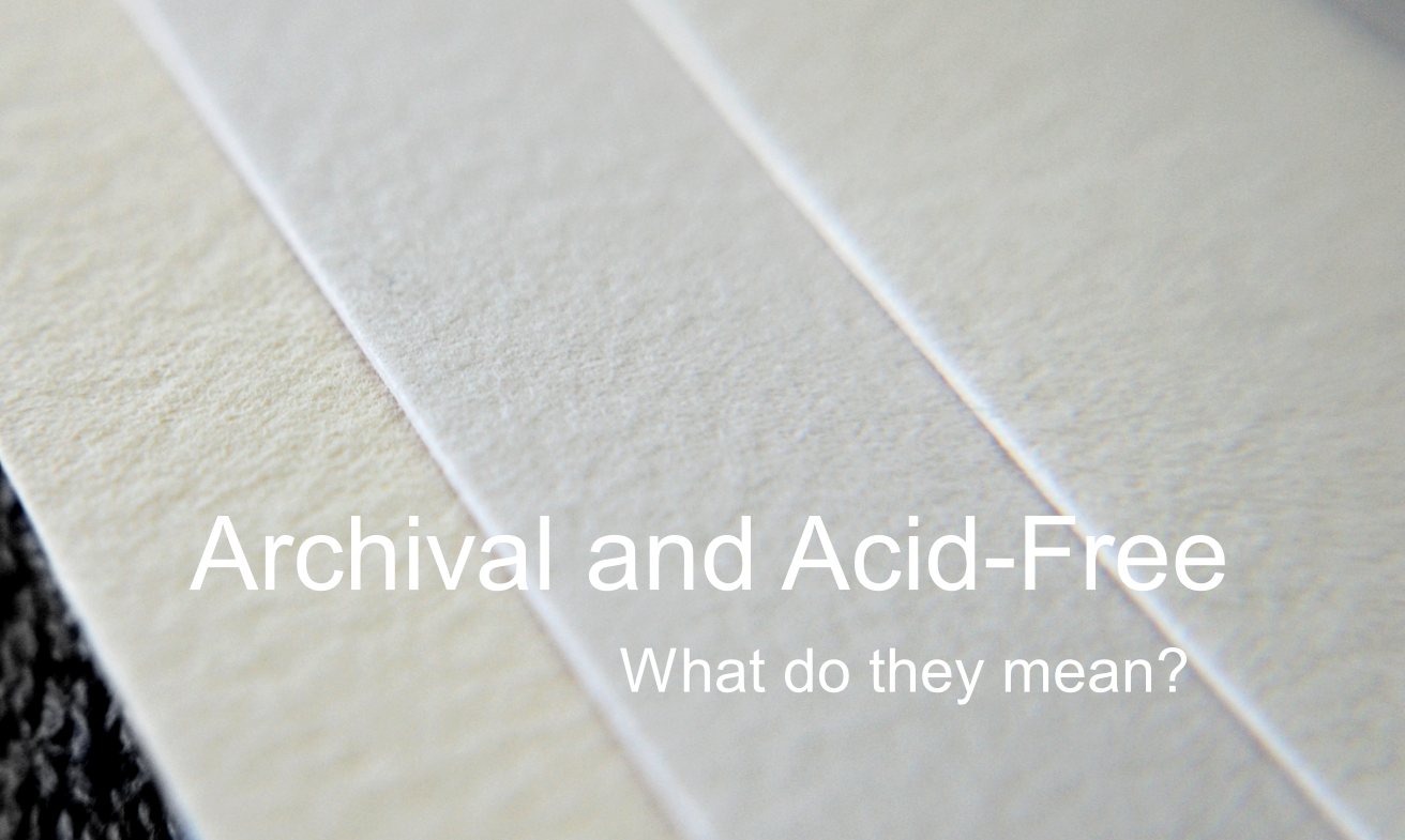 Acid-free paper is paper that has a neutral or alkaline pH, meaning it does not contain any acids that could cause deterioration or discoloration over time. Acid-free paper is more resistant to yellowing and fading, and it is better for the environment. Archival paper is paper that meets certain standards of permanence and durability, in addition to being acid-free. Archival paper should also contain no groundwood or unbleached pulp, meet strict limits on metallic content, and be free from optical brighteners, which artificially make the sheet whiter. Archival paper is often made with 100% cotton, which is considered to be the most stable and pure cellulose fiber. Acid-free paper is not necessarily archival, and archival paper is not necessarily acid-free. For example, an acid paper with buffers added could still deteriorate or yellow if the acid remaining in the sheet or formed during aging exceeds the buffering capacity. Conversely, an alkaline paper without any buffers could become acidic over time due to environmental factors.
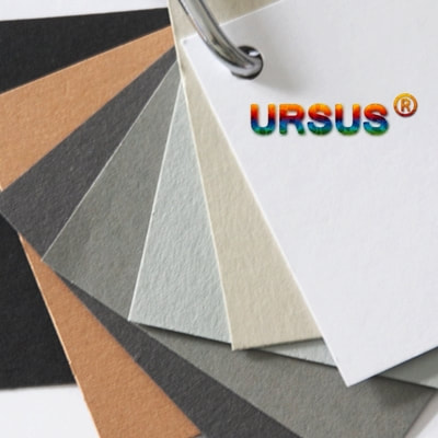
Most papers that have archival properties were originally designed for use in printing. However, certain papers, like Stonehenge, have gained popularity among coloured pencil artists due to their archival qualities. Archival papers are known for their lightfastness, which is typically assessed using the "Blue Wool" scale. This means that these papers do not fade over time or experience significant fading compared to non-lightfast papers. Conversely, non-archival papers like the Ursus line, are acid-free and can still be protected in various ways. If you intend to frame your artwork, it is advisable to use UV-protected or museum-quality glass as a means of safeguarding the artwork. Although this option may be more expensive, it provides the assurance of long-term protection. Did you know? If you cover the entire surface using lightfast products, the underlying material is protected from direct exposure to light. Lightfast products are designed to resist degradation when exposed to light, significantly reducing the rate of fading. However, it’s important to note that no product can completely eliminate fading, especially under intense or prolonged exposure to light. Regular maintenance and care are still necessary to preserve the appearance and quality of the surface. Advice for caring for your archival and acid free paper
The term “archival” is not regulated or standardised, and different manufacturers and archivists may have different definitions and criteria for what makes a paper archival. Therefore, it is important to check the specifications and certifications of the paper before buying it, and to look for reputable brands and sources.
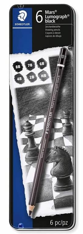
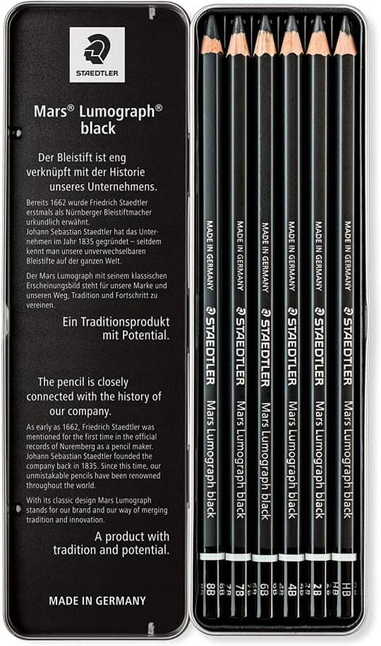
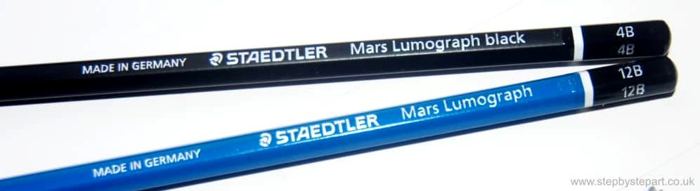
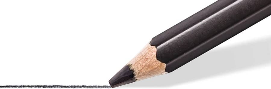
What’s your favourite type of paper for your art? Do you go for acid-free, archival, or a mix of both? We’d love to hear your thoughts in the comments! The Staedtler Mars Lumograph black pencil boasts a smooth matte finish, thanks to its high carbon content which gives it a deep and intense black hue. Using graphite pencils often results in a shiny finish, but this is eliminated when using the Lumograph black carbon pencils. Carbon and charcoal-based pencils are ideal for drawing, hatching, and creating expressive sketches and portraits. They produce deeper blacks than graphite pencils, making them a valuable addition to any art kit. In this article, we analyse their effectiveness and the different features they offer for graphite-based artwork. Our aim is to allow you to determine if they would make a useful addition to your own art kit. 
|
 |  |
| GRAPHITE PENCILS
| CARBON PENCIL
|
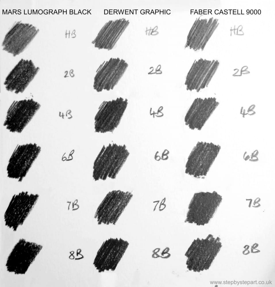
The composition of these pencils contain some graphite but are primarily carbon-based, resulting in a matte finish that diminishes the typical luster found in graphite pencils. Additionally, they are notably resilient, even in the darker grades, and do not flake during use. However, it is important to note that they are not well-suited for blending and cannot be fully erased.
If you want to achieve a dark and matte finish in your artwork, blending graphite and carbon pencils can be a great technique to try out. These two types of pencils can be combined to create a unique and striking effect that will enhance the overall look of your work. They work best for techniques like hatching or stippling that don't require blending. Why not try them and see how it can elevate your art to the next level.
Customer feedback:
(Via Amazon)
" Great pencils.... I've always disliked how I'd get a shiny graphite tone when using 6B+ grades. I found charcoal and charcoal pencils don't blend with graphite to get black blacks but these do. "
" Leads are good and don't break readily. Would recommend. "
" After years of using graphite and carbon for drawing, I constantly look for new products. While the Staedtler 7B and 8B provide contrast, I found the Lyra and Faber Castell PITT Oilbase carbon pens more suitable. The Mars Lumograph black still feels like a graphite pencil and the degrees of hardness are unequal, for example, the 2B felt visibly harder than the HB. The 4B broke often, whilst the 6B was fine. However, they still have that shimmer found in graphite blends. The 7B and 8B pencils were harder than expected for their grade level. The level of graphite was noticeable, resulting in shades that are appropriately black. These pencils are unsuitable for my needs as they do not produce my desired effect and have unpredictable degrees of hardness." Translated from German
Staedtler Mars Lumograph standard versus Lumograph Mars black
Answer:
Yes, They are significantly different. The black option is much darker and produces far less shine. Having both is a good choice.
Question and answer from the Amazon webstore.
Have you tried these pencils yet? please share your own personal opinions of them in the comments below.
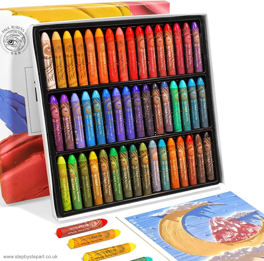
- Creamy Texture: They are super smooth and soft to use. The soft texture allows them to perform great for blending and mixing! Easy to colour with no effort!
- Novel Design: The new bullet design and cylindrical paint allow to grip and draw comfortably!
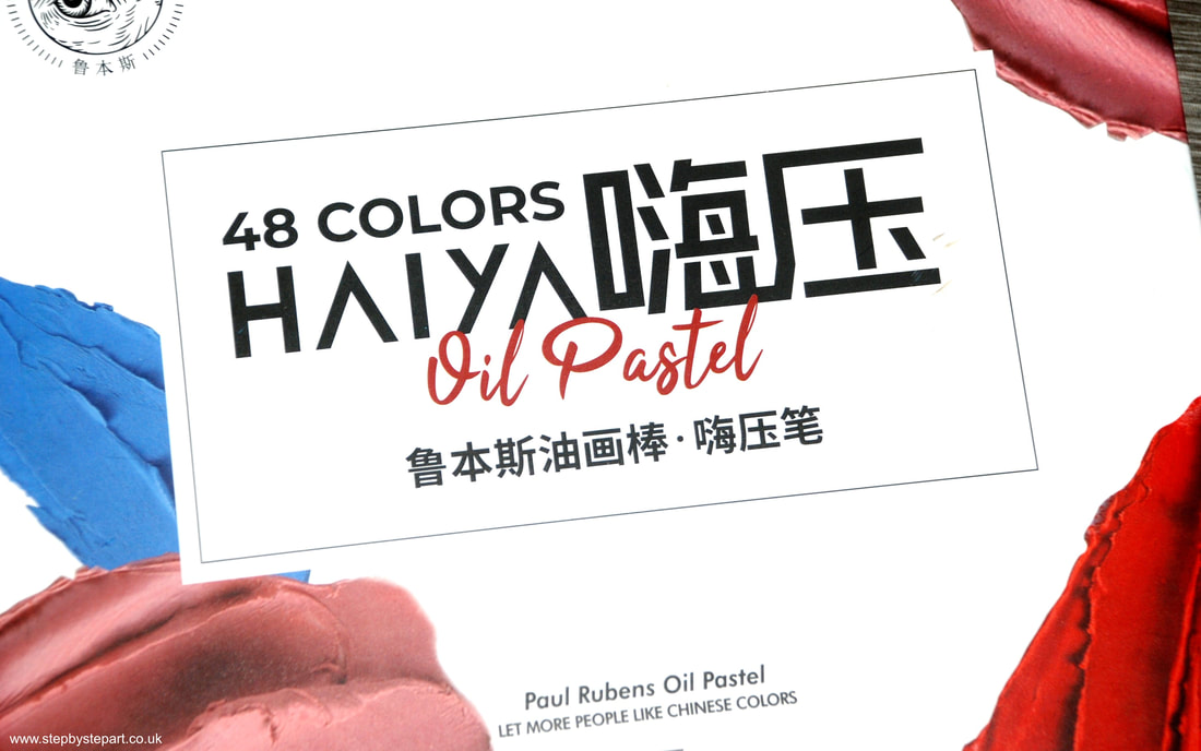
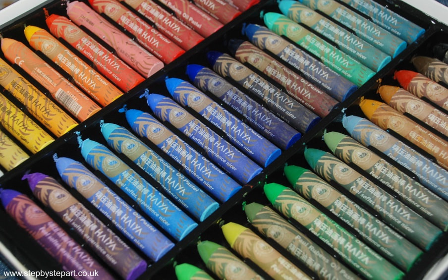
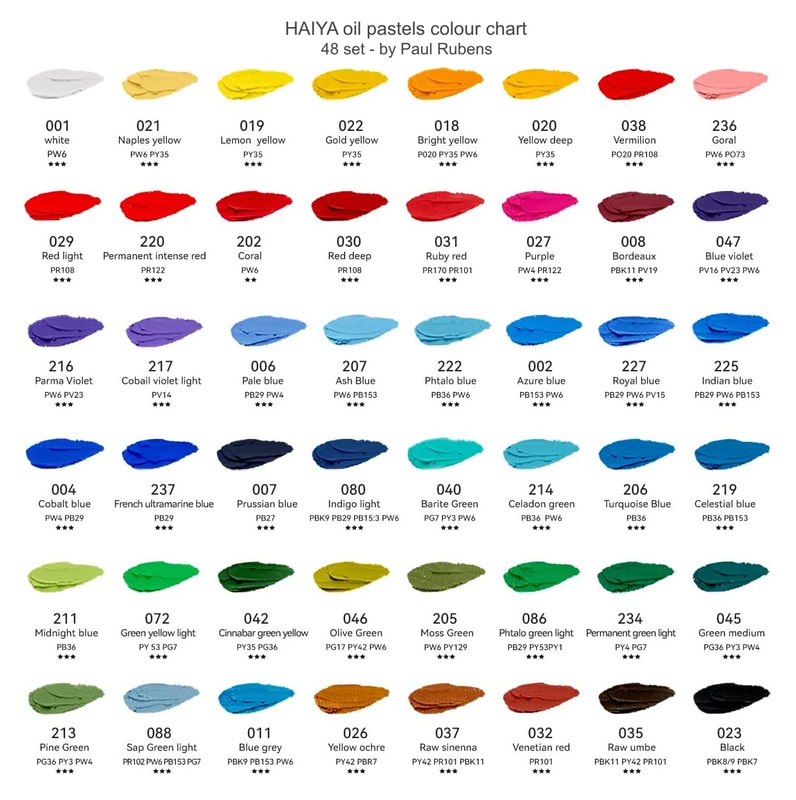
- 48 Vibrant Colours: 48 vivid colours and providing strong coverage, showing the texture effect of an oil painting!
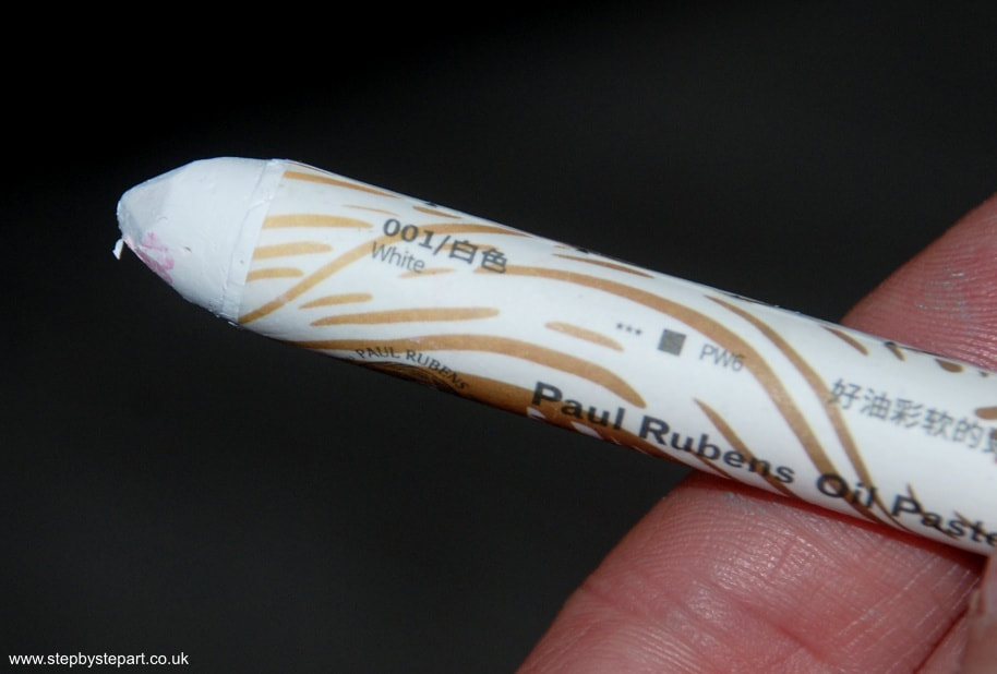
- Eco-friendly and High-quality Materials: The oil pastel set is made of eco-friendly materials and high-quality. Four seasons available, winter and summer seasons soft and hard degree changes very little.
- Affordable: This set of oil pastels is very affordable, high quality, and also perfect for beginners.
Ideal for the novice
You can purchase this set of 48 oil pastels on Amazon for approximately £30. They are considered to be of student-quality, which means they are priced similarly to other student-quality oil pastels and provide good coverage. If you are an amateur, this set is a great way to get a feel for the medium.
How do they compare to professional quality oil pastels?
Though Paul Rubens states their pastels are lightfast, we cannot find any information on the testing standards they use, so it is unlikely that they will be of the same rigorous levels that well-known brands use. Always ensure your artwork is correctly protected and avoid hanging your paintings in direct sunlight.
Our trial and findings
What do the symbols mean that are printed on the paper sleeve?
Unfortunately, these pastels are not currently available as open stock, which is a significant issue for a pliable medium like the oil pastel. The necessity of accessing additional colours is fundamental to the product's longevity.
Final thoughts
At this price, they would make an excellent addition to your oil pastel collection, and it won't break the bank if using them to practice your techniques or create art to reproduce into prints.
About the Paul Rubens company
- 2008 Paul Rubens art supply brand was established.
- 2008 Paul Rubens' 1st generation of artist-grade oil paints was successfully developed
- 2012 saw Paul Rubens' 1st generation of artist-grade watercolours successfully developed (launched in 2014)
- 2014 saw the 2nd generation of Paul Rubens artist-grade oil paints launched
- 2015 - 2016 Pearlescent solid watercolours were first launched and the 2nd generation of artist-grade watercolours were researched and developed, plus Paul Rubens' watercolour paper products, watercolour brushes, and watercolour auxiliary tools.
- 2016 - 2017, successfully developed the Paul Rubens star product, the artist-level 3rd generation "fresh new solid watercolour"
- 2018, the 3rd generation of Paul Rubens artist-level oil painting (blue packaging) was developed, and a series of alkyd resin products
- 2019, the Paul Rubens watercolour auxiliary material white ink was successfully launched
- 2020, Paul Rubens artist-grade oil painting colours (black packaging) launched
- 2021, the Paul Rubens oil pastel series officially launched
- 2022, Paul Rubens 4th generation of artist-level watercolour released
- Who is Paul Rubens? Is he a real person? Paul Rubens is just our brand name, not a pastel artist.
- Where is the company based? We are based in China
- Do you make your own products? The Paul Rubens company makes our own products. After several trials and visits to many artists, the founder of our brand went to Germany, Belgium, the Netherlands and other birthplace of oil painting, and finally established the brand Paul Rubens.
- Do they contain any animal products? No
- Are there any beeswax in this product? No
- Are they lightfast? Yes. Note the star ratings on each colour.
- What other art products do you sell? Watercolours and brushes, Oil paints, Soft Pastels, Oil Pastels, Acrylic paints.
- Do you have a website? Yes; Lightwish Art (lightswish.com)
- Do you have a social media account? Instagram
- Where can I buy your products? Visit the Amazon store here > >
- Where can I buy this set? HAIYA oil pastels 48 set
It is worth noting that we do not receive a commission for any products sold through this review. In this particular case, we were fortunate enough to receive this set without charge. We are committed to providing an impartial review of the product, and our opinions are based solely on our own experiences and observations.
Vertical Divider
|
|
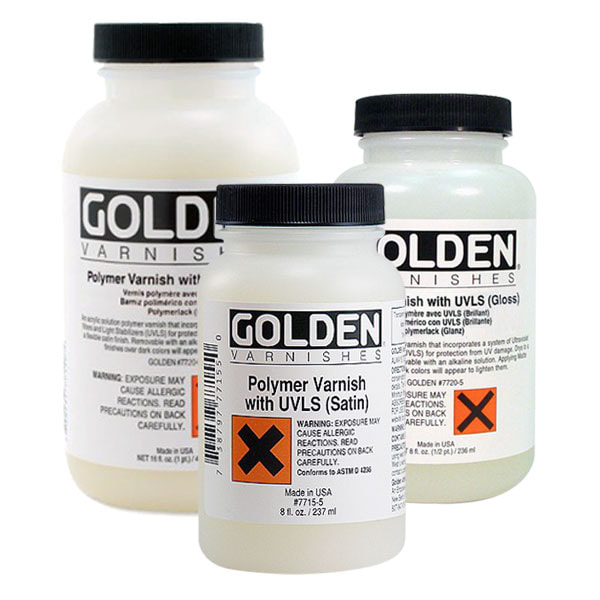
Why have GOLDEN discontinued their Polymer varnish range?
" Due to a raw material shortage, we are currently unable to produce our Polymer Varnishes (all sheens). We are working with suppliers to understand when these materials may be available again to resume production, but at this time, the shortage is expected to last through at least June (2021) "
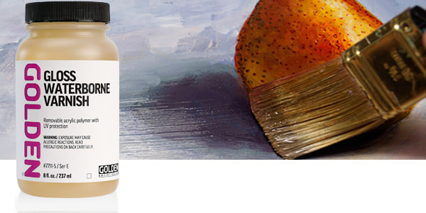
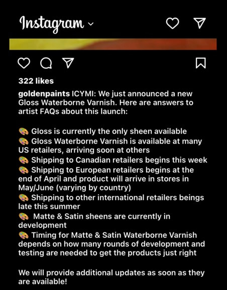
" First, we are excited to introduce our newly formulated Waterborne Varnish. After a raw material discontinuation forced us to halt production of Polymer Varnish in 2021, we fielded a number of artist requests for waterborne varnish for use on interior acrylic paintings (which can be applied without the need for harsh solvents for thinning, cleanup or removal, or ventilation and other precautions necessary when working with mineral spirit varnish.)
Gloss Waterborne Varnish is shipping now to retailers in the US and we're eager to get it into artist studios! Be on the lookout for updates later this year as a Matte sheen is currently in development. "
So, what is the waterborne varnish?
An isolation coat between the paint and varnish is recommended, to reduce interaction during varnish application or removal.
- Do not use on oil paintings or any artwork intended for outdoor display.
- Do not use on functional objects (such as furniture).
- Do not apply acrylics or oils over Waterborne Varnish.
Application & After care:
- Allow one week after last varnish coat before handling/packing/shipping.
- Avoid stacking of artwork and any direct contact with any materials during shipping or storage.
Please note the MSA varnishes are still available.
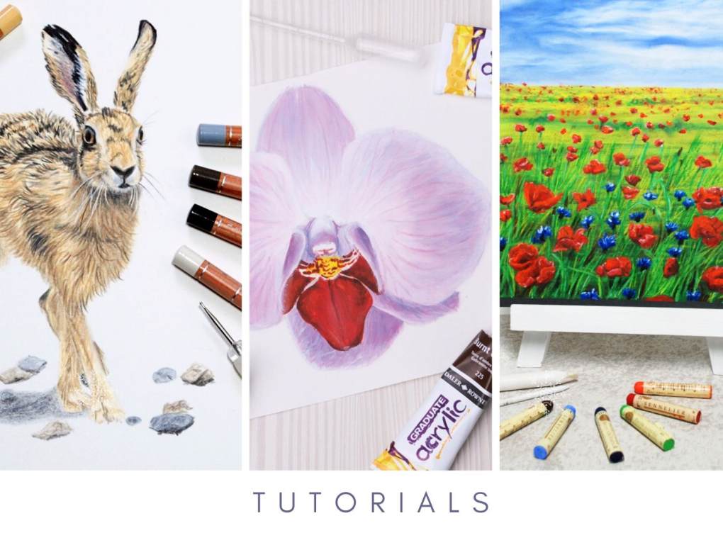
We like to cover a wide range of mediums and products in each article, so in this newsletter, we explore the Chromaflow coloured pencil range, the latest pencil produced by Derwent. Do we have a UK Prismacolor Premier pencil finally? Our second article covers the creamy oil pastels by Sennelier. Even if you don't work with oil pastels, you may find this article interesting, and you may even decide to try them yourself.
Finally, we have the latest 2023 art workshops now available to book, but for those who can't make one of our workshops, we have the latest tutorial for soft pastel artists. If you haven't tried soft pastels before, we highly recommend you give this tutorial a go. It's so easy and you don't need any previous experience to make a brilliant piece of art.
Click on any of the images below to visit the article and have a read. Why not grab a coffee, as we do throw lots of information into our articles, so we hope you enjoy them!
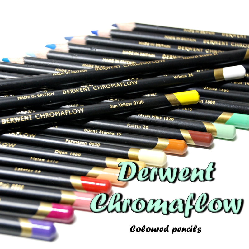
Derwents' new coloured pencil range
In this article, we analyse the quality and application of the pencils. Did we find the same quality that we have come to expect from Derwent?
We provide information from our own research, as well as reviews by other artists', found online. See how they compare to other brands, in particular with the highly popular Prismacolor Premier pencil, but with Derwents' other lines too.
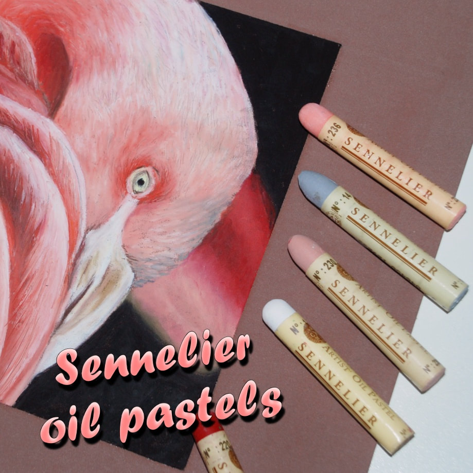
Sennelier collaborated with Picasso to create this lightfast oil pastel range
In this article, we explore the possibilities of this compelling brand and the rich history of the company. We discuss best practices, delve into lightfast properties and provide recommendations on effective accessories. Finally, we share the feedback of other users and our own thoughts on this product. Even if you have never used oil pastels before, this article may inspire you to give them a go.
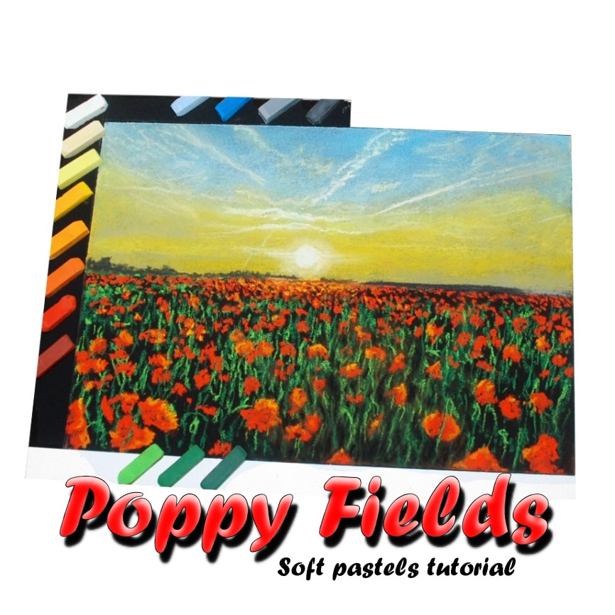
New tutorial - Poppy field on black base for soft pastel artists
Pastels are a quick and easy medium, making them ideal for the absolute beginner. We provide a simple breakdown of how to create an eye catching landscape of these sun-kissed poppies. We show you how to build the foundations and offer practical techniques. By providing images and descriptions, we offer an easy to follow guide for every artist.
You may just wish to pass the time with a box of pastel and a cuppa, simply because you like the composition. Wherever you are in the process, we encourage you to embellish as much as you want, or keep it as simple as we have. Why not give it a go?
2023 Art workshops
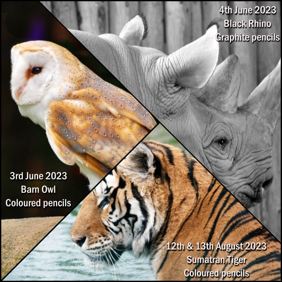
Why not come and join us!

|
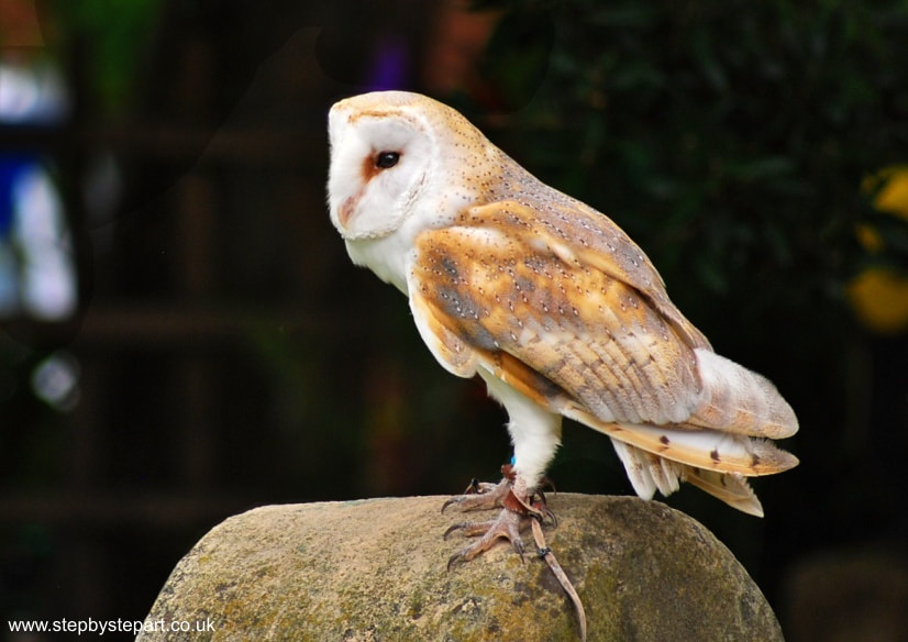
BARN OWL
THIS WORKSHOP HAS NOW COMMENCED Vertical Divider
|
BLACK RHINO
THIS WORKSHOP HAS NOW COMMENCED Vertical Divider
|
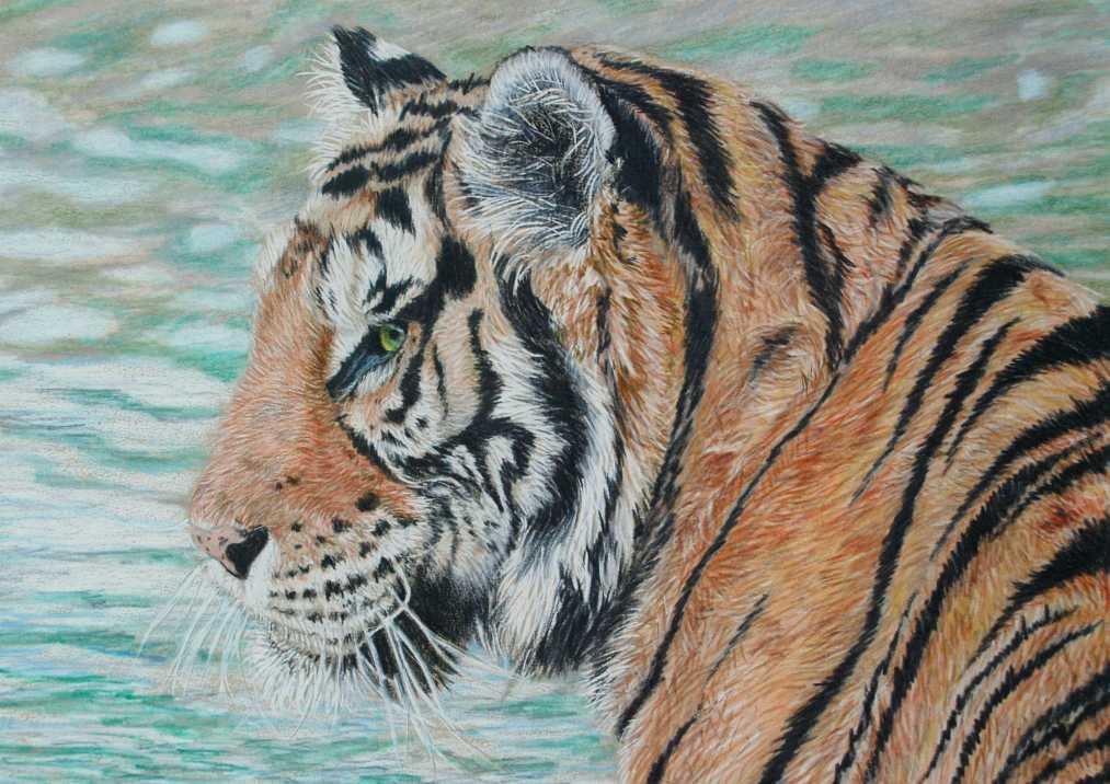
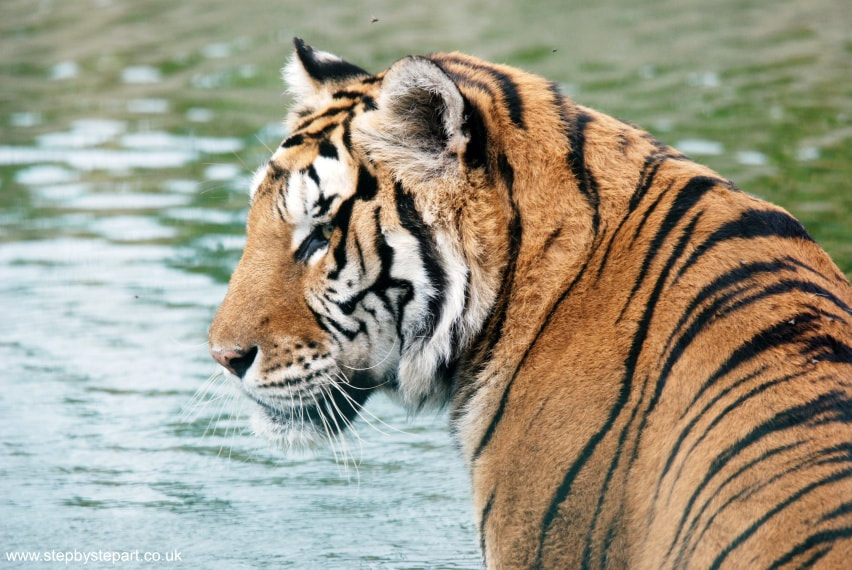
SUMATRAN TIGER
Saturday 12th & Sunday the 13th of August Coloured pencils 2-day workshop Time: 11:30am - 4:00pm From £110.00* *Art kits extra LOAN KITS £5.00 EXTRA HOME KITS £15.00 EXTRA |
Where is the workshop venue?
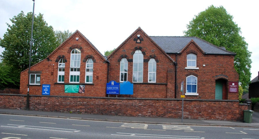
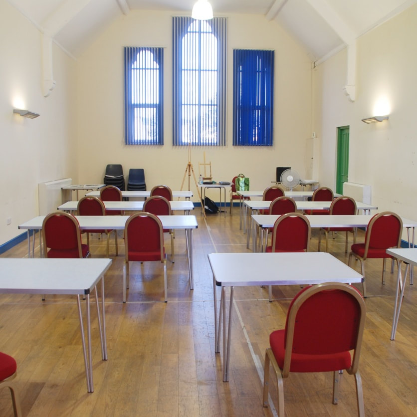 | Our workshops are run in Chesterfield, Derbyshire. The county borders the Peak District, which many will be aware of, maybe even visited in the past. If you have heard of the 'wonky spire', (officially known as the Church of St. Mary and All Saints), this is the town. PARISH CENTRE STONEGRAVELS 91 SHEFFIELD ROAD CHESTERFIELD DERBYSHIRE S41 7JH |
You don't need a large assortment of products. If you enjoy drawing outdoors, you can travel light, with no need for solvents and little to no mess.
The pencils are the most important part of the graphite toolkit, but they are more effective when combined with other products. In this blog, we discuss the five essential accessories for the graphite artist. If you are new to graphite pencils, you may prefer some over others, conditional on the style of your work. Let's take a look at them.
Although we don't lean towards any particular brand, we provide images of the products we use ourselves, or have chosen purely for representation.
We discuss five different styles of eraser, that, depending on your artistic style, could be of interest to you. Do let us know in the comments section at the bottom of this page, what your personal favourite eraser(s) is and why.
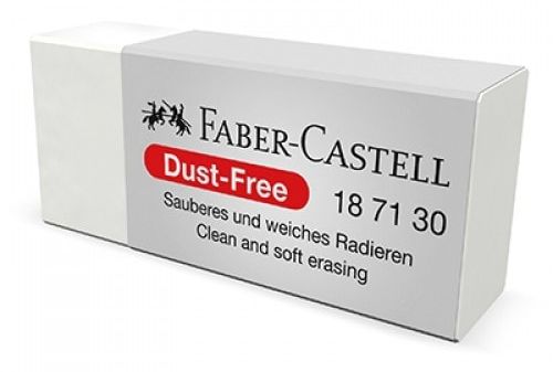
standard eraserThis style of eraser is most commonly used. The corners, edges and the flat surface can be used wherever you need to erase. Choosing a dust-free option minimises dust drop, and is safer. These erasers do not contain any harmful phthalates (chemical compounds), but contain a mixture of balanced plastics.
Vertical Divider
|
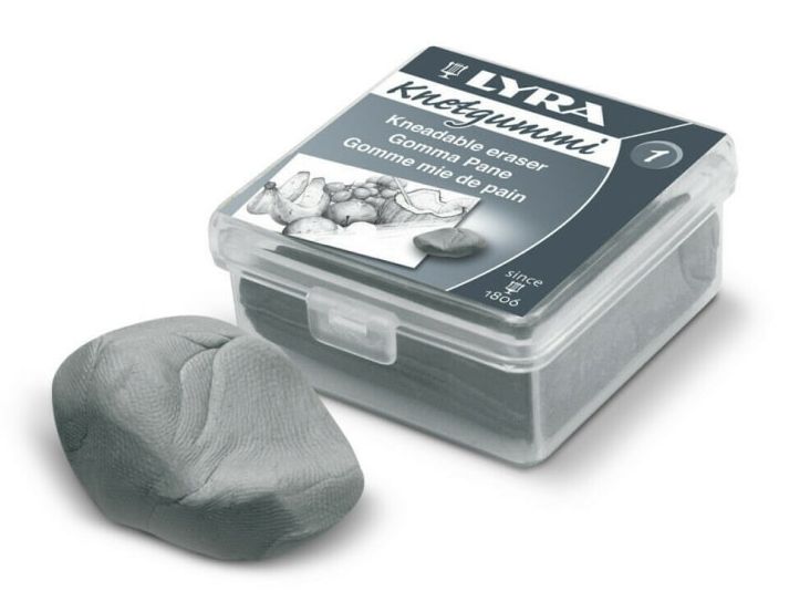
Kneadable putty rubberKneaded erasers have great flexibility, allowing you to stretch, compress, split, and mould it into shape to achieve precision. You can create highlights, clean edges and trim lines during the drawing process. You may struggle to remove dark marks, and they can also smear or stick if they get too warm.
|
PENCIL RUBBER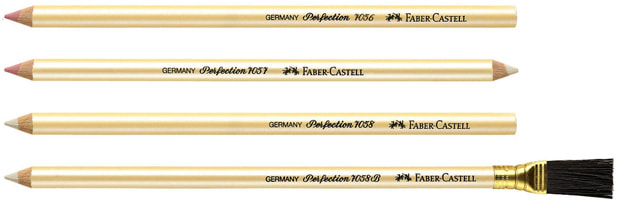
The Perfection Eraser Pencil is an eraser core in a wood-cased barrel. It is ideal for detailed erasing. The white end erases ink. The pink end erases graphite and coloured pencil.
Vertical Divider
|
PEN ERASER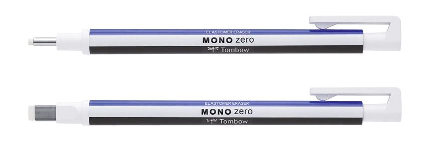
The refillable precision eraser Mono Zero Classic erases fine lines and small detailed corrections, where precision is essential. The classic version is available with round and rectangular tips.
|
the must-have eraser
Battery powered eraser
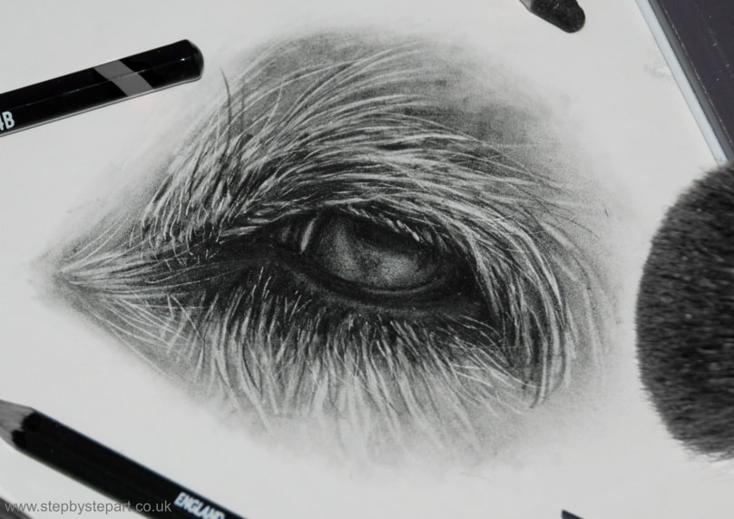
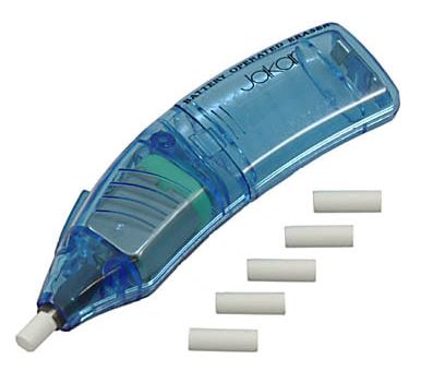 | 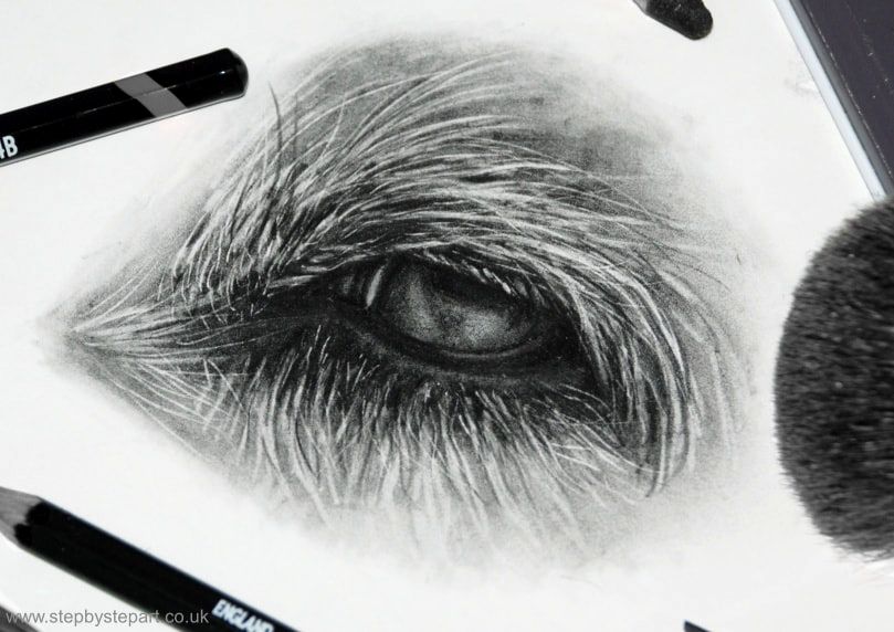 The white hairs were created with the battery powered eraser |
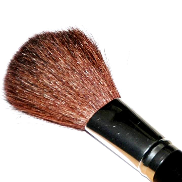 | soft brushAvoid touching your paper with your hands. The natural oils in your skin can transfer onto the paper, leaving behind smears and dirt that can stain. This may cause the graphite to congregate in patches, which you may struggle to remove. We recommend that you use a soft bristle brush to remove excess graphite or eraser dust from your paper, to avoid any surface contact. A make-up brush is a low-cost option. We recommend that you place a clean sheet of paper or glassine, between hand and drawing to avoid the transfer of oils. |
Emboss tools
 |
 |
blending tools
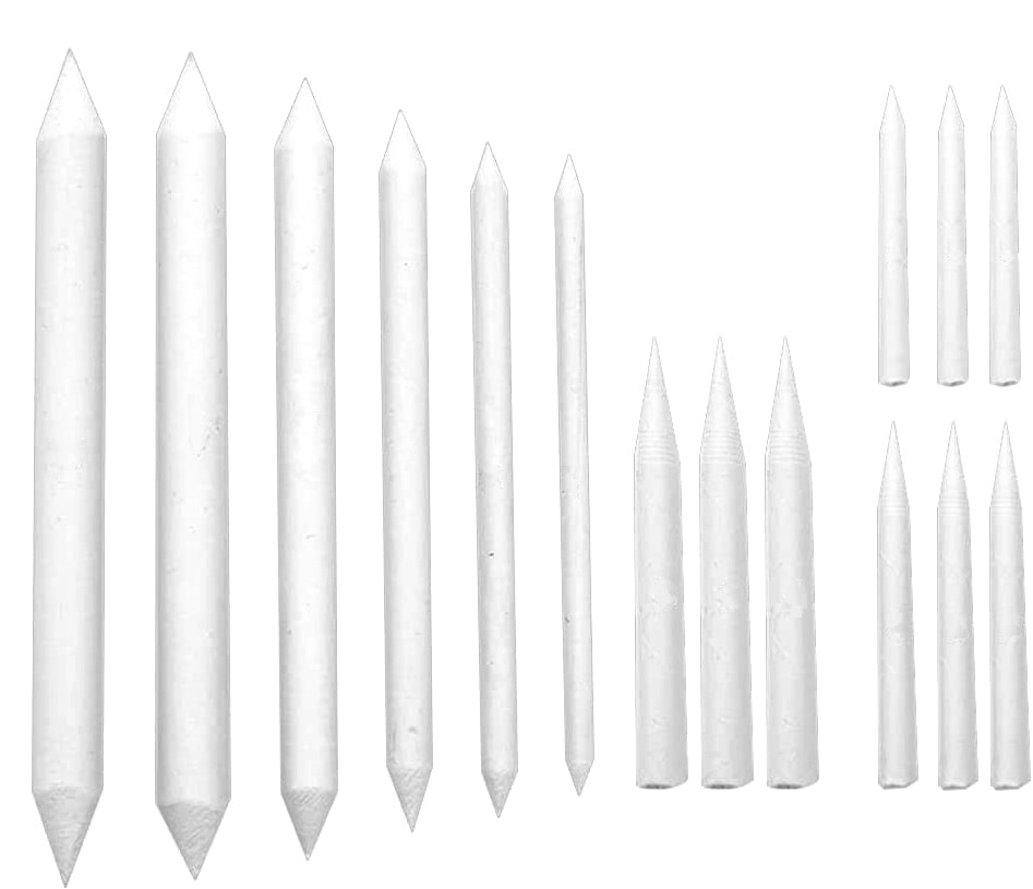
paper stumps & tortillions
 |  |
tissues
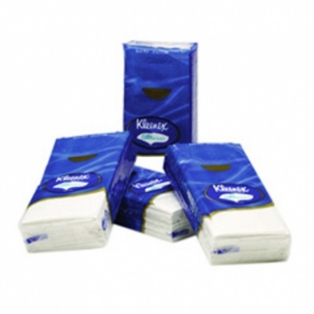 | 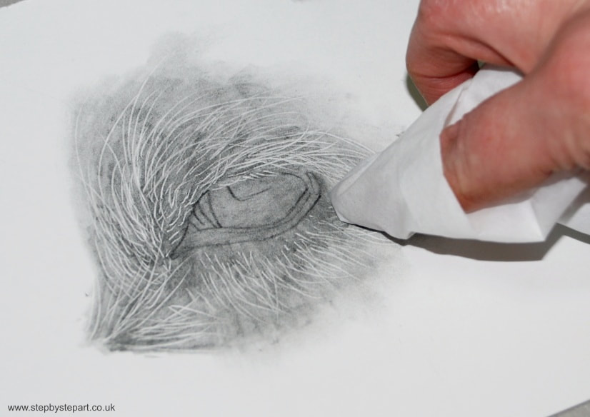 |
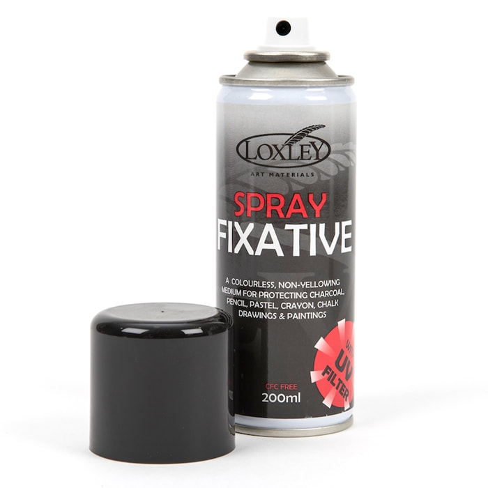 | fixativeIf you work with graphite pencils, we recommend that you fix your drawing once you have finished. It protects from accidental smudging (although it is not smudgeproof) and can add an extra layer of preservation if you buy a fixative with UV protection. It is important to keep some distance between the can and your artwork (around 12"), in order to achieve an even layer. Make sure you shake the can thoroughly, and give it a light, even spray, using deliberate motion of left to right and up to down. Don't over saturate. |
ADDITIONAL PRODUCTS THAT MAY BE USEFUL
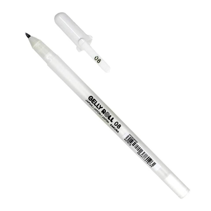 | 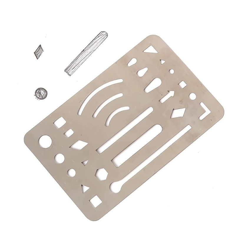 |
white gelly penIf you want to add some really vivid highlights into your drawing, the white Sakura Gelly roll pen is the ideal choice. With 3 nib sizes, it is waterproof, acid free and fade resistant. | ERASING SHIELD/STENCILThe drawing template shield is made of flexible stainless steel. They are very thin and work easily with an eraser. Good for precise and controlled erasing and drawing. |
LEAVE US A COMMENT
We like to cover a different medium or product, in each article, so this quarter, we provide a list of blending tools for soft pastel artists, a selection of black papers for artists who enjoy working on a dark surface. We have chosen various surfaces and brands, suitable for numerous mediums, not just pencils.
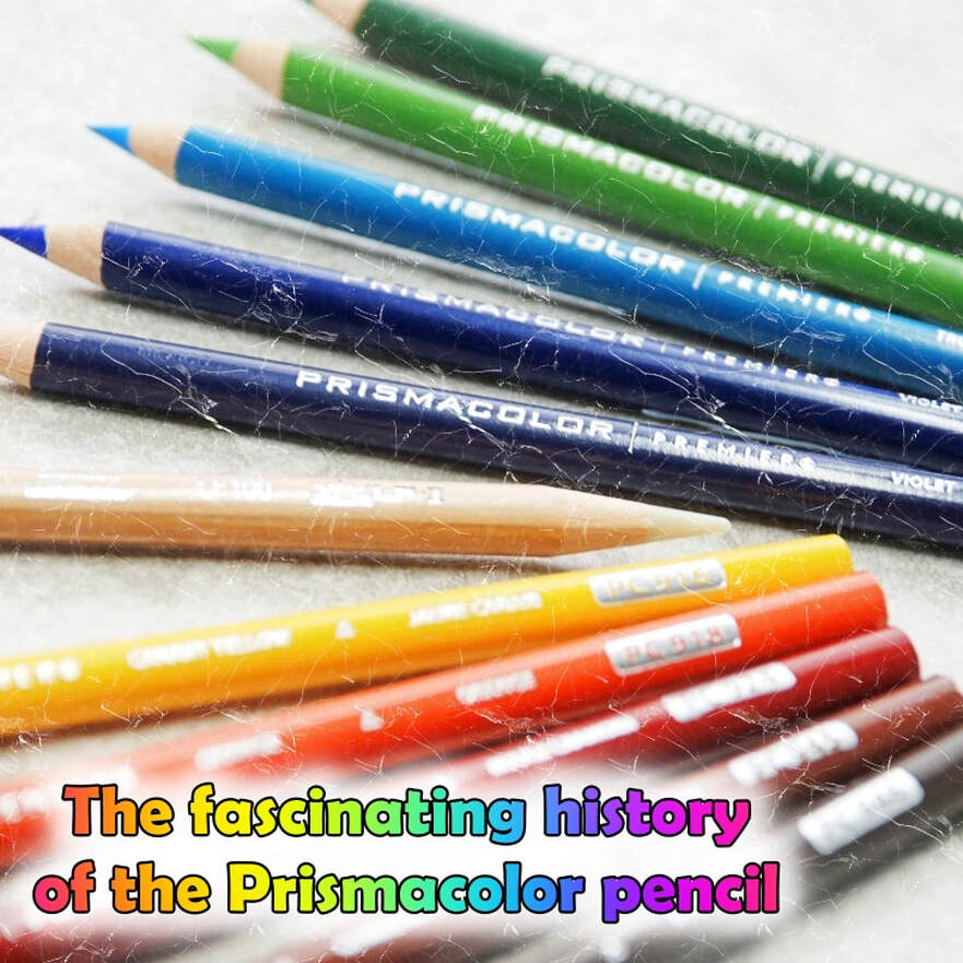
Finally, we have updated the Prismacolor pencil artist. We really delved deep into the history of these pencils and believe us, these pencils have a great history. They span over a hundred years! We also discuss what these pencils can achieve, as we are aware that they are a favourite of many coloured pencil artists.
Click on any of the images below to visit the article and have a read. Why not grab a coffee, as we do throw lots of information into our articles, so we hope you enjoy them.
About the Prismacolor pencil
Updated
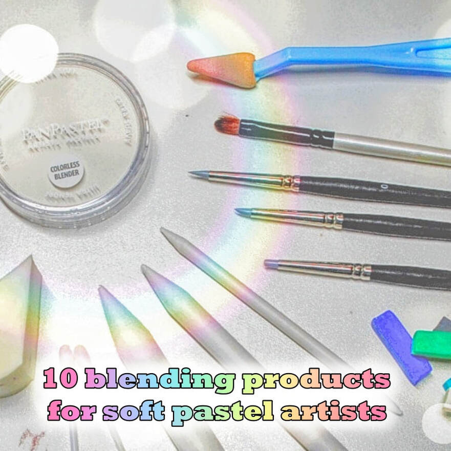
10 blending tools for soft pastels
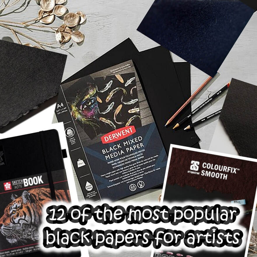
12 Popular black papers for artists
Brand new medium added to our tutorials section
Oil pastels
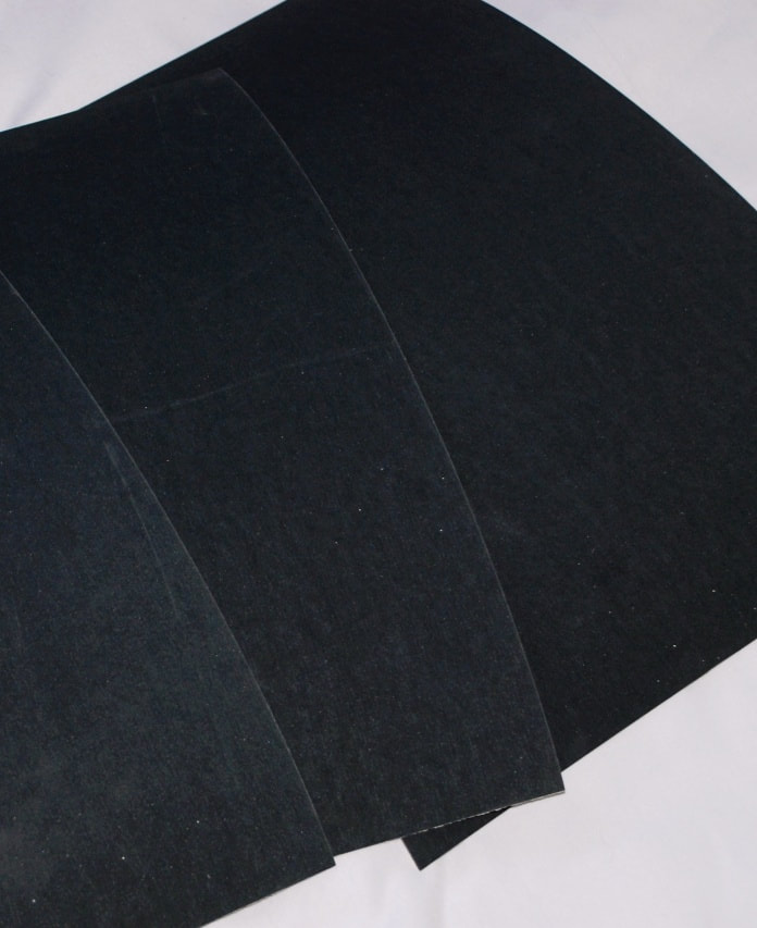
A list of 12 Black paper brands - Archival and Acid Free options
During our search for the 12 black surfaces we include in this article, we found there are far more options, with many companies producing their own ranges, in varying shades of black and different textures. The following article provides you with a selection of the most popular brands, including some lesser known, which are suitable for different mediums and offer varying textures, allowing you to choose the one(s) most relevant.
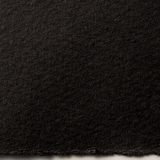
Somerset black
|
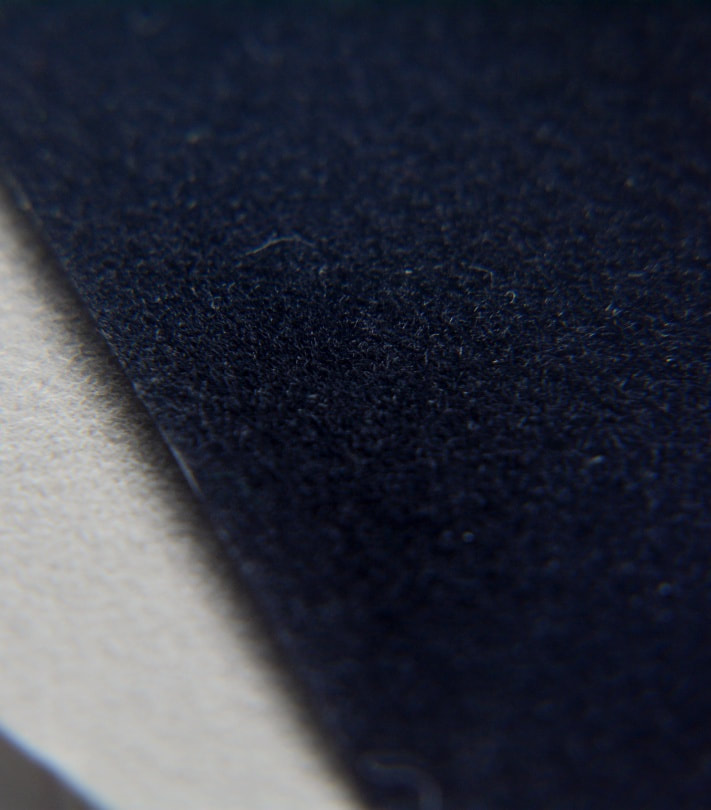
Somerset is a very popular grade of printmaking paper from the historic St. Cuthbert’s Mill in the UK, first introduced in the early 1970’s. In addition to its popularity in printmaking, Somerset found success as a wonderful drawing paper due to its soft handle and supple feel. Made with improved black pigments, Somerset Black has a deep, warm shade combined with a soft velvet surface. The internal structure of the sheet exhibits even darker fibres, which gives dramatic results, especially when laser etched. It is made to archival standards from 100% cotton and is fade resistant to the Blue Wool scale 6+. Mould made from 100% cotton to high archival standards.
Read our Somerset article. Company: St. Cuthbert's Mill
Weight: 280gsm Texture: Velvet (Like NOT surface) Composition: 100% Cotton Suitable for: Pastel, pencil and charcoal. Block/relief printing, embossing, intaglio/etching, hand/stone lithography, laser printing, letterpress and silkscreen/serigraphy. Sizes available: Sheets only (30" x 22" & 30" x 44") Company base: UK Accessibility: Limited suppliers. Vegan: Yes |
UArt Black paper
|
UART Premium Sanded Pastel Paper accepts a wide variety of wet media for underpainting without compromising or damaging the tooth. The company states that you can add layer upon layer, correcting and creating, without impairing the surface of your artwork. From the toothiest grade (240), which is ideal for blending and layering, to the finer grades that are perfect for delicate and detailed work. You can add layer on top of layer without losing tooth. The abrasive surface eliminates the need for fixatives. The colour of the paper fluctuates depending on which grades you are using: while the 400 & 500 grades provide a rich black texture, the 600 & 800 grades lean towards a dark charcoal colour, as the higher the grade, the smaller the pigments. UART employs a state-of-the-art manufacturing process that ensures a consistent grain application on every inch of the paper.
Read our UArt dark paper article. Company: Uneeda
Grades: 400/500/600/800 (Abrasiveness) Texture: Abrasive Composition: Unsure - This is a sandpaper Suitable for: Pastels, Pencils, Charcoal, Watercolour, and Conté. Accepts all wet media (alcohol, mineral spirits, turpentine, water) for underpainting. Sizes available: Sheets, Mounted boards and rolls. Company base: New York, USA Accessibility: Accessible in various countries Vegan: Yes |
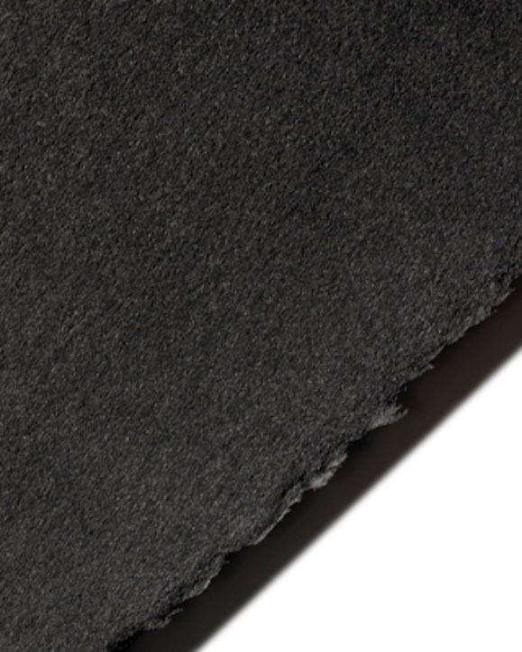
Stonehenge black
|
Stonehenge was created in 1972 specifically as a 100% cotton deckled paper for the printmaking community. Over the years, it has gained worldwide recognition as a paper that works well across a range of other fine art applications. The paper of choice of many members of the Colored Pencil Society of America, Stonehenge has the ability to take multiple layers of wax-based and oil-based coloured pencil without any buildup, allowing colours to penetrate and absorb into the surface of the sheet. Neutral pH and no optical brightening agents (OBA's can cause fading).
Read our Stonehenge article. Company: Legion
Weight: 250gsm Texture: Vellum Composition: 100% Cotton Suitable for: Coloured Pencil, Pen & Ink, Pastel, Charcoal, Watercolour, Hand Lithography, Intaglio, Letterpress, Offset, Relief Printing and Silkscreen Sizes available: Sheets & rolls Company base: USA Accessibility: Easier to access in the USA Vegan: Yes |
Velour pastel
|
Velour paper is an artist quality pastel paper with a velvety texture that grips soft pastel and give them a delicate soft edge. Hahnemuhle Velour is an artist-quality 260gsm pastel paper which is both acid-free and archival. It is composed of an acid-free backing sheet which is coated with inert synthetic fibres. This gives the surface a velvety feel which has sufficient tooth to hold soft pastel, as well as oil pastel, charcoal or soft pencils. Velour can hold a lot of pastel, so it is perfect for painterly pastel artists who create works with soft edges and is particularly suited to pet portraiture.
Company: Hahnemühle
Weight: 260gsm Texture: Texture Composition: Cellulose Suitable for: Soft & Oil pastel, soft pencil, Charcoal and Conté crayons. Sizes available: Sheets and pads Company base: Germany Accessibility: Although not widely available, it is accessible online. Vegan: Yes |
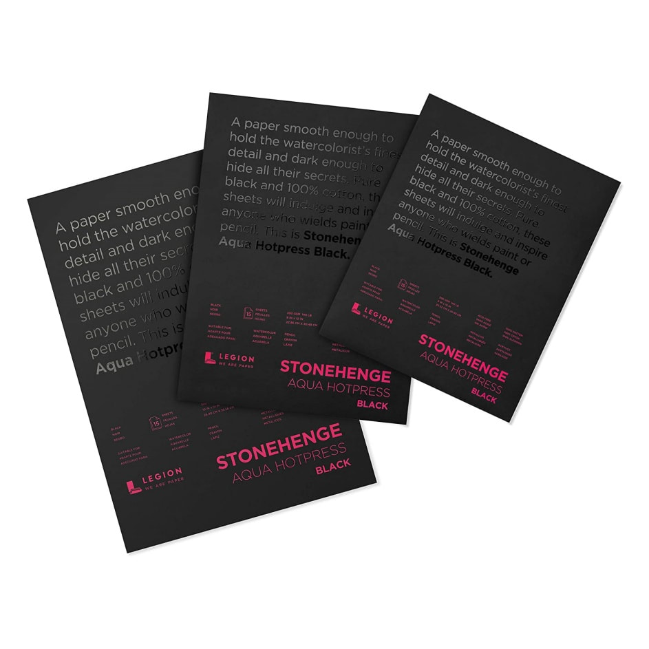
Aqua Stonehenge
|
Stonehenge Aqua Black Watercolour paper is a cotton paper with excellent wet-on-wet performance. Paint can be easily manipulated without drying up. Like any other top-quality watercolour paper, it withstands repeated wetting/drying with no damage to the paper. The paper allows for easy lifting and blending and ensures you have excellent control of your colours.Colours won't blur, bleed, or mix in undesirable ways like other black papers can. It holds multiple layers of colour and holds up to masking and scrubbing.
Company: Legion
Weight: 300gsm Texture: Hot pressed and NOT Composition: 100% Cotton Suitable for: Coloured pencils, Pen & Ink, Pastel & Charcoal, Metallic/Interference/Iridescent paint, Gouache, Acrylics, Watercolour, Watercolour pencil, Pigment sticks, Markers, Calligraphy, Intaglio, Letterpress and Silkscreen. Sizes available: Blocks, pads and sheets Company base: USA Accessibility: Available but easier to access in the USA Vegan: Yes |
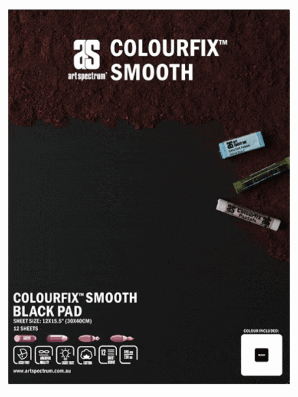
Colourfix™ black
|
Colourfix papers are sheets of high-quality, archival 300gsm hot pressed European watercolour paper, screen printed with Colourfix Primer. The natural, toothy surface will hold multiple layers of pastel without the need for fixative, allowing the velvet bloom and vibrant colour of pastel to be preserved. Erasing is also easy with Colourfix™ – simply lift off excess pastel with clear adhesive tape, brush off with a dry brush, or use a pencil eraser. Alternatively, errors can be overpainted or areas touched up with the matching colour of Art Spectrum Colourfix™ Primer. The tough, toothy surface can be sanded, scrubbed, soaked and reworked over and over.
Read our Colourfix smooth article. Company: Art Spectrum
Weight: 340gsm Texture: Fine (Smooth), Medium (Original) & Rough (Supertooth) surfaces Composition: 100% Cotton and primer Suitable for: Pastels, oil colours, acrylics, inks, oil pastels, gouache, watercolours and dry media such as charcoal and pencils. Sizes available: Sheets and pads Company base: Australia Accessibility: Available across many countries. Vegan: Yes |
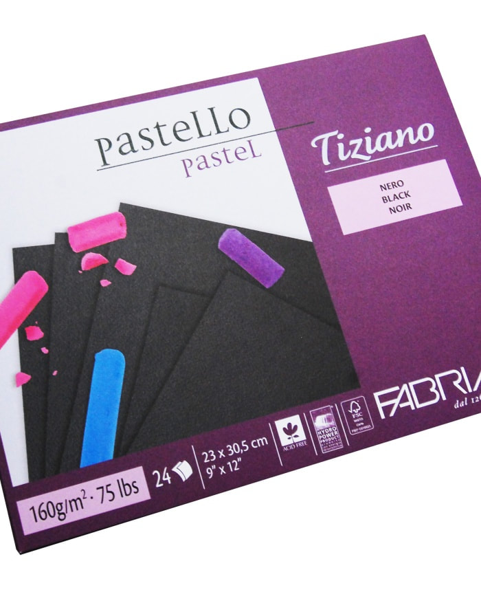
Tiziano pastel paper
|
Tiziano is a high rag content, acid-free, pH neutral and with high archival permanence. The colours are highly lightfast. It is a cold press surface, containing cotton. Tiziano is Acid Free, produced with ECF pulp (Elemental Chlorine Free), FSC® certified from forests responsibly managed respectful of environmental, social and economic standards. Particularly suited to soft and oil pastels due to its good pigment uptake.
Company: Fabriano
Weight: 160gsm Texture: Tooth Composition: High rag content Suitable for: Pastel, pencil, graphite, charcoal and airbrush. Can also be used with all printing techniques. Sizes available: Sheets, pads and rolls Company base: Italy Accessibility: Easily accessible Vegan: Yes (Synthetic sizing) |
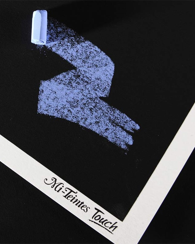
Mi-tientes 'Touch'
|
Canson Mi-Teintes Touch Paper is particularly suited to soft and oil pastels as well as pencil, but is also suited to wet techniques and acrylics. The Touch Paper is micro-abrasive with a finely textured, sandblasted finish. It is lightfast and age-resistant. The innovative surface holds the pigments and creates the possibility of superimposition of colours and colour mixing. Colours are rendered remarkably, and fine details stand out.
Read our Mi-tientes Touch article. Company: Canson
Weight: 350gsm Texture: Abrasive surface (Medium) Composition: watercolour paper and a primer Suitable for: Pastel, sanguine, charcoal, chalk and acrylic. Sizes available: Sheets & Pads Company base: France Accessibility: Not as accessible as its pastel paper Vegan: No. (sized with gelatin) |
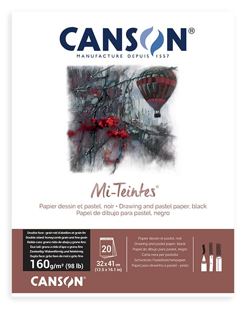
Mi-tientes pastel paper
|
This paper is a pulp-dyed colour paper that contains more than 50% cotton. It has the advantage of having a different texture on either side: a honeycombed side; and fine grain on the other. It has 50 light-resistant tones including the black. Pulp-dyed, colours are light-resistant and its high cotton content makes it both robust and flexible. Complies with ISO 9706 standards on permanence, to guarantee excellent conservation. It is acid-free and has no optical brightness additives (OBA's can cause fading).
Company: Canson
Weight: 160gsm Texture: 2 sided - Fine and Textured (Like NOT paper) Composition: Cotton rag (50% cotton) Suitable for: Pastel, charcoal, sanguine, pencil, even watercolours and gouache. Handicrafts such as folding, cutting, gluing, making cards, etc. Sizes available: Sheets, rolls and pads Company base: France Accessibility: Easily accessible Vegan: No. (sized with gelatin) |
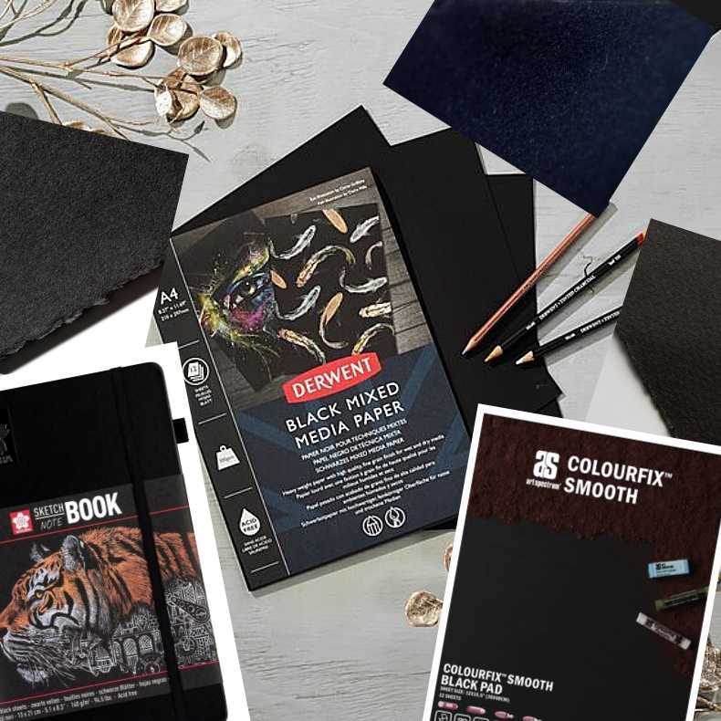
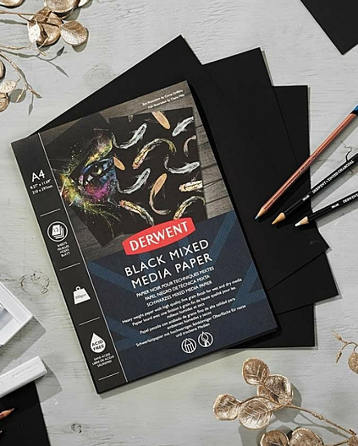
Derwent Black Mixed Media paper (New)
|
The Derwent Professional black paper pad is ideal for creating dramatic art with a variety of media types. This fine grain, smooth paper offers artists a dramatic backdrop that maximises the performance of metallic mediums, including metallic and opaque pencils, paints and inks. The heavyweight 300gsm composition provides a sturdy and reliable foundation of the highest quality for both wet and dry media, differing from other Derwent black paper surfaces that suit dry media only.
Company: Derwent
Weight: 300gsm Texture: Smooth Composition: 100% Recycled Suitable for: Pens, pencils, markers, inks. Wet and dry media. Sizes available: A4 Pad only Company base: UK Accessibility: New product 2022 - Derwent sell their products worldwide. Vegan: Uncertain |
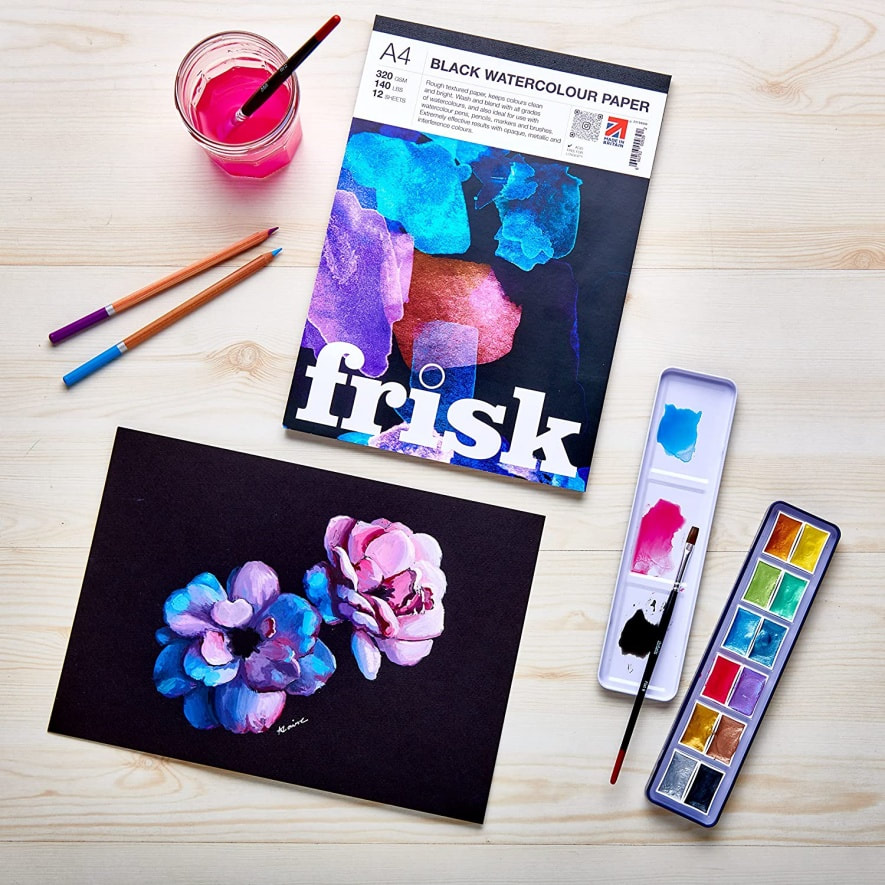
Frisk Black watercolour paper
|
Rough textured paper, keeps colours clean and bright. Wash and blend with all grades of watercolour. Extremely effective results with opaque, metallic and interference colours. Also available as a mixed media pad and a canvas pad.
Company: Artcoe
Weight: 320gsm Texture: Textured Composition: Unsure Suitable for: Watercolour, pens, pencils, markers and brushes Sizes available: Gummed pads (A6, A5, A4, A3) Company base: UK Accessibility: Products sold internationally Vegan: Uncertain |
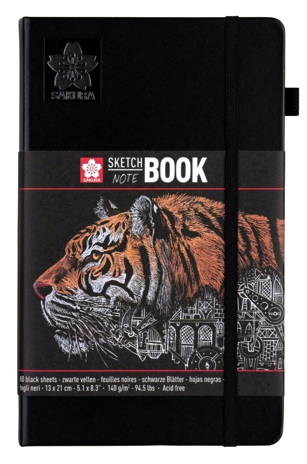
Sakura sketchbook
|
Sakura Sketchbooks and Notebooks are suitable for all ages, and for both experienced and aspiring artists. The hardcover book comes with a pen holder that perfectly fits pens such as the Pigma Micron and Sakura Gelly Roll. In the back of the Sketch notebook, an expandable envelope is included for storing sketches and notes. The elastic closure band ensures the book stays closed and compact when travelling.
Company: Royal Talens
Weight: 140gsm Texture: Smooth Composition: Acid free Suitable for: Ink, pencil, oil pastel & charcoal Sizes available: Notebook only (5 sizes) Company base: Netherlands Accessibility: Accessible online Vegan: Uncertain |
Which black paper surface do you prefer?
What is your favourite black paper not on this list and what medium do you use with it?
Any hints and tips for artists using black paper with a particular medium?
Please share your thoughts and ideas in the comments below, so we can help inspire other artists.
Author
Karen M Berisford
Archives
March 2024
February 2024
August 2023
May 2023
March 2023
February 2023
October 2022
June 2022
May 2022
April 2022
March 2022
July 2021
March 2021
December 2020
November 2020
August 2020
July 2020
January 2020
November 2018
June 2018
July 2017
January 2017
April 2016
March 2016
February 2016
June 2015
May 2015
March 2015
April 2014
December 2011
Categories
All
1 Day Art Workshop
1 Day Graphite Workshop In The UK
2 Day Art Workshop
Accessories For Artists
Acid Free Black Paper
Acid Free Paper
Acid-free Paper
Acid Free V Archival
Acid-free V Archival
Acrylic Articles
Acrylic Panel Board
Acrylic Varnishes
Alkaline Paper
Ampersand Pastelbord
Aqua Stonehenge
Archival Acid Free
Archival Acid-free
Archival Black Artist Paper
Archival Paper
Archivists
Arm Rest
Arm Support
Art Education
Articles On Art
Artist Essentials
Artist Light
Artists Easel
Art Lighting
Art Materials
Art Product Recommendations
Art Spectrum
Art Spectrum Colourfix Smooth
Art Studio Light
Art Tips
Art Tutorials
Arty Articles
Audrey Hepburn Art Workshop
Barn Owl Art Workshop
Battery Powered Eraser
Berol Karisma Pencils
Black Art Paper
Black Art Papers
Black Labrador Art Workshop
Black Labrador Coloured Pencil Art Workshop
Black Labrador In Coloured Pencils
Black Paper Tutorial
Black Rhino Art Workshop
Blenders
Blenders And Burnishers
Blending Soft Pastels
Blending Sponges
Blending Stumps
Blending Tools For Coloured Pencil Artists
Blending Tools For Graphite Art
Blending Tools For Soft Pastels
Blueberries In Coloured Pencil Tutorial
Blue Wool Papers
Brush And Pencil Colored Pencil Powder Blender
Buffers
Canson Mi-tientes
Canson Mi Tientes Touch
Canson Mi-tientes Touch
Caran D'Ache
Caran Dache Full Blender Bright
Caran Dache Luminance Pencils
Carbon Pencil
Carbon Pencils Help
Carbon Versus Charcoal
Cheap Coloured Pencils
Chesterfield Art Group
Chesterfield Art Tutor
Chesterfield Art Workshops
Chromaflow Pencils
Clairfontaine Pastelmat
Colored Pencil Magazine
Colored Pencils
Coloured Pencil Accessories
Coloured Pencil Article
Coloured Pencil Artists
Coloured Pencil Art Kit
Coloured Pencil Mini Tutorial
Coloured Pencils
Coloured Pencils Comparison Article
Coloured Pencils On Pastelbord
Coloured Pencil Tutor
Coloured Pencil Tutorial
Coloured Pencil Workshop
Colourfix Black
Colourfix Paper Review
Colourfix Smooth Black
Colour Shapers
Commission Art
Commission Art Business
Coronavirus
D33200
D33500
Daler Rowney Graduate Acrylics
Daylight Company
Derbyshire Art Workshop
Derwent
Derwent Black Mixed Media Paper
Derwent Blender
Derwent Blender Pen
Derwent Burnisher
Derwent Chromaflow
Derwent Coloured Pencils
Derwent Coloursoft Pencils
Derwent Graphic Pencils
Derwent Graphite Pencils
Derwent Lightfast
Derwent Lightfast And Zest It
Derwent Lightfast On Pastelbord
Derwent Metallics
Derwent Onyx
Derwent Onyx Pencils
Derwent Pencils
Discontinued Product
Dogs Eye In Graphite Pencil Tutorial#
Drawing A Hare
Dust Free Eraser
Embossing Tools
Environmental Paper
Erasing Carbon Pencils
Erasing Shield/stencil
Ergonomic
Ergonomic Arm Rest
Faber Castell Graphite 9000
Faber Castell Pastel Pencils
Faber Castell Polychromos Pencils
Fabriano Tiziano
Fixative Spray
Free Art Tutorials
Frisk Black Watercolour Paper
Frisk Paper
Gallery Oil Pastels
Gelly Roll Pens
Gesso
Gesso Panel
GOLDEN
Golden Polymer Varnishes
Golden Varnishes
Golden Waterborne Varnish
Grahite Lemur Art Workshops
Graphite Artist Help
Graphite Mini Tutorial
Graphite Pencil Accessories
Graphite Pencil Help
Graphite Pencils
Graphite Pencils Article
Graphite Pencils Art Workshops
Graphite Pencil Tips
Group Advertising
Hahnemuhle Velour
HAIYA
HAIYA Oil Pastels
Hare
Hints And Tips
Hot Pressed Watercolour Paper
How To Blend Soft Pastels
Indenting Tool
Inktense Pencils
Inscribe Pastels
Jackson's Art
Jackson's Art Gesso Panel
John Graham Artist
Karen M Berisford
Karen M Berisford Art Articles
Karismacolor
Kingfisher Art Workshop
Kneadable Putty Rubber
Ko-fi
Learn Coloured Pencils
Learn How To Draw With Coloured Pencils
Learn How To Draw With Graphite Pencils
Learn How To Draw With Pastels
LED Lights
Legion Aqua Stonehenge
Legion Stonehenge
Lemur UK Pencil Workshop
Light For Craft Art
Loxley
Loxley Fixative
Lumi Light
Luminance Pencils
Luminance Portrait Colours
Lyra Splender Blender
Mars Black Pencil
Mars Lumograph Black
Mini Art Tutorial
Mi Tientes Black Pastel Paper
Mi Tientes Touch Black Paper
Mi-tientes Touch Black Paper
Mi-tientes Touch Paper
Mono Zero Erasers
Moulin Du Roy
Newbiggin By The Sea Art Workshops
Newbiggin-by-the-sea Art Workshops
Newbiggin-by-the-sea Pet Artists
Northumberland Artists
Oil Paint Articles
Oil Panel Board
Oil Pastel Art
Oil Pastels
PAINT Magazine
Panel Board For Painters
Pan Pastels
Paper For Acrylics
Paper For Coloured Pencils
Paper For Pastels
Paper Quality
Paper Stumps
Pastel Applicators
Pastel Articles
Pastel Blending
Pastelbord
Pastelmat
Pastel Surfaces
Paul Rubens
Paul Rubens Oil Pastels
PDF Art Tutorials
Pencil Art
Pencils For Beginners
Pencil Workshops
Perfection Eraser Pencil
Pitt Pastels
Polymer Varnish Discontinued
Poppy Field Tutorial
Portrait Pencil Palette
Prismacolor Blender
Prismacolor Premier
Rabbit Coloured Pencil Art Workshop#
Rabbit In Coloured Pencils
Red Squirrel
Ring Tailed Lemur Art Workshop
Robin In Coloured Pencils
Royal Talens Sakura Notebook
SAA Article
Sakura Notebook Black Sheets
Sennelier
Sennelier Oil Pastels
Shetland Sheepdog UK Pencil Workshop
Snow Leopard Eye Art Workshop
Soft Pastel Articles
Soft Pastel Help
Soft Pastels Articles
Soft Pastels Tutorial
Stabilo Carbothello Pastel Pencils
Stabilo Pastel Pencils
Staedtler
Staedtler Lumograph
Staedtler Mars
Starting Out With Graphite Pencils
Starting Your Own Art Business
St Cuthbert's Mill Somerset
Step By Step Art Tutorials
Stonehenge Black
Strawberry Art Tutorial
Student Quality
Studio Lighting
Studio Practices
Sumatran Tiger Art Workshop
Tiziano Black Pastel Paper
Tortillions
Uk Art Workshops
Uk Coloured Pencil Workshop
Uncradled Gesso Panel
Uneeda UArt Paper
Unison Pastels
Ursus
Waves In Coloured Pencils
WH Smith Colouring Pencils
Wild Rabbit Art Workshop
Workshop Series
YouTube Channel
Zest It
Zest It Pencil Blend
 RSS Feed