|
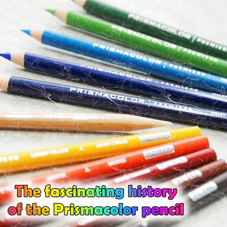
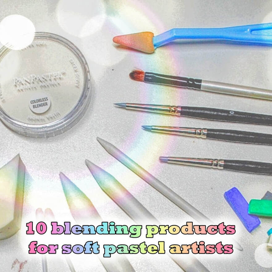
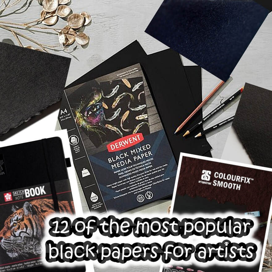
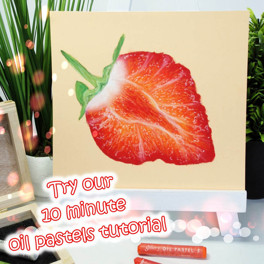
Our newsletter has dropped and we have four new articles, including a brand new medium for our mini tutorials section, the oil pastel. If you haven't tried oil pastels, we would highly recommend you give them a go. Our new tutorial only takes 10 minutes to create a highly effective piece of work, and maybe you will fall in love with the medium too? We certainly love them! We like to cover a different medium or product, in each article, so this quarter, we provide a list of blending tools for soft pastel artists, a selection of black papers for artists who enjoy working on a dark surface. We have chosen various surfaces and brands, suitable for numerous mediums, not just pencils. Finally, we have updated the Prismacolor pencil artist. We really delved deep into the history of these pencils and believe us, these pencils have a great history. They span over a hundred years! We also discuss what these pencils can achieve, as we are aware that they are a favourite of many coloured pencil artists. Click on any of the images below to visit the article and have a read. Why not grab a coffee, as we do throw lots of information into our articles, so we hope you enjoy them. About the Prismacolor pencil |
 |  |
Download the CPM app
About the reference image
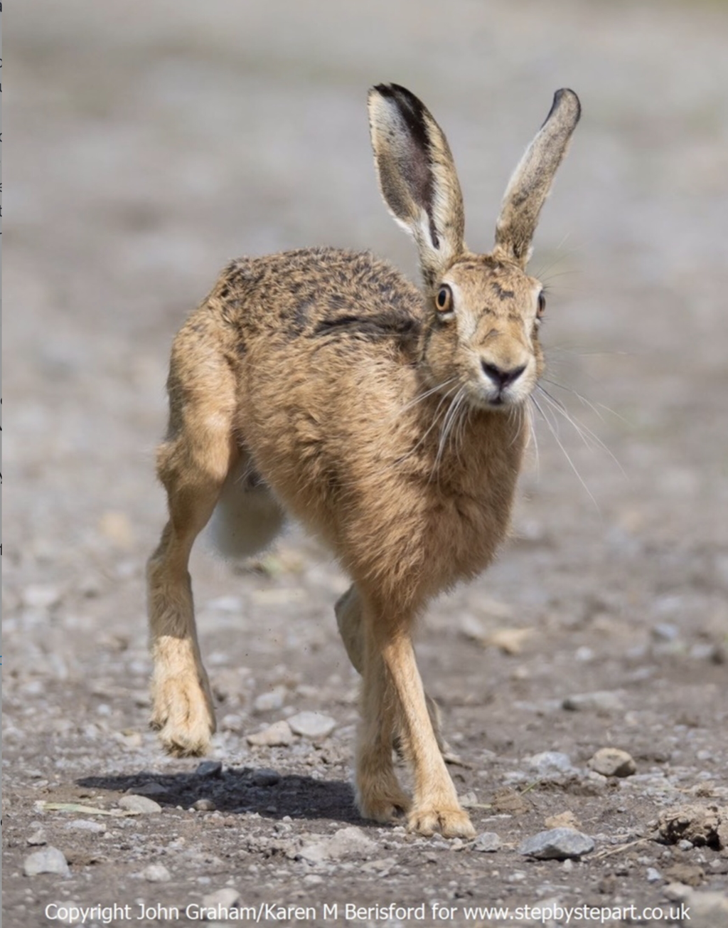 | My partner John Graham photographed this Hare back in October 2019. It was very inquisitive. Whilst John sat motionless on the ground; the Hare came closer, allowing him to capture this image and the second one below. This high definition photo can be used as a reference during the construction of your drawing. 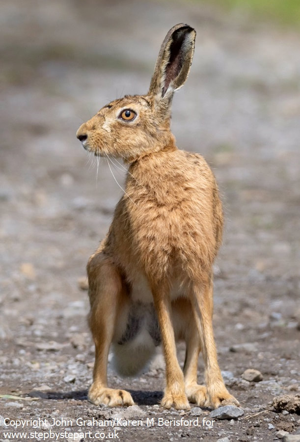 |
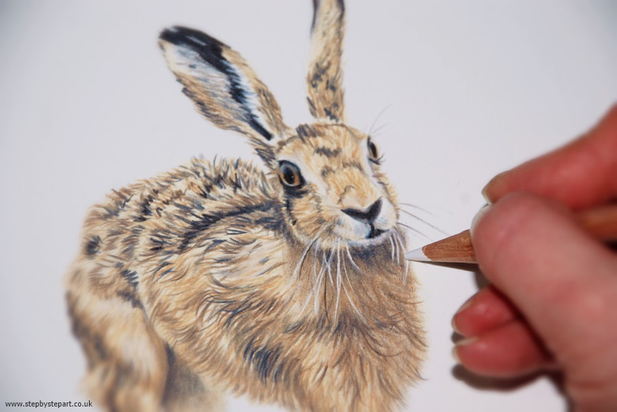
If you haven't read this magazine before, you may find it a valuable resource as not only does it provide plenty of data on coloured pencils, it occasionally covers other mediums like pastel pencils and marker pens. There is an abundance of articles offering hints and tips, tutorials like this Hare above, regular competitions, a peek into the lives and studios of other artists and even guidance on the art business. They also have Facebook, Twitter and Instagram pages too so you can get involved in those competitions wherever you are in the world - I even had a go myself a few years ago!
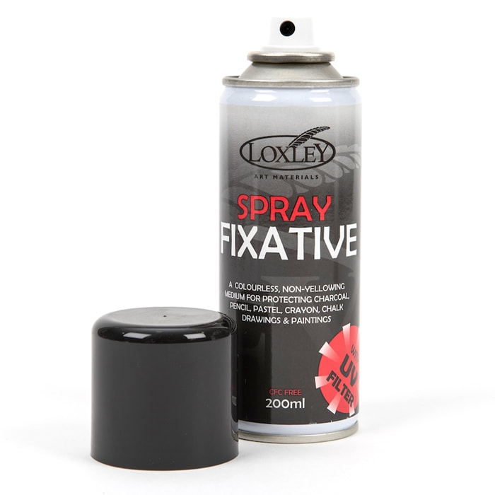 | Loxley spray fixative 200ml is a high quality, colourless, non-yellowing protection medium with UV Filter and is CFC free. It protects artwork from atmosphere damage caused by moisture and the suns UV rays as well as preventing smudging and is recommended particularly for use on charcoal, pencil, pastel, crayon, chalk drawings and paintings. This is available in two sizes: 200ml and 400ml. |
I have used this product for many years to help seal my graphite and coloured pencil drawings as well as my pastel portraits too. I have tried some other fixatives, but I personally like this one due to the fact that it also includes a UV filter, which offers extra protection. Some fixative nozzles can become blocked which is when spitting happens and this can leave marks on your drawing, particularly noticeable if you use it for your pastel paintings. I have never had that problem with the Loxley one.
When working on my coloured pencil portraits, I sometimes apply a fixative between the layers which helps to extend the working surface and minimise saturation if I have applied a large amount of layers to a particular piece. As the fixative secures previous layers, ensure you have finished blending as you may not be able to do this after sealing it with fixative. In the video above, you can see the Loxley fixative appear in the video showing you where I apply a spray of fixative. There are around 8 or 9 layers on this area alone and as I need to apply highlights to the dark fur, the fixative allows me to do this without muddying the colours. I can then continue with more layers. Once the portrait is complete, I treat it with two layers over the whole of the portrait to minimise smudging and to offer extra protection to the framed portrait, particularly as many people do not choose a UV or museum glass when framing.
If you work with pastels, you may wonder if you should use a fixative on your drawings. Take a look at the comparison photos below and see what may happen if you do. The one on the left is before applying fixative and the one on the right is after. See how the fixative has darkened the colours, creating a more translucent finish. The fixative has dampened the pastel application, causing the darkening of the pastels. This may depend on the pastels you use though as higher quality pastels may not react in the same way as cheaper brand ones due to their being more pigment in them. Many papers, particularly textured ones, do not require a fixative as they hold the pastel well with minimal pastel drop. At the end of the day, the final decision is yours alone.
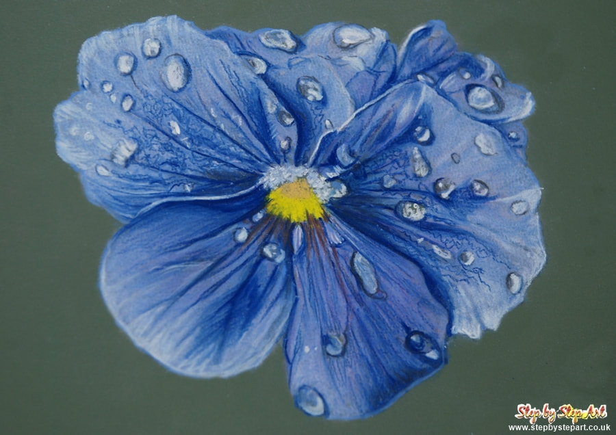
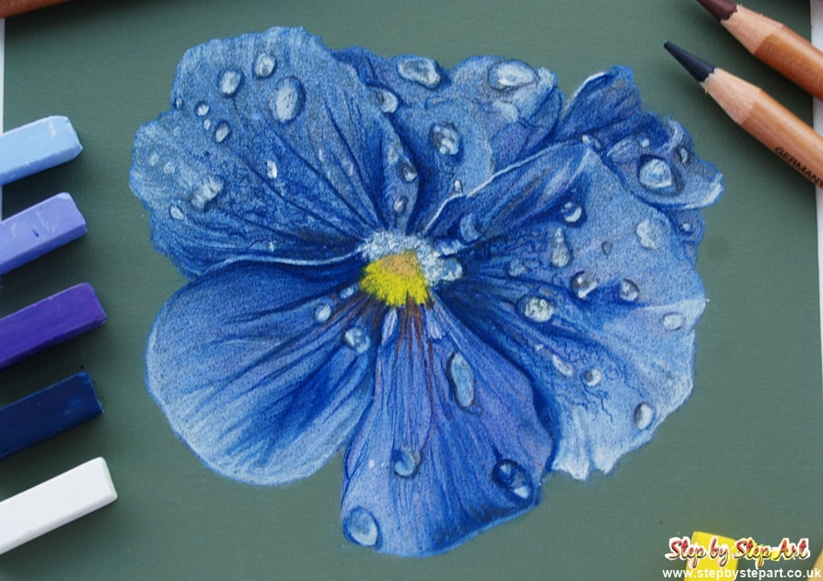
When spraying, hold the can about 12" away from your upright drawing and spray evenly from top to bottom. It has also been suggested to me that you can turn your drawing 45 degrees and respray, so you are applying a balanced amount over the whole of your drawing. Spray too close and you may create speckling from the aerosol.
Never use hairspray as a fixative. Manufacturers of hairspray make this product for use on hair, not artwork. As hairspray is not acid-free, should you spray it over your artwork, it could cause it to yellow over time. The acid in the hairspray can cause discolouration of the pigment and may also make the paper brittle too. If you have ever used hairspray, you'll note that some can leave a tacky residue behind, not good for your work. It really is better to buy a fixative made for art, which will help protect your work properly for many years.
If you wish to see the final portrait of the Boxer dog being created in the video above, click this link
These pencils have been available to 'pre-order' for a while, but online stores, are now receiving stock and getting them sent out to everyone. My set appeared on Saturday morning (18.07.20) and I have to admit to being very excited upon opening the box.
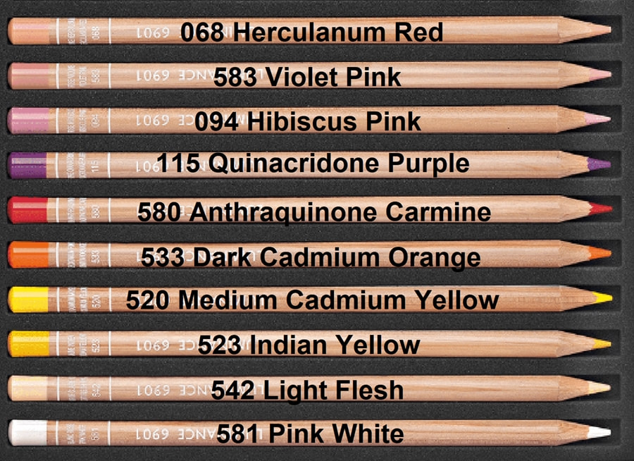 | 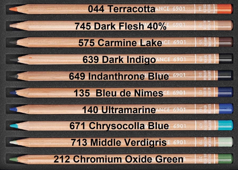 |
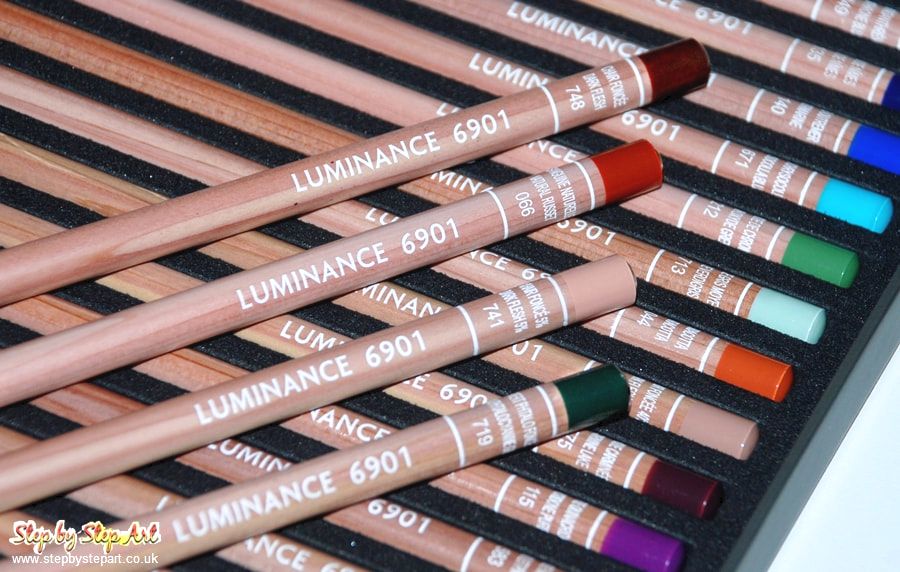
You can view our Luminance article by clicking the link below.
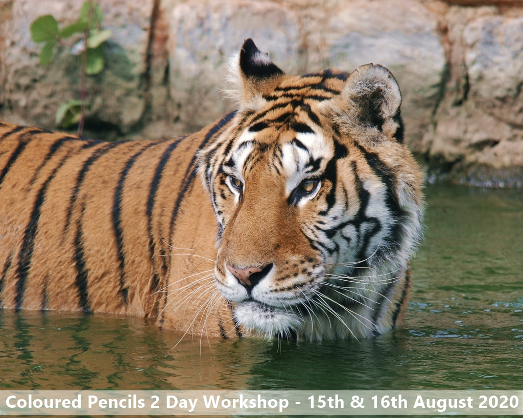
Cancelled Workshop
The two day, coloured pencil workshop that was booked to run over the weekend of 15th and the 16th of August has now been rolled over to next year.
The Coronavirus has turned many lives and businesses upside down this year, and although we are all trying to get back to normal, it's going to take some time adapting to the new normal. Government regulations offer advice for all businesses and event planners to follow so they can provide a service as safely as possible. For many, this is possible, for others, it isn't. This workshop comes under the latter, and unfortunately there are too many hurdles that I, as the art tutor, am unable to fulfil.
The room where the workshop is held, is simply too small for social distancing. The raison d'etre of my workshops is providing demonstrations and one to one help, any social distancing means the whole point of the workshop is lost. Other guidelines, understandably, cover strict sanitation and it would be almost impossible to follow all the requirements.
As many are still concerned about gathering in groups, the interest in this workshop has been low, meaning people are simply not booking and the workshop is not viable.
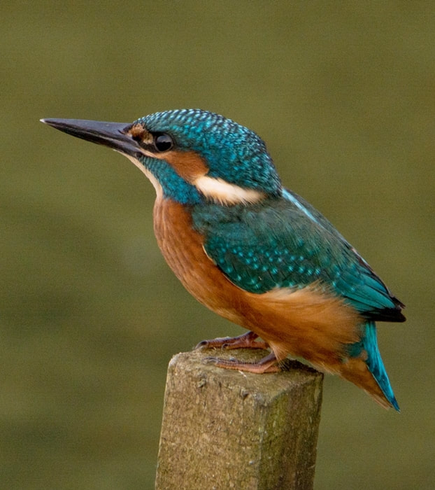
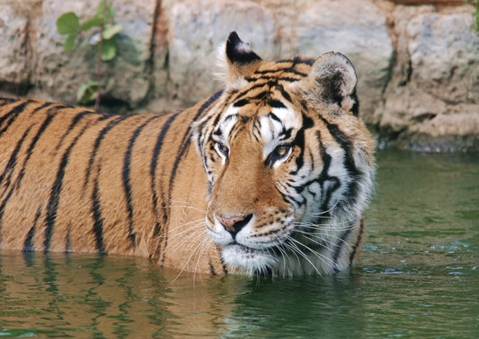
I have decided to roll all my 2020 art workshops over to 2021 whilst adding in a Coronavirus caveat which may affect a workshop depending on the situation at that time. Anyone who wanted to attend the workshops this year, can still attend next year if they are able. You can click on any of the images below to find out more information on each workshop. I will open up bookings in the new year.

Stay safe everyone,
Karen Berisford,
Artist & art tutor of Step by Step Art
2020 Art Workshops
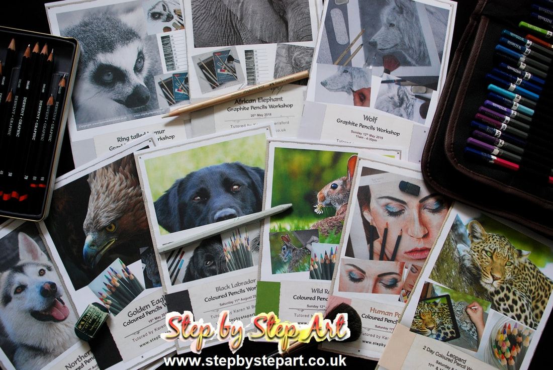
Every year I choose 3 or 4 subjects for the Coloured pencil & Graphite pencil workshops which include varying techniques and surfaces to previous years, ensuring each workshop is different to another. Coloured pencil workshops using textured paper are somewhat easier for a complete beginner than the workshops working on smooth paper, however every workshop available can be attended by any artist regardless of their calibre, even if they have NEVER drawn anything since their time at school!
To find out more about our workshops, click any one of the following links to visit the page of interest:
Reviews & Tutorials
Latest product reviews
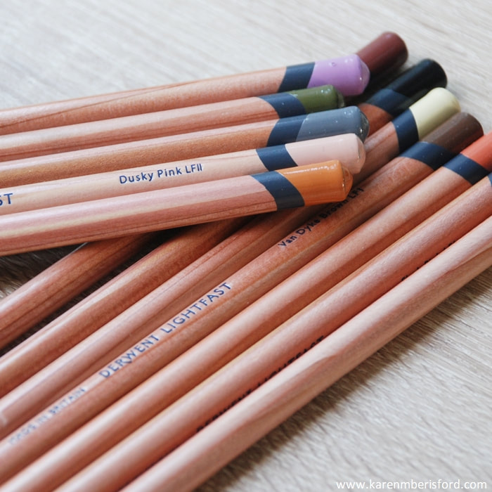
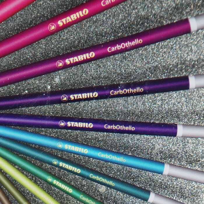
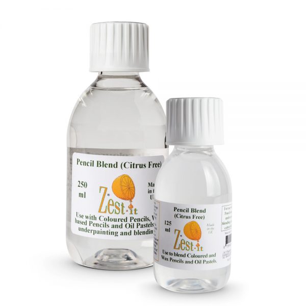
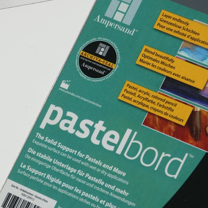
| Derwent released their first 100% lightfast Coloured pencil range this year and I decided to try them out on both smooth and textured surfaces, see how I got on. | The CarbOthello pastel pencils offer 60 vibrant colours and would make a great addition to the colour palette of any Pastellist. Find out more about this range. | In this article, I mixed pencil blend and Derwent Lightfast pencils on both the Pastelbord surface and the Strathmore bristol plate surface, check out the review. | This canvas is an ideal surface for many different mediums, not just pastels and in this article I show what is achievable using Acrylics & Coloured pencils. |
New Mini Tutorials
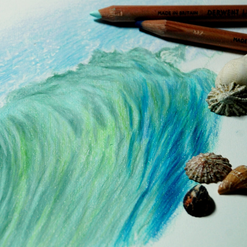
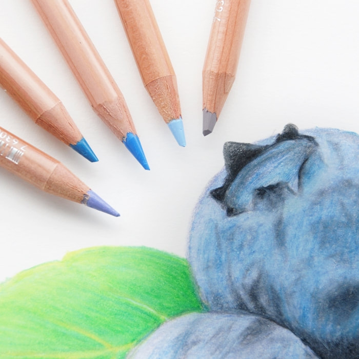
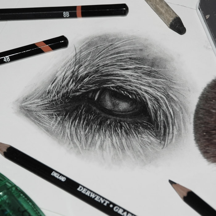
| Requested by a 'SBS Art' subscriber, this tutorial shows you how to create depth and movement in water using Coloured pencils. For all art abilities. | Originally published in the USA Colored pencil magazine in 2018, this tutorial explains the process of how to create Blueberries in Coloured pencil. For all art levels. | An in depth guide explaining how to create a dogs eye using Graphite pencils and other accessories that will help you achieve a highly detailed, 3D drawing. |
Finally, you can always SUBSCRIBE to our quarterly newsletter, ensuring you receive the very latest articles, delivered straight to your E-mail.
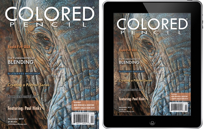
Blueberries Tutorial in the Colored Pencil Magazine - November issue.
 |
|
I was approached by Sally Robertson, Editor in Chief, at the Colored Pencil magazine asking if I wished to contribute a tutorial as part of their new 'Workshop series' and I agreed.
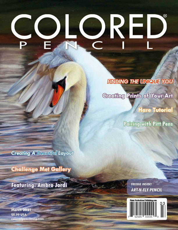
For the reference image I choose a simplistic subject of some blueberries so that any pencil artist could give it a go, and working with my Caran Dache Luminance pencil brand I created a comprehensive, step by step guide showing where to start and how effective layering is before adding then adding the finer detail. The magazine can now be purchased via digital download or in print - a copy of the front cover can be seen above with a list of articles that can be found inside. There is also a special article with the artist Paul Hinks (UK Artist) who works solely in pastel pencils (front cover artwork) so not always fully limited to coloured pencil articles. 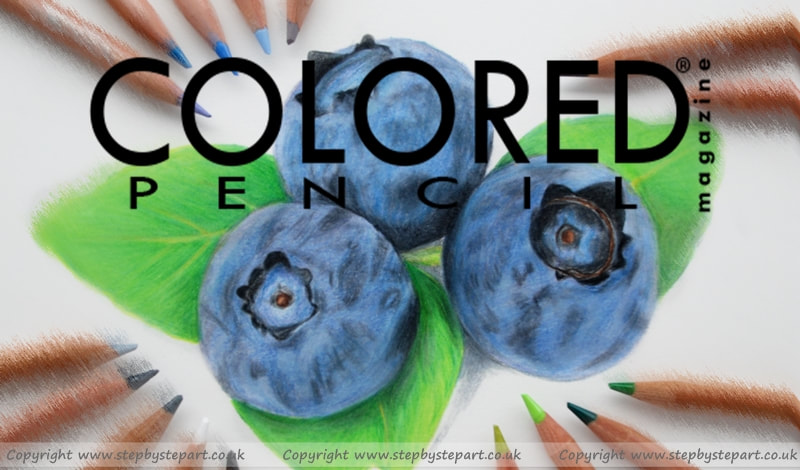
The November magazine is now out with my tutorial inside and for anyone wishing to purchase the magazine, you can purchase in either digital format to download immediately or order the print copy - you can also order both together too.
*Prices outside of the USA may vary due to the exchange rate on the day of purchase
|
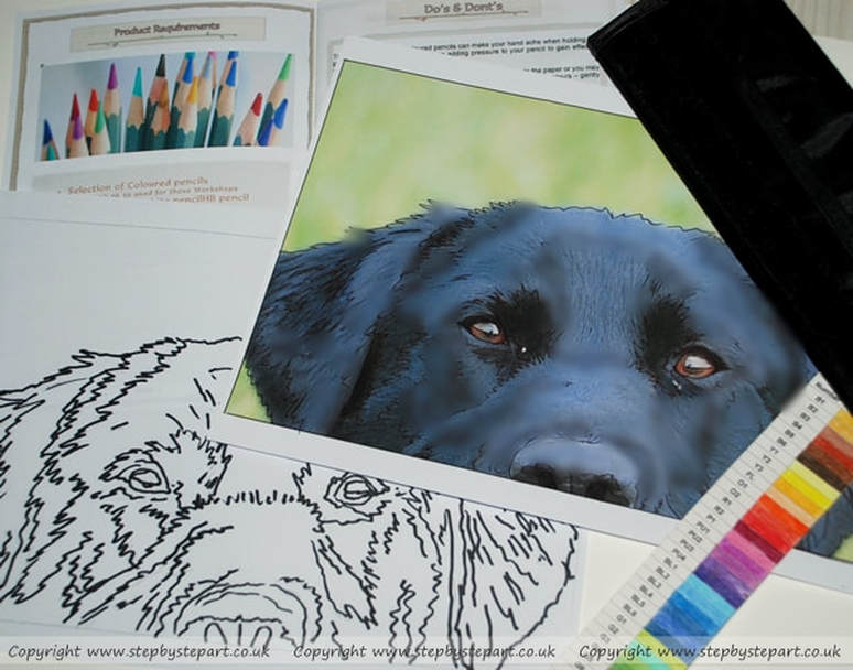
BLACK LABRADOR
Saturday - August 11th - 10am - 3:30pm
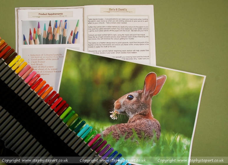
WILD RABBIT
Sunday - August 12th - 11am - 4:30pm
About these Workshops
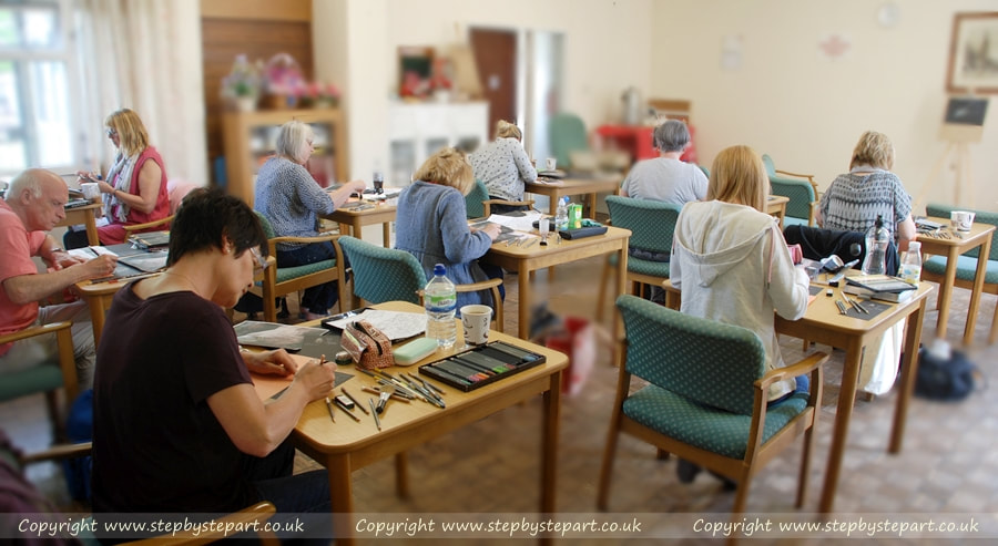
You can either use your own products from home or loan/purchase an art kit from myself (book in advance)
THIS WORKSHOP HAS BEEN COMPLETED
[email protected]
Our 4 latest Articles
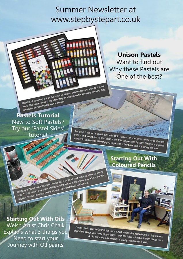
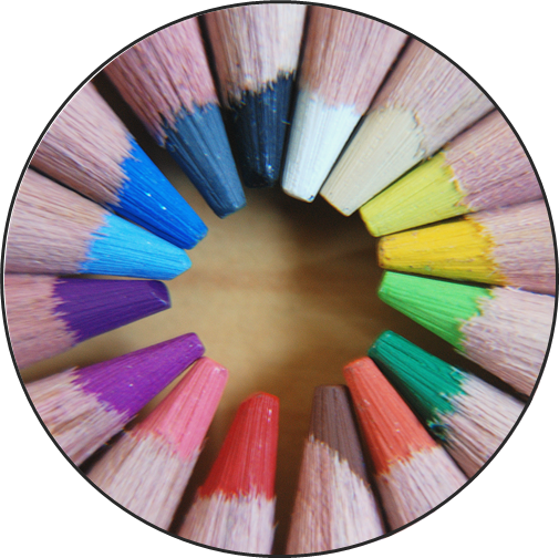 New to coloured pencils? Why not view our 'Starting out with coloured pencils' article with some great hints and tips on where to begin, with what to buy and how to use them to their best ability. | 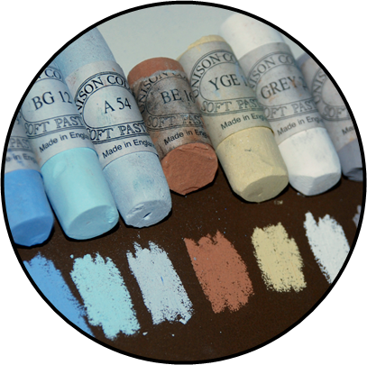 If you are a newbie to soft pastels, this simple step by step tutorial explains how to create a tonal sky with the smoothest transitions and may offer you some great pointers to get you started. | 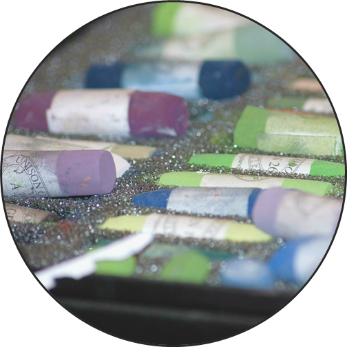 Looking for some top quality soft pastels and have your eye on the Unison range but want to know more about them before splashing out? This article may offer you some great information. | 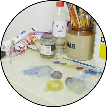 Would you like to give oils a try and unsure what you need to get going? This article written by Welsh oil painter Chris Chalk and gives some simple advice to those new to oils. |
Why not subscribe to our newsletter
 |  |  |
Thanks for looking!
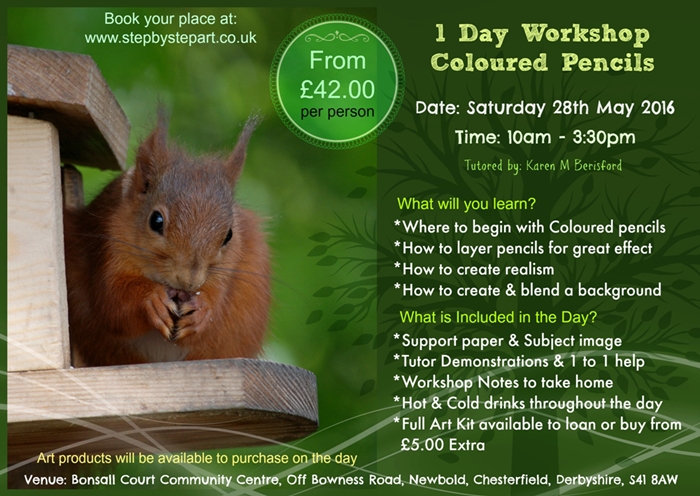
WORKSHOP COMPLETED
View any current Workshops available HERE
Feel free to click the Facebook 'Like' button, 'tweet' on Twitter or post a comment below!
Hope to see you there!
Author
Karen M Berisford
Archives
March 2024
February 2024
August 2023
May 2023
March 2023
February 2023
October 2022
June 2022
May 2022
April 2022
March 2022
July 2021
March 2021
December 2020
November 2020
August 2020
July 2020
January 2020
November 2018
June 2018
July 2017
January 2017
April 2016
March 2016
February 2016
June 2015
May 2015
March 2015
April 2014
December 2011
Categories
All
1 Day Art Workshop
1 Day Graphite Workshop In The UK
2 Day Art Workshop
Accessories For Artists
Acid Free Black Paper
Acid Free Paper
Acid-free Paper
Acid Free V Archival
Acid-free V Archival
Acrylic Articles
Acrylic Panel Board
Acrylic Varnishes
Alkaline Paper
Ampersand Pastelbord
Aqua Stonehenge
Archival Acid Free
Archival Acid-free
Archival Black Artist Paper
Archival Paper
Archivists
Arm Rest
Arm Support
Art Education
Articles On Art
Artist Essentials
Artist Light
Artists Easel
Art Lighting
Art Materials
Art Product Recommendations
Art Spectrum
Art Spectrum Colourfix Smooth
Art Studio Light
Art Tips
Art Tutorials
Arty Articles
Audrey Hepburn Art Workshop
Barn Owl Art Workshop
Battery Powered Eraser
Berol Karisma Pencils
Black Art Paper
Black Art Papers
Black Labrador Art Workshop
Black Labrador Coloured Pencil Art Workshop
Black Labrador In Coloured Pencils
Black Paper Tutorial
Black Rhino Art Workshop
Blenders
Blenders And Burnishers
Blending Soft Pastels
Blending Sponges
Blending Stumps
Blending Tools For Coloured Pencil Artists
Blending Tools For Graphite Art
Blending Tools For Soft Pastels
Blueberries In Coloured Pencil Tutorial
Blue Wool Papers
Brush And Pencil Colored Pencil Powder Blender
Buffers
Canson Mi-tientes
Canson Mi Tientes Touch
Canson Mi-tientes Touch
Caran D'Ache
Caran Dache Full Blender Bright
Caran Dache Luminance Pencils
Carbon Pencil
Carbon Pencils Help
Carbon Versus Charcoal
Cheap Coloured Pencils
Chesterfield Art Group
Chesterfield Art Tutor
Chesterfield Art Workshops
Chromaflow Pencils
Clairfontaine Pastelmat
Colored Pencil Magazine
Colored Pencils
Coloured Pencil Accessories
Coloured Pencil Article
Coloured Pencil Artists
Coloured Pencil Art Kit
Coloured Pencil Mini Tutorial
Coloured Pencils
Coloured Pencils Comparison Article
Coloured Pencils On Pastelbord
Coloured Pencil Tutor
Coloured Pencil Tutorial
Coloured Pencil Workshop
Colourfix Black
Colourfix Paper Review
Colourfix Smooth Black
Colour Shapers
Commission Art
Commission Art Business
Coronavirus
D33200
D33500
Daler Rowney Graduate Acrylics
Daylight Company
Derbyshire Art Workshop
Derwent
Derwent Black Mixed Media Paper
Derwent Blender
Derwent Blender Pen
Derwent Burnisher
Derwent Chromaflow
Derwent Coloured Pencils
Derwent Coloursoft Pencils
Derwent Graphic Pencils
Derwent Graphite Pencils
Derwent Lightfast
Derwent Lightfast And Zest It
Derwent Lightfast On Pastelbord
Derwent Metallics
Derwent Onyx
Derwent Onyx Pencils
Derwent Pencils
Discontinued Product
Dogs Eye In Graphite Pencil Tutorial#
Drawing A Hare
Dust Free Eraser
Embossing Tools
Environmental Paper
Erasing Carbon Pencils
Erasing Shield/stencil
Ergonomic
Ergonomic Arm Rest
Faber Castell Graphite 9000
Faber Castell Pastel Pencils
Faber Castell Polychromos Pencils
Fabriano Tiziano
Fixative Spray
Free Art Tutorials
Frisk Black Watercolour Paper
Frisk Paper
Gallery Oil Pastels
Gelly Roll Pens
Gesso
Gesso Panel
GOLDEN
Golden Polymer Varnishes
Golden Varnishes
Golden Waterborne Varnish
Grahite Lemur Art Workshops
Graphite Artist Help
Graphite Mini Tutorial
Graphite Pencil Accessories
Graphite Pencil Help
Graphite Pencils
Graphite Pencils Article
Graphite Pencils Art Workshops
Graphite Pencil Tips
Group Advertising
Hahnemuhle Velour
HAIYA
HAIYA Oil Pastels
Hare
Hints And Tips
Hot Pressed Watercolour Paper
How To Blend Soft Pastels
Indenting Tool
Inktense Pencils
Inscribe Pastels
Jackson's Art
Jackson's Art Gesso Panel
John Graham Artist
Karen M Berisford
Karen M Berisford Art Articles
Karismacolor
Kingfisher Art Workshop
Kneadable Putty Rubber
Ko-fi
Learn Coloured Pencils
Learn How To Draw With Coloured Pencils
Learn How To Draw With Graphite Pencils
Learn How To Draw With Pastels
LED Lights
Legion Aqua Stonehenge
Legion Stonehenge
Lemur UK Pencil Workshop
Light For Craft Art
Loxley
Loxley Fixative
Lumi Light
Luminance Pencils
Luminance Portrait Colours
Lyra Splender Blender
Mars Black Pencil
Mars Lumograph Black
Mini Art Tutorial
Mi Tientes Black Pastel Paper
Mi Tientes Touch Black Paper
Mi-tientes Touch Black Paper
Mi-tientes Touch Paper
Mono Zero Erasers
Moulin Du Roy
Newbiggin By The Sea Art Workshops
Newbiggin-by-the-sea Art Workshops
Newbiggin-by-the-sea Pet Artists
Northumberland Artists
Oil Paint Articles
Oil Panel Board
Oil Pastel Art
Oil Pastels
PAINT Magazine
Panel Board For Painters
Pan Pastels
Paper For Acrylics
Paper For Coloured Pencils
Paper For Pastels
Paper Quality
Paper Stumps
Pastel Applicators
Pastel Articles
Pastel Blending
Pastelbord
Pastelmat
Pastel Surfaces
Paul Rubens
Paul Rubens Oil Pastels
PDF Art Tutorials
Pencil Art
Pencils For Beginners
Pencil Workshops
Perfection Eraser Pencil
Pitt Pastels
Polymer Varnish Discontinued
Poppy Field Tutorial
Portrait Pencil Palette
Prismacolor Blender
Prismacolor Premier
Rabbit Coloured Pencil Art Workshop#
Rabbit In Coloured Pencils
Red Squirrel
Ring Tailed Lemur Art Workshop
Robin In Coloured Pencils
Royal Talens Sakura Notebook
SAA Article
Sakura Notebook Black Sheets
Sennelier
Sennelier Oil Pastels
Shetland Sheepdog UK Pencil Workshop
Snow Leopard Eye Art Workshop
Soft Pastel Articles
Soft Pastel Help
Soft Pastels Articles
Soft Pastels Tutorial
Stabilo Carbothello Pastel Pencils
Stabilo Pastel Pencils
Staedtler
Staedtler Lumograph
Staedtler Mars
Starting Out With Graphite Pencils
Starting Your Own Art Business
St Cuthbert's Mill Somerset
Step By Step Art Tutorials
Stonehenge Black
Strawberry Art Tutorial
Student Quality
Studio Lighting
Studio Practices
Sumatran Tiger Art Workshop
Tiziano Black Pastel Paper
Tortillions
Uk Art Workshops
Uk Coloured Pencil Workshop
Uncradled Gesso Panel
Uneeda UArt Paper
Unison Pastels
Ursus
Waves In Coloured Pencils
WH Smith Colouring Pencils
Wild Rabbit Art Workshop
Workshop Series
YouTube Channel
Zest It
Zest It Pencil Blend
 RSS Feed